|
| |
Credits :
Download :
Look for downloads on external sites:
Pokefinder.org
User Comment
Submitted by Paul Bearer on 9 November 2012
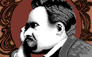
I can't think of a good "Übermensch" joke right now... but yeah, the pic is really nice.
@Frantic: Alexander Bard? I was thinking of Ned Flanders. |
User Comment
Submitted by Joe on 8 November 2012
Nice interpretation and refurbishment of that classic image. It's cleverly done and I like the poetry of the background.
The grid is a powerful device to help enlargement and translation. I've used it myself several times.
Here in Southern part of Sweden, we have seen another hairy man recently, known for other things,
A. Strindberg. Locally posted on by-stands for buses and so forth, and who couldn't tie the full Windsor for sure.
Nice to see those old men get out of their coffins once in a while to see the daylight I'd guess.
The general thematic almost reminded me of this old thing...
http://www.youtube.com/watch?v=wwdOX19_ETI |
User Comment
Submitted by Achim on 8 November 2012
...let's philosophize with a hammer!
Yeah, and always keep in mind what Heidegger said about pixeling: Nobody ever thought about the pixelhood of the pixel as such! |
User Comment
Submitted by Dr.j on 8 November 2012
| Cool job..excellent picture |
User Comment
Submitted by TheRyk on 8 November 2012
| Awesome! Like it escaped from a Monty Python's Flying cirlce cartoon trailer :D |
User Comment
Submitted by Frantic on 8 November 2012
User Comment
Submitted by Frost on 8 November 2012
Bryt sönder!
Bryt sönder de gamles lagtavlor! |
User Comment
Submitted by Oswald on 8 November 2012
| very strong image. love it. |
User Comment
Submitted by hedning on 8 November 2012
User Comment
Submitted by hedning on 8 November 2012
Very nice! Only the arm looks a little freaky (or at least the gray quarter-circle to the lower left, by the arm, which make the arm look like it's bent in a very odd angle). Makes me want to try out some other philosopher. :)
EDIT: It could be my eyes fooling me. When I look at it again the weirdness is gone.
One more thing: Is it something new that graphicians tend to crop the borders on their screenshots? Yes, it makes the picture "look better", but it's still no screenshot. |
User Comment
Submitted by v3to on 8 November 2012
| yes, nice one. motive, composition, colors remind me wayne schmidt works. |
User Comment
Submitted by OMP on 8 November 2012
User Comment
Submitted by Shine on 8 November 2012
User Comment
Submitted by Jak T Rip on 8 November 2012
Great idea, great execution!
I love how the colours underline the motive, very effective. |
User Comment
Submitted by PAL on 7 November 2012
love it! The background is super top... the man too is cool ontop of that background!
|
|
|
|
 | Search CSDb |
|
 | Navigate |  |
|
 | Detailed Info |  |
|
 | Fun Stuff |  |
· Goofs
· Hidden Parts
· Trivia
|
|
 | Forum |  |
|
 | Support CSDb |  |
|
 |  |
|


