|
| |
Website :
http://www.ajkanet.hu/~leonofsgr
Credits :
Download :
Look for downloads on external sites:
Pokefinder.org
User Comment
Submitted by Shine on 22 March 2014
| Underrated ofCoz! 9/10 :) |
User Comment
Submitted by madcrow on 9 November 2005
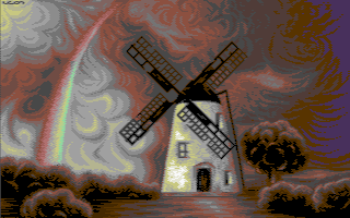
| Focuses on looking really pretty and succeeds. The C64 isn't good for "realistic" art, but it rocks at stuff like this. Two thumbs way up. |
User Comment
Submitted by leonofsgr on 6 November 2005
Hi Everybody!
Thanks for the reactions and votes! I recently met a beautiful woman whit whom we have mostly common opinions on things and we shared many experiences. We both liked very much this wind-mill and the atmosphere of the original photo. The typical common landscape, common life in a possible future... in short the inspiration is this. Besides I got to like the landscape-motive, and it's likely I will do more of these for parties to see them 'in action'. Not always 'woman with big tits' is the mood to go in my opinion. The technique is simple: the use of minamlistic colors, sky and gorund with perfect harmony was my intention.
Thanks for the attention!
Leon/SGR/Chorus |
User Comment
Submitted by Twoflower on 6 November 2005
| Sort of nice. I really like the dithering and the colors, but I think some more contrasting colors at places would have lifted it even more. Can't really understand why you choose to work with a motive like this, though? |
User Comment
Submitted by Skate on 6 November 2005
| Very cool fullscreen interlace graphic. I specially liked the bg colors. Great work. |
User Comment
Submitted by CreaMD on 5 November 2005
| Fabulous! The mill fan is a bit out of perspective though. ;-) |
User Comment
Submitted by Hoild on 5 November 2005
Obviously meant to be a mood piece.
For those familiar with Leon's early attempts, it is a return to his landscapes-and-stills beginnings, backed with strong technical knowledge this time. :]
I concur maestro Sander's opinion about faults with perspective and proportions, but there is a strong overdose of chiselled dithering/colouring technique at use for capturing a tensive, moody moment.
Hoild\UNC |
User Comment
Submitted by Sander on 5 November 2005
The dithering is well done and there's some nice atmosphere. IMHO it misses quite a lot, perspective, proportions, blurry/sharpness (depth) etc. Sometimes i wonder why a picture like this is being so adored. Perhaps lack of a compo-context?
/Sander (in an honest mood ;) |
User Comment
Submitted by Zyron on 4 November 2005
Quite nice pic, what's at the end of the rainbow? A bag of green?
The website is not specially dedicated to this release though so the URL should be removed. |
User Comment
Submitted by blackdroid on 4 November 2005
| quite nice atmosphere, but I cant help to think that the windmill looks flat, two-dimensional and that the windmill sails relative positioning feels odd, and not in lieu with the windmill itself. nice pixeling technique to bad the screenshot on csdb is crap though. |
User Comment
Submitted by Deev on 4 November 2005
| The trees, the swirls in the cloud, the lighting, the windmill...all really beautifully done! If I have one critisism, it's perhaps that something is needed in the top right to balance the picture out a little more, but I still like this lots! Definately one of Leon's best. |
User Comment
Submitted by Nafcom on 3 November 2005
| I disagree with DCMP, the colours are just right. |
User Comment
Submitted by Tch on 3 November 2005
User Comment
Submitted by Jazzcat on 3 November 2005
| Nice picture indeed. One of Leon's better works in my opinion. The tree-pixelling is good, more pictures capturing the elements (wind) at their best please! |
User Comment
Submitted by DCMP on 3 November 2005
| Nice Leon. You dream about the Netherlands? Adding a little more color variation would make it look better I think. |
|
|
|
 | Search CSDb |
|
 | Navigate |  |
|
 | Detailed Info |  |
|
 | Fun Stuff |  |
· Goofs
· Hidden Parts
· Trivia
|
|
 | Forum |  |
|
 | Support CSDb |  |
|
 |  |
|


