Credits :
Download :
Look for downloads on external sites:
Pokefinder.org
User Comment
Submitted by Jok on 12 June 2014
with this settings looks really impressive
perfect pixelwork
you really have control over medium |
User Comment
Submitted by Paul Bearer on 7 July 2011
@ptoing:
Okay, now I understand. |
User Comment
Submitted by ptoing on 7 July 2011
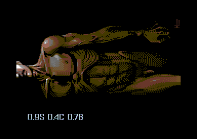
| Paul: No it is not. Helm has intended this to be watched on an adjusted monitor (or tweaked settings in Vice) hence the 3 numbers which stand for Saturation, Contrast and Brightness. The shot was taken with those settings in VICE 2.3. |
User Comment
Submitted by Paul Bearer on 7 July 2011

That's taken from VICE 2.3, CRT Emu with standard settings. Maybe my display settings are screwed up, but the screenshot at the top is just too dark. |
User Comment
Submitted by ptoing on 6 July 2011
| Saturation, Contrast, Brightness as deviated from the middle value being 1 (scale from 0-2) |
User Comment
Submitted by JackAsser on 6 July 2011
| Good picture! But I failed to find a meaning behind the numbers and it's annoying... What are those? |
User Comment
Submitted by DeeKay on 6 July 2011
| ptoing: I mean the orientation. That hard edge still is annoying and doesn't fit, even if it's on purpose! ;-) |
User Comment
Submitted by Paul Bearer on 6 July 2011
Well, that screenshot actually looks the same as in VICE with CRT Emulation... if you're wearing 3 pairs of black sunglasses at the same time...
The picture is really well done. |
User Comment
Submitted by ptoing on 6 July 2011
Deekay: I can tell you that there for sure is no conversion error in there. Everything should be as Helm intended it. We did not use a converted that "fixes" stuff.
As far as the screenshot being misleading goes, how so? Is it the rotation or the colours? The colours can easily be achieved in Vice and also on real hardware pretty much. |
User Comment
Submitted by DeeKay on 6 July 2011
Very nice, Helm, usually i despise patterndither, but for some reason it works rather well here! ;-) Just the hard edge/corner his left breast muscle should've been fixed (i really doubt that's on purpose, it's the only hard edge in the picture, must be a conversion bug!).. And what's that bulge in the middle of the chest? I just assume the combination of the starving-to-death ribcage and the muscles is a style/anatomical experiment! ;-)
P.S: I was a bit disappointed to find out it's actually 90 degrees rotated, was really looking forward to some hirespic with nice upperlower-border-gfx a la Duce/Mermaid/Zeldin! |
User Comment
Submitted by Motion on 6 July 2011
| Very good - isn't this based on medical anatomy, research? |
User Comment
Submitted by Radiant on 6 July 2011
Nice! We've had plenty of female genitalia during the years, now it's time for some male counterparts! Good technique as always. The screenshot is misleading, but I believe that has already been commented on...
Anyway, enjoying the public display of homophobia over here, always nice when you can provoke strong reactions through art. |
User Comment
Submitted by PAL on 5 July 2011
| It looks really cool in a way... but maaaaannnnn... that weird sorry arse of a deformed and abnormal, sorry I exist and sick, bad, horrible and total turndown looking penis really turn this image down... it is incredible non-sexy and makes me almost wanna puke. Sorry to say that but it is the truth... and nothing but the truth... from me... That is a shame as the image is rather cool on an overall... |
User Comment
Submitted by Stainless Steel on 5 July 2011
| nice but very misleading screenshot. And ofcourse the penis. |
User Comment
Submitted by hedning on 5 July 2011
| Very good. Impressive. The screenshot should be corrected though. |
User Comment
Submitted by Conrad on 5 July 2011
| Very nice, but err... I second FatFrost too. :P |
User Comment
Submitted by Deev on 5 July 2011
Nicely done, at first view looks very anatomically detailed, yet when you look closely the pixel style is quite artistic.
Instead of commenting on the picture, someone shortly will complain about that screenshot. That person has no soul! :) |
User Comment
Submitted by FATFrost on 5 July 2011
User Comment
Submitted by Ed on 5 July 2011
| Wow. Expected something quite else from looking at the screen shot. Pretty nice. |
|
|
 | Search CSDb |
|
 | Navigate |  |
|
 | Detailed Info |  |
|
 | Fun Stuff |  |
· Goofs
· Hidden Parts
· Trivia
|
|
 | Forum |  |
|
 | Support CSDb |  |
|
 |  |
|


