|
| |
|
Angels Are the First to Leave for War [2014] |
AKA :
5814
Credits :
No credits found
Download :
Look for downloads on external sites:
Pokefinder.org
User Comment
Submitted by Bob on 22 March 2014
| I C the colors are coming back here more and more ;) |
User Comment
Submitted by leonofsgr on 16 March 2014
| saimo: thanks the long and complex comments, and the helpful criticism!!! |
User Comment
Submitted by saimo on 3 March 2014
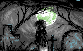
Leon, this piece clearly shows another area where you need to improve: lighting. Random/inconsistent lighting is a problem that affects all your pieces, but here it's very easy to see.
Here you have a single, big light source: the moon shining from up above, at the center and in front of all the objects depicted. This means that the objects should have most of their contours hit by light and their bodies mostly dark. Instead:
* the tombstones have dark edges (as if immersed in darkness) and highlights on the sides not exposed to light (in practice, the opposite of what should be);
* the same goes for the trees and clouds;
* the woman is hit by a light source coming from down-right, placed between the viewer and the woman itself, almost at her feet;
* the left cross is hit by another similarly placed light source;
* the cross in the middle is hit by another another similarly placed light source, except that it comes from above.
Note that by fixing lighting, you will automatically fix/improve the volumes and depth of your pictures.
Other notes:
* the woman's legs are too short (again);
* I don't understand the stylistical choice of the green color.
Please don't let be down by this criticism: it is only meant to help you improve, and it is much more effective than any fake cheering I could have come up with. You're doing quite an effort, so it's a matter of channeling those energies. Keep on pixelling, but, before the pixeltech, keep in my that the abstract concepts of drawing. A badly placed shadow, a distorted solid, a wrong perspective will look bad no matter how cool you pixel textures are. |
User Comment
Submitted by Sixx on 3 March 2014
| Superb as usual, now i wanna see some more colours please! Leon. <3 |
User Comment
Submitted by Shine on 3 March 2014
User Comment
Submitted by TheRyk on 3 March 2014
in terms of graphics & motive nothing technically of course impressive as usual, but nothing that sticks out from your recent work, just another of many b&w umrella girls showing us her back & staring at a gothic scenario
in terms of title it hits the Zeitgeist & makes you think... |
|
|
|
 | Search CSDb |
|
 | Navigate |  |
|
 | Detailed Info |  |
|
 | Fun Stuff |  |
· Goofs
· Hidden Parts
· Trivia
|
|
 | Forum |  |
|
 | Support CSDb |  |
|
 |  |
|


