|
| |
Released At :
Revision 2012
Achievements :
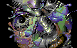
Mixed Graphics Competition at Revision 2012 : #10
Credits :
Download :
Look for downloads on external sites:
Pokefinder.org
User Comment
Submitted by Jammer on 16 February 2015
| How did I miss it? Awesome! |
User Comment
Submitted by Tom-Cat on 9 June 2014
| Wow. One of the top nufli pictures out there, and overall one of the best c64 pictures :) Love the design... |
User Comment
Submitted by DeeKay on 15 April 2012
| VERY nice, Seba! Really nice experimenting with the dithering, also the "circle-edges" are an innovative idea only possible in hires! This should rank much higher IMHO! (and yes, *I* voted for it! ;-) |
User Comment
Submitted by Jok on 11 April 2012
User Comment
Submitted by v3to on 10 April 2012
| wile coyote: if you are interested in the nufli you really should give the editor a second chance. it takes a while to get into for sure, but it is definitely worth it - at least to avoid clashes from the converter. |
User Comment
Submitted by Wile Coyote on 10 April 2012
@Sebaloz
I never implied you used Photoshop. I fully thought you had pixel pushed the colour.
My comment about Photoshop was based on magazines I have seen that teach people how to use Photoshop. They tend to use examples that include source material / photographs of females etc then set about adding various FX to them, that sort of stuff.
Im impressed you can use the NUFLI editor. I booted it up once, and thought no thanks ;)
|
User Comment
Submitted by sebalozlepsi on 10 April 2012
| WEC: You are wrong. I didnt use Photoshop or Timanthes. Project one rulez. Face is original, you can check step1 with tineye. Dont do it with other compo entries :). I cant compete with Photoshop Liars, Timanthes Players, or copiers of 'google image' pictures, but i can use any pixelling/dithering/hatching technique as long as its pure handjob. |
User Comment
Submitted by psych on 10 April 2012
User Comment
Submitted by Yogibear on 9 April 2012
User Comment
Submitted by Wile Coyote on 9 April 2012
I have mixed thoughts.
First impressions were favourable.
I checked out the stages. Grey scale female face over which colour was added.
The lips look almost metallic, and I like the textured effect on the upper nose / forehead.
All the colour to the left and right Im not sure what to make of it.
The whole thing reminds me a little of an image from a magazine thats been played around with using Photoshop.
I like it more than the 4th place entry. |
User Comment
Submitted by Sixx on 9 April 2012
User Comment
Submitted by Hoild on 9 April 2012
| This pixelling technique is worth exploring by more and more graphicians, I am glad to see a pic like this from Sebaloz. |
User Comment
Submitted by Celtic on 9 April 2012
| this is amazing, and incredibly underrated. The details are fantastic. My number 2 or 3. Go dude! |
User Comment
Submitted by CONS on 9 April 2012
| Great work. The competition was strong, but the feeling of "this is underrated" remains. |
User Comment
Submitted by Joe on 9 April 2012
User Comment
Submitted by bugjam on 9 April 2012
User Comment
Submitted by Cresh on 9 April 2012
|
|
|
 | Search CSDb |
|
 | Navigate |  |
|
 | Detailed Info |  |
|
 | Fun Stuff |  |
· Goofs
· Hidden Parts
· Trivia
|
|
 | Forum |  |
|
 | Support CSDb |  |
|
 |  |
|


