|
| |
Website :
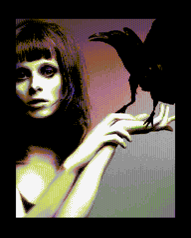
http://c64pixels.com/dane/raven
Released At :
C64pixels.com Double Screen Compo
Achievements :
C64 Graphics Competition at C64pixels.com Double Screen Compo : #6
Credits :
Download :
Look for downloads on external sites:
Pokefinder.org
User Comment
Submitted by KAL_123 on 25 May 2020
User Comment
Submitted by OMP on 3 April 2013
Lame? Wtf!? It's tight!
Well done, Dane. |
User Comment
Submitted by Yogibear on 11 May 2011
User Comment
Submitted by Rough on 10 May 2011
| Looks scanned or digitized.. lame. |
User Comment
Submitted by Twoflower on 8 May 2011
| What's not to like about Karen Elson? Kudos for the nice red/gray interlace-color, nice idea which works out really well. |
User Comment
Submitted by Mermaid on 8 May 2011
User Comment
Submitted by Celtic on 8 May 2011
| I love this pic, but am confused about the interlace. But in all this one is quite great. Good to see new Dane stuff, this one reminded me of you 90's gfx. very nice sir! |
User Comment
Submitted by Ksubi on 8 May 2011
| Love the colour combinations and the dithering used, the background especially is brilliantly done. |
User Comment
Submitted by Mermaid on 8 May 2011

(Credit for detective work goes to JCB) |
User Comment
Submitted by Wile Coyote on 8 May 2011
Background, girl, raven. 3 elements, proportionally all correct.
UPDATE: Heh, when I posted the above comment, I thought Dane had simply created 3 layers, as the Raven looks 'stuck on' and not part of the same scene as the female. Now that the original source image has been posted, I guess that's how the original looked also.
|
User Comment
Submitted by Skate on 8 May 2011
| picture is great except interlaced colors. color interlace + scrolling = weird results |
|
|
|
 | Search CSDb |
|
 | Navigate |  |
|
 | Detailed Info |  |
|
 | Fun Stuff |  |
· Goofs
· Hidden Parts
· Trivia
|
|
 | Forum |  |
|
 | Support CSDb |  |
|
 |  |
|


