|
| |
Released At :
BCC Party #6
Achievements :
Mixed Competition at BCC Party #6 : #1
Credits :
SIDs used in this release :
Download :
Look for downloads on external sites:
Pokefinder.org
User Comment
Submitted by spider-j on 7 March 2012
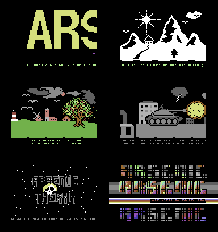
| i was really surprised when i saw this at the party. i knew TheRyk was working on some fullscreen scrolling part, but i expected some text oder maybe a doublescreen koala. so this is far beyond my expectations. i love the idea and execution. was a real nice "trip", being drunk and watch this at the big screen =) plus: i appreciate intros/demos with some kind of message. |
User Comment
Submitted by Joe on 28 February 2012
User Comment
Submitted by Yogibear on 28 February 2012
| Like it! Especially the logo in the last part! |
User Comment
Submitted by dEViLOCk on 28 February 2012
| cool, dude! gonna watch this a few times to get all the texts and gfx. outpost fits well into this piece of code, i think. great job, keep it up ... wanna see more =D |
User Comment
Submitted by Jak T Rip on 27 February 2012
| Creative texts and graphics, and good style in the in between and end parts. I disagree that the text scroller should have been in its own speed. This would have been the way everybody is doing it. For me having text and pictures sticking/belonging together made the style of this thing more unique (even though it was probably done just because it was easier in the first place). And finally Devilock's great outpost music was put to good use ;-) |
User Comment
Submitted by TheRyk on 27 February 2012
Groepaz may have some point with the speed of the scrolls. There are of course always some little things which you regret yourself not having done differently looking back. But there was some point when RAM was more or less wasted from Zeropage to $FCXY and it was just working very solidly and I was 97.5% pleased with it, so I didn't dare to spoil everything by any further changes. :)
Thx and love 2 everyone at the party and everyone commenting here on CSDb! Though I did not totally lose the faint hope to be among top 3, I was a little shocked when I understood that I really won a competition 4 the first time in my life (guess I'm even a little lucky Enthusi didn't release anything :)). But much more important than winning is really to hang around IRL with other ppl to learn from the advanced ones and maybe inspire ppl who started even later than oneself. I'll continue coding anyway of course as long as it's fun 2 me and I've got the feeling i can entertain a fistful of ppl. :)
Thx also for forcing me to join Arsenic (and not kicking me out again because of this ASC firstie, hehehe), not only partying but also "working" with you is great!
|
User Comment
Submitted by Celtic on 27 February 2012
| This production makes me really happy you are on the Arsenic team. Great show, great vibes and a nod to Yazoo for his amazing logo. |
User Comment
Submitted by Didi on 27 February 2012
| Wise words combined with nice code. Not bad! |
User Comment
Submitted by Mactron on 27 February 2012
Congraz for winning the first place.
This demo has a great flow and some nice ideas. Keep it up !
|
User Comment
Submitted by chatGPZ on 26 February 2012
i love the middle logo in part 2 <3 so simple yet so good looking :)
some solid code too :) the only thing that disturbs me a bit is that in the first part the scrolltext and the pictures scroll at the same speed - that would have been nicer with a rastersplit and different speeds, imho. |
User Comment
Submitted by Yazoo on 26 February 2012
| <3 good job ryker. i like the gfx combined with music and the flow of everything |
User Comment
Submitted by BYB on 26 February 2012
| wow, i like petscii. Seeing this scrolled and linked together to flow is excellent. Also this fantastic music-parts i like. |
|
|
|
 | Search CSDb |
 |
|
 | Navigate |  |
|
 | Detailed Info |  |
|
 | Fun Stuff |  |
|
 | Forum |  |
|
 | Support CSDb |  |
|
 |  |
|


