|
| |
Released At :
Revision 2013
Achievements :
Mixed Graphics Competition at Revision 2013 : #5
Credits :
Download :
Look for downloads on external sites:
Pokefinder.org
User Comment
Submitted by rail slave on 16 April 2017
User Comment
Submitted by Puma on 4 April 2013
User Comment
Submitted by Motion on 2 April 2013
| Exceptional stuff guys. Thumbs up! (great skills, great fun!). |
User Comment
Submitted by DeeKay on 2 April 2013
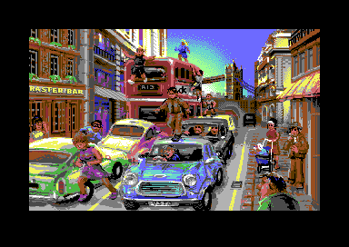
Yazoo/CONS: We thought about filling the sky with clouds, but we decided against it, because then 100% of the picture would be filled with detail, and that would seem a little bit too much to handle. So it was left as simple as it is to provide some contrast! ;-) As for the girl being too tall: An Aston Martin DB5 (green car) is 1.3m tall - and she's in mid-air running...
Bitbreaker: I didn't have to "urge" Veto to do anything, in fact I volunteered to adapt to his style with my parts and not to do any dithering... And he rejected! ;-) So whenever you see dithering, it merely means it's a part that I have done... |
User Comment
Submitted by Fanta on 1 April 2013
the only downside is the dithering in the sky. i also second yazoo with the woman in the front being a tad too tall.
other than that, this picture is truly brilliant and had a wow-effect on me! lovely and unique comic style. it hurts seing this released in a mixed compo on place #5 and not in an upcoming oxyron demo. well... :-) |
User Comment
Submitted by Bitbreaker on 1 April 2013
| Personally i think there are stronger (nufli) pieces from you, like the 25 years yie ar kung-fu. Still this pic and your style is very unique and awesome, and good to see that Deekay urged you to do some dithering here and there :-) |
User Comment
Submitted by Yazoo on 1 April 2013
yea the sky is almost the only thing to complain about.
and maybe the girl on the left bottom is quite big compared to the car and so on.
but that doesnt matter much because of the cartoonish style.
this is a masterpiece which for sure would have deserved to be higher in the compo.
i love all the details in this, especially the "raster bar" hehe ;-) |
User Comment
Submitted by CONS on 1 April 2013
| Very rich in detail, something I really didn't expect to see. Only thing I would have done different (despite the fact that I am not able to do this image in the first place) would be the sky. That looks a little rushed. But the rest does look great. |
User Comment
Submitted by Dr.Science on 1 April 2013
User Comment
Submitted by Joe on 1 April 2013
| Despite the final results, I do believe we have a winner! Congratulations again Veto and Deekay and thanks for the nice weekend letters. |
User Comment
Submitted by Yogibear on 1 April 2013
| This is absolutely fantastic! 10! |
User Comment
Submitted by N3XU5 on 31 March 2013
| Gorgeous pixel art ... =) |
User Comment
Submitted by Bob on 31 March 2013
I love the cartoonish looks of gfx this one is really awesome.. "Raster bar" good one
excellent work Veto and Deekay :) |
User Comment
Submitted by Dr.j on 31 March 2013
| Look so different from the regular pixeled gfx we used to see, so i can give 10 for the innovative drawing technique here . great job Veto |
User Comment
Submitted by Tom-Cat on 31 March 2013
| Wow. Veto hi-res style but in nu-fli :) Great stuff ! |
User Comment
Submitted by tokra on 31 March 2013
| Bloody brilliant. Hopefully compo-winner. You got my vote! |
User Comment
Submitted by Oswald on 31 March 2013
User Comment
Submitted by pcollins on 31 March 2013
User Comment
Submitted by Raffox|HF on 31 March 2013
| Best viewed on a real C64 or, at least with pal emulation enabled in Vice. |
User Comment
Submitted by leonofsgr on 31 March 2013
|
|
|
 | Search CSDb |
|
 | Navigate |  |
|
 | Detailed Info |  |
|
 | Fun Stuff |  |
· Goofs
· Hidden Parts
· Trivia
|
|
 | Forum |  |
|
 | Support CSDb |  |
|
 |  |
|


