|
| |
Released At :
Flashback 2013
Achievements :
Mixed Graphics Competition at Flashback 2013 : #4
Credits :
Download :
Look for downloads on external sites:
Pokefinder.org
User Comment
Submitted by Flavioweb on 15 June 2013
@Oswald: tnx for post your version here. Now i know that use the right color at the right place, instead to use black everywhere, is the best solution for my taste.
Now i can see it here directly. |
User Comment
Submitted by Raffox|HF on 15 June 2013
@Oswald: fap fap fap fap
...
And you think you did a good job, really?
Oh, btw... I see you're a hell of a coder... how about updating your own function status, adding your hell of a graphician skills... |
User Comment
Submitted by Oswald on 15 June 2013
User Comment
Submitted by slimeysmine on 12 June 2013
User Comment
Submitted by Doc Strange on 11 June 2013
| Dragon's Lair: more than a game and less than a movie. Thanks for bringing back good old memories mate. |
User Comment
Submitted by wacek on 11 June 2013
@Flex, gotta good memory dude :)
 |
User Comment
Submitted by der_ton on 11 June 2013
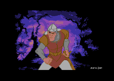
| Antialias and black outlines on the character would weaken the contrast against the background (which uses black and has antialiasing), it probably was a conscious choice and I think it works well. Employing techniques selectively is what makes an artist an artist. |
User Comment
Submitted by Oswald on 11 June 2013
| nice cartoon style, only one complaint antialias wouldnt hurt and the outlines I would have made those black. |
User Comment
Submitted by Moloch on 11 June 2013
User Comment
Submitted by Yogibear on 11 June 2013
User Comment
Submitted by Flex on 11 June 2013
| Dragon's Lair comes to mind.. Nice! |
User Comment
Submitted by Raffox|HF on 10 June 2013
| Glad you like it, my friend! |
User Comment
Submitted by celticdesign on 10 June 2013
| Ahh, sweet memories of my childhood. Well done mate! |
|
|
|
 | Search CSDb |
 |
|
 | Navigate |  |
|
 | Detailed Info |  |
|
 | Fun Stuff |  |
· Goofs
· Hidden Parts
· Trivia
|
|
 | Forum |  |
|
 | Support CSDb |  |
|
 |  |
|


