|
| |
 |
Released by :
JSL
Release Date :
24 July 2013
Type :
C64 Graphics
(MultiColor)
|
Credits :
Download :
Look for downloads on external sites:
Pokefinder.org
User Comment
Submitted by saimo on 25 July 2013
@JSL
No, I wanted to tell you exactly what I told you. I invited you to join Pixelation publically and privately multiple times, so why should I have done it indirectly now? ;)
Anyway, congratulations on finally posting over there - I wish you success!
As for the hassle of transferring pictures and the stress of waiting for answers and the desire of pixelling like a mad... man, sorry, but those are just excuses ;) You're free to work on as many pictures as you want while one of them is being discussed on Pixelation.
That said, one important thing: forget quantity, it means nothing. Look at Night Walk just released by Veto: to make such a masterpiece, it probably took him more time than you needed for all of your pictures this month (and maybe even more). Don't waste your energies: focus on a piece, push it will all your might, be aware that there's always room for improvement. When you reach the point that you think: OK, it's done, it can't be any better, remember that, well, that's just false.
As for the fact that you realize that you're not improving: isn't that a perfect sign that it's finally time to stop listening to yourself and to start learning from others? So, again, be brave, listen to the advices you'll get on Pixelation and *implement* them: it will make for a very good exercise and it will have the nice side effect of improving your picture! |
User Comment
Submitted by Richard on 25 July 2013
User Comment
Submitted by JSL on 25 July 2013
The East, was made few months ago, so it is from 2013. I wanted to post something on Pixelation, but Helm said it goes by Url, and most of you have free storage websites in hands, I don't. I hardly can upload it to deviantART. Just wanted some tips on my picture "Autumn" before uploading it here, I did some perspective stuff, and two of my contacts said the house is out of perspective.
Updating this Comment, Some admin from Pixelation helped out with a thread on Hosting websites, Imgur worked out fine and Autumn is now on Pixelation, and soonish aswell here on CSDb.. |
User Comment
Submitted by Nith on 25 July 2013
| The most important thing is not that anyone sees a progress in your releases but that you benefit from criticism so that your upcoming work gets better. What saimo said are just essential things - especially lighting - that make a big difference in picture quality. Can't be the goal that no one can tell the difference between a 2011 and a 2013 picture of yours, right? |
User Comment
Submitted by JSL on 25 July 2013
| "getting better next time" is with me a bit off the line, since I made heaps of pictures, and some are made in 2011 or 2012, that it is to see, that I didn't get better at all, but just are old pictures. Before 2011 I was that guy, like Leon/Singular, coming with a picture, uploading it, and start another. Like Leon is now working on his Shark. But since 2011 I am doing it with Sketches, means I can pixel 4-5 pictures on a row, using my own sketches. When I do heaps of them, my maps become bigger and bigger, and untill now.. 2013.. I reached on about 250 unreleased pictures. If I pick one of them, I didn't get better, just took an old picture. I have in mind to upload my picture Autumn very soon, it is 2 weeks old, and has no Black Outlines, just wanted to try that out.. |
User Comment
Submitted by Nith on 25 July 2013
| I can't find anything negative in what saimo said, it's just constructive criticism and he's right. So one can either complain about it or think about it to become better next time. |
User Comment
Submitted by JSL on 25 July 2013
| Saimo actually wants to say to me that I must post my workstages/before pixeling at Way of the Pixel/Pixelation, but when I have Workstages done sofar, then I want to pixel whole Saturday 4-5 pictures, instead of transferring those 4-5 workstages with SC to D64 and staring to the monitor on what happens on Pixelation. Usually I think I do it good, but to Saimo and others I fuckup everything on pixeling. I spend my Saturday usually on pixeling. I could ofcourse post there my finished pictures, but thats rather strange, since what can those guys there implement more to get the picture better. I know, workstages at Pixelation. |
User Comment
Submitted by saimo on 24 July 2013
| Just for truth's sake: I'm by no means an artist. |
User Comment
Submitted by Dr.j on 24 July 2013
| @saimo: i beleive you are very professional artist that can give guide lines and useful matters but i think you take it too far with your criticism . imho the picture is quite good and the flowers looks adorable |
User Comment
Submitted by saimo on 24 July 2013
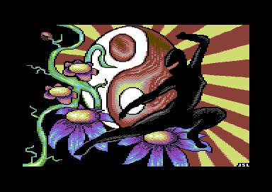
JSL, please ponder on this remarks, which only intend to help you.
The lighting on the body of the woman is all over the place (i.e. inconsistent light source).
The branch is so flat that it's almost a ribbon (especially in the thickest part).
The antialias in some places is overdone, in some places is missing, in some other places is done by means of detached pixels, in some places it changes the shape of, well, shapes (see how the small upper circle is not a circle at all).
The rendering of the flowers "buttons" (sorry, I don't have the English word for that) is totally inconsistent (3 different light sources) and quite meanigless (to achieve that kind of illumination one would need very small light sources very close to the buttons, in a darkish environment).
The shading of the petals suggest an opposite lighting with respect to the buttons.
The flow in the red part of the symbol is kind of broken by the staticness and squariness of the core.
The white circle, because of its outline and the positioning with respect to the flow looks like a (detached) patch. |
User Comment
Submitted by Yogibear on 24 July 2013
User Comment
Submitted by dink on 24 July 2013
User Comment
Submitted by JSL on 24 July 2013
| These yellow/red combinations where earlier also used in my picture Bruce Lee or Pulp Fiction. And while upping this picture, I even thought it could be any better when the bars are set more straight to the yingyang symbol, because now they look a bit, wrong set. Ahh well.. |
User Comment
Submitted by Jak T Rip on 24 July 2013
| Nice! Love yellow/red combinations! |
|
|
|
 | Search CSDb |
|
|
| Navigate | |
|
| Detailed Info | |
|
| Fun Stuff | |
· Goofs
· Hidden Parts
· Trivia
|
|
| Forum | |
|
| Support CSDb | |
|
 |  |
|
