|
| |
|
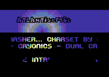
Blue Intro (atl+f4cg) [2013] |
Released At :
Intro Creation Competition 2013
Achievements :
C64 Demo Competition at Intro Creation Competition 2013 : #24
Credits :
SIDs used in this release :
Cracks which use this intro :
Download :
Look for downloads on external sites:
Pokefinder.org
User Comment
Submitted by Total Chaos on 4 December 2013
Good comment, I can't believe Sixx gave it.
;) |
User Comment
Submitted by Sixx on 3 December 2013
| Good intro, can't belive TC coded it.. ;) |
User Comment
Submitted by bepp on 3 December 2013
| Perfect tune! I could have wished for more colors though. But overall nice intro! |
User Comment
Submitted by Hammerfist on 2 December 2013
| From the screen shot and the time it took to begin, I almost gave up on this intro. Glad I didn't, it's very nice! I like the logo reacting to the music and I would've loved a longer song! 8/10 |
User Comment
Submitted by Total Chaos on 2 December 2013
| Such blue. wow. much up votes. wow. |
User Comment
Submitted by Smasher on 29 November 2013
| @sixx: some rumours say you forced us to rejoin the scene... :) |
User Comment
Submitted by Sixx on 29 November 2013
| Geez, it feels SO strange F4CG is back. Genesis Project forever - Förever Genesis Project. F4CG FTW! <3 |
User Comment
Submitted by Total Chaos on 28 November 2013
haha, sure you can :)
(you have my blessing master Unifier ;) ) |
User Comment
Submitted by Beastifire on 28 November 2013
| Cool! (Does this mean that I can't call my intro that I'm working on "Green intro" anymore?) |
User Comment
Submitted by Total Chaos on 28 November 2013
Thanks for all the kind words :)
@TheRyk: well, it's 192x21 pixels, expanding the sprites looked weird ;)
The "plasma" is only a straight color flasher with a look-up table for position and adding another table for the movement will be easy. However the intro was not done for the compo to begin with and my main focus was to keep the size down :)
@zeSmasher: hehe, next time we do the graphics FIRST, then code ;) |
User Comment
Submitted by TheRyk on 28 November 2013
| @Smasher: I see, but that's why I opted for less (letters!) AND thus, bigger, letters in the logo ;) e.g. only "ATL+F4CG". But as I said, criticism on a high level. |
User Comment
Submitted by Dr.j on 28 November 2013
| I have only one request hehe..please update the screenshot 'coz its only blue and black without nothing.. :-) |
User Comment
Submitted by Smasher on 28 November 2013
| @TheRyk: it's a (fast painted) 8-sprite-logo, so it cannot be bigger. I told TC to Y-double, but he refused my idea. maybe I should bruteforce him next time, hehehe... |
User Comment
Submitted by TheRyk on 28 November 2013
Thumbs up, all in all, a very good production.
No complaints about scrolling speed here. The few things, I find worth talking about in terms of constructive criticism on a very high level is I'd have preferred a logo with less but bigger letters (both on X and Y axis) plus plasma should be a little more elaborate, i.e. its shape should be variable.
Kewl one, however! |
User Comment
Submitted by bepp on 28 November 2013
User Comment
Submitted by Dr.j on 28 November 2013
User Comment
Submitted by STF on 28 November 2013
| Cool intro, love the tune. |
User Comment
Submitted by E$G on 28 November 2013
My friend, don't exitate to partecipate, I know Gary is a cool one but don't forget the powA of Dinasours with Rytm Are A Dinasour ;)
Nice work maybe a little too fast scrolling ... for me 8/10. |
|
|
|
 | Search CSDb |
 |
|
 | Navigate |  |
|
 | Detailed Info |  |
|
 | Fun Stuff |  |
· Goofs
· Hidden Parts
· Trivia
|
|
 | Forum |  |
|
 | Support CSDb |  |
|
 |  |
|


