|
| |
Credits :
SIDs used in this release :
Download :
Look for downloads on external sites:
Pokefinder.org
User Comment
Submitted by Karmic on 23 April 2016
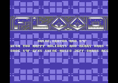
| Damn Shine, that is one logo :D |
User Comment
Submitted by Motion on 13 April 2014
It's a real shame you didn't use colour '1' (white) for the areas of text. Had you done so, your font would appear as Hi-res and not as it stands, multi-colour. :(
Otherwise, very nice design and layout. Make a fix! |
User Comment
Submitted by daison on 22 January 2014
User Comment
Submitted by The Shadow on 22 December 2013
| Wow! Everything about this intro is aWeSomE! |
User Comment
Submitted by Shine on 22 December 2013
| Nice surprise! :) See progress ! You get better'N'better!!! ;) |
User Comment
Submitted by Doc Strange on 22 December 2013
| I had to say that there some elements of this into I like a lot, some others not (like charset). The background is definitely hypnotizing. ;) |
User Comment
Submitted by iAN CooG on 22 December 2013
| ah right, the lower line IS the "scroller" ok, i was hypnotized by the eor squares and didn't notice it =) |
User Comment
Submitted by iAN CooG on 22 December 2013
| I love the full screen action, but ... it's all there, no scroller? =) |
User Comment
Submitted by celticdesign on 22 December 2013
| love it. some fade in/out would be nice. |
User Comment
Submitted by Dr.j on 22 December 2013
| Yet another great logo Andy , and nice intro tough soon i will expect more from you guyz :-) , thanks for the greetings. |
User Comment
Submitted by bugjam on 21 December 2013
User Comment
Submitted by psych on 21 December 2013
|
|
|
 | Search CSDb |
 |
|
 | Navigate |  |
|
 | Detailed Info |  |
|
 | Fun Stuff |  |
· Goofs
· Hidden Parts
· Trivia
|
|
 | Forum |  |
|
 | Info on other sites |  |
|
 | Support CSDb |  |
|
 |  |
|


