|
| |
 |
Released by :
JSL
Release Date :
27 January 2014
Type :
C64 Graphics
(MultiColor)
|
AKA :
Following Shine..
Credits :
Download :
Look for downloads on external sites:
Pokefinder.org
User Comment
Submitted by chatGPZ on 29 January 2014
User Comment
Submitted by Karoshier on 29 January 2014
| I am *no* graphician, but I think JSL's style is very promising. I liked that color shading in Ninja Dreams; and the 0xC64 logo is pretty nice, to name just a few of the recent ones. I've also seen a lot of releases from him just in 2013, which surely means he likes drawing. I'm happy to see positive criticism here, and I totally agree with Jailbird: there's no secret magic spell making you Jailbird all of a sudden. It's just your passion and determination to improve. And you'll realize that there's nothing impossible as long as you try hard enough. Btw Jailbird: nice story! And thanks for the link to the pixeling tutorial. :) |
User Comment
Submitted by chatGPZ on 29 January 2014
Quote:I have an other style.
although i think its hopeless i will say it again: bad technique has nothing to do with style. really. you CAN learn the basic stuff about C64 graphics. you can learn about luma/chroma tricks. you can learn antialiasing. hell even i did (somewhat).
i can only give the same advice as everyone else - dont rush out whatever comes across your mind. take one piece, finish it, put it aside for a while, come back to it, and improve it more. |
User Comment
Submitted by jailbird on 29 January 2014
JSL, first of all, don't put yourself down. Have you seen my first logos/graphics? They weren't much better than yours. Example 1, example 2, example 3, example 4, example 5, example 6.
The difference is, from the very first day of my "career" as a graphician, I listen to people who are better than me, take my time to explore new methods, try to implement them into my work, and struggle fucking hard to do better every time I put out a new piece of graphics.
Here's a fun little story about how did I became a graphician and not a musician or a coder (even though I was interested in all on the same level).
I was a little kiddo buying pirated games from the organizer of one of the leading groups in my country. After our 3rd or 4th trade, he asked me if I do anything on the C64 except gaming. Well, although I was retyping a lot of BASIC crap from computer magazines and books, that wasn't programming. I loved to play music on my guitar, but I've never composed a single note on the C64 except hitting the keys randomly like an idiot in synthesizer simulators. And yes, I was more or less good with art, but except for messing around a bit with Art Studio Hires (drawing circles and rectangles and filling it with colors), I've never ever done anything serious in it.
But, at the very moment I panicked, and for some reason (till this day I don't know why) I told him that I've done a lot of graphics on the C64. Well, to my utter surprise, his answer was to bring my works to his place the next time we meet, and maybe he'll be able to put me into a local lamer group. I became really excited, but in the same time I just realized that I'm screwed, since I didn't had any graphics at all.
So what did I do? Obviously, I run home, and started drawing shit like a maniac. Anything that came into my mind. Mostly very crude and primitive stuff which occupied my immature, heavy metal loving mind (I'll try to recall, I think there was one with a death in front of a full moon, one with a face of a vampire, one with a semi naked chick, perhaps even a car, and a pentagram with swords crossing above it...), but well, at least it was something.
Till our next meeting in couple of days, I was finished with at least 5 or 6 pieces of crappy graphics, but they were worth enough to grant my join to my first (lamer) group. The leader of that group was better in pixelling than me, so he showed me some tips&trick which I've quickly mastered. Then, my father noticed that I became really interested in doing other stuff than gaming on the C64, so I've got an Action Replay for my birthday. I was finally able to rip and examine all those amazing graphics I always admired! In a few months of constant ripping&mimicking (but bringing a bit of my own stile into it as well), I've overgrown my first group and the guy from the beginning of my story asked me to join to his country-wide group (there were even some foreign members). That opened doors to meet and befriend even more talented people who always showed something new to me. I was really eager to incept everything they offered, and I worked fucking such a determination as if my life would depend on it. I've took really good care of every single piece of graphics I've released according to my current skill level at the time.
And BAM, about 15 years later, I became a member of Booze Design, a group I never even dared to dream to be a part of when I've seen their first demos.
Now the moral of the story? Determination, work, progress.
In case you're pixelling only for your own entertainment, that's only yours to deal with. Do it, have fun with it, it's a great way to spend time. But, since you release your stuff here, and it's obvious you'd like to wow and entertain others with your work (just as 99% of us here) - you have to do hard and advance. I've already mentioned this: you're stagnating on the same level for years, you don't advance, you don't seem to listen to others - and that may bore and disappoints. When people are bored, they might get cruel. So, either bear with the criticism and the harsh words, or put you shit together and get better. Believe me, a lot will appreciate if we'll finally see that you really try to be better.
DO NOT release half-finished works. |
User Comment
Submitted by JSL on 29 January 2014
| Trying to do something good, getting a smile on the faces of Booze Design, ends up in an Unfinished logo. And I appreciate the help/bookmarked Pixeljoint page.. But it is just I am JSL and you're JailBird, and I am not pixelingwise Jailbird. I have an other style. Maybe incomplete style, as you say it could be much, much better. And I agree that the Booze part you overpixeled looks far more better than mine. :D - But finishing off the logo, in terms of JSL pixeling, won't be any better I guess.. I am a crap logo graphician.. |
User Comment
Submitted by Hammerfist on 28 January 2014
| @Jailbird: lolz, well, if you only spend 3-4 minutes on a blunt comment instead of taking 20-30 minutes to make it educational and also tactful... :P |
User Comment
Submitted by Magic on 28 January 2014
It's very simple.. Jailbird should make new gfx for the next BIG booze design demo for X
Than the logo's will be the best in the business ;) |
User Comment
Submitted by leonofsgr on 28 January 2014
| WOW! jailby', thanks the cool tutorial page, it's opened my eyes... ;_) |
User Comment
Submitted by Sounx on 28 January 2014
Pretty much agree with Jailbird. Though much of the same could also be said of the recent Booze logo from Shine.
Having found my way to the new-age editors, I've found out that perfecting GFX to the standards one might expect in 2014, is quite time-consuming. Sometimes taking me more time than the whole picture itself...
Nevertheless, the eventual result makes up for all the effort in the end! :) |
User Comment
Submitted by jailbird on 28 January 2014
Quoting HammerfistI agree with you, Jailbird, although why do you post half-finished messages? I mean, the message is good and your advice useful and solid, but the delivery could've been a little more tactful. ;)
OH NOES!! My reputation as one of the most terrific and avid C64 commenters/forum posters has been compromised! Please don't downvote me! :O |
User Comment
Submitted by Hammerfist on 28 January 2014
'Unless you're Joe'... agreed :) Or Rexbeng, he's good at too ordered also.
I agree with you, Jailbird, although why do you post half-finished messages? I mean, the message is good and your advice useful and solid, but the delivery could've been a little more tactful. ;)
I wonder, JSL, this does sound like a challenge for you. Can you up your game and make better logos? I believe you can and would like to see you try! |
User Comment
Submitted by jailbird on 27 January 2014
| Edit: eh, I've meant mixing light red with mid grey... Well, whatever. |
User Comment
Submitted by jailbird on 27 January 2014
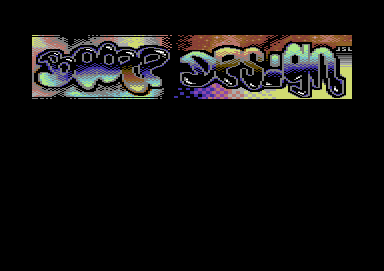
JSL, why are you releasing half-finished stuff?
The shape is quite fine, but other than that, it's incomplete or simply chaotic, I'm really baffled at some of your solutions...
Sorry for meddling into your work, but to illustrate my point, I've improved the left part of your image in no more than 20-30 minutes of lazy pixelling. Quite far from perfect, but another 3-4 hours of tweaking colors, fixing the dithering and shit, and it would be a kicking logo. DOING GOOD STUFF TAKES TIME! Don't rush it, damn it!

Now, bear with me, I'm trying to help.
1. LEARN how to antialias. What you're doing at the moment is either half-assed, or you're just applying an outline on a shape. NOT good.
2. LEARN how to dither. Too ordered or too unordered is usually a no-no. Unless you're Joe, that is.
3. LEARN color luminance orders. E.g. mixing light red with light grey (which are on the same luminance level) mostly results shit. Similarly, mixing colors which are too far one from the other (light grey and black in this case) may also look like shit, unless you exactly know what are you doing.
Here you are, some tutorials: http://www.pixeljoint.com/forum/forum_posts.asp?TID=11299
Perhaps you could also try and now actually finish the logo in the same vein I've started. |
User Comment
Submitted by Yogibear on 27 January 2014
User Comment
Submitted by The Shadow on 27 January 2014
| JSL you make great logos! |
User Comment
Submitted by Linus on 27 January 2014
User Comment
Submitted by Dr.j on 27 January 2014
| With all my respect i think you could invest more time on the coloring. the design is Okey but something is not working fine here |
User Comment
Submitted by JackAsser on 27 January 2014
User Comment
Submitted by STF on 27 January 2014
User Comment
Submitted by hedning on 27 January 2014
| Yup. First word is better than the second. :) |
User Comment
Submitted by JSL on 27 January 2014
| You like to booze, and the Design is bad, or you like the first name better than the second.. :) |
User Comment
Submitted by hedning on 27 January 2014
| Booze is better than design, if you understand what I mean. :D |
|
|
|
 | Search CSDb |
|
|
| Navigate | |
|
| Detailed Info | |
|
| Fun Stuff | |
· Goofs
· Hidden Parts
· Trivia
|
|
| Forum | |
|
| Support CSDb | |
|
 |  |
|
