|
| |
Released At :
Syntax 2014
Achievements :
C64 Graphics Competition at Syntax 2014 : #1
Credits :
Download :
Look for downloads on external sites:
Pokefinder.org
User Comment
Submitted by Cresh on 19 November 2014
@Peacemaker.
Cool! Now you you have deserved your silver medal for protecting your group buddy. Thing appreciated, really!!
But back in the day your another group buddy Seven used to bitch about every copy on his ART THAT ISN'T web page.
This one would be on a top spot.
Tell me, is this picture art.
Or this is not?
Ps.
This has won the compo and has 9.4 score in here and NOTHING inappropriate has been written.
What is your problem?!
(no chance to re-edit, so it goes as it is) |
User Comment
Submitted by Peacemaker on 19 November 2014
| haha. everyone saying "this is just a converted pic", please convert it like this. have fun. you have no idea what work is this picture.. idiots ;) |
User Comment
Submitted by Rough on 18 November 2014
| Actually some people on fb advise Marc to leave CSDb. *g* |
User Comment
Submitted by chatGPZ on 18 November 2014
| it'd be more a reason for quitting facebook than quitting the scene for me =) |
User Comment
Submitted by Jok on 18 November 2014
You won competition, you get 9,4 vote for you picture. This picture is widely discussed and gain positive feedback (including mine).. and this is reason for quitting scene ?
I dont understand. :/
I don't read discussion on facebook, anyway - for many people it could be true achievement but... everybody is different. |
User Comment
Submitted by iLKke on 18 November 2014
N3XU5, I hope you will come around.
If you find pushing pixels fun, then rating at compos or comments on forums should not be more important than that.
Nothing seen or done here is any different from a practice that has been almost mandatory in Amiga compos since probably '91 or so! Then again, that does not automatically make it something people are not supposed to discuss.
Personally (and everyone is free to disagree with me here) I think it is the equivalent of music covers. Sure, it takes a lot of effort (and knowledge!) to make a good sid cover of a popular tune, but in the end it is a display of technical skill rather than creative, and I think we'd be denied many a great original tune if covers were very common in party compos. And they would be if they were allowed.
Is the scene just about technical prowess, regardless of the overall experience? It can be different things to different people.
It's quite fine to disagree on these issues, and it's even better to discuss them.
[/end rant] |
User Comment
Submitted by Mixer on 18 November 2014
| Self deception is not healthy. Truth shall set thy free. |
User Comment
Submitted by Jammer on 18 November 2014
| Lemming - don't exaggerate, m8 ;) That was a discussion like many before, nothing unusuall. N3XU5 will miss C64, you'll see ;) BTW is 9.2 average not gratifying enough? We cannot count only on praising comments and blowjob - that's childish and people here are already in their 30s and 40s :) Get a life! |
User Comment
Submitted by lemming on 18 November 2014
| Congratulations assholes, another very skilled graphician demotivated to inactivity. |
User Comment
Submitted by Mace on 18 November 2014
I wish they talked about my productions (however few) that much as they do about that single picture of yours!
You stirred the scene, make use of it and stay a while. Stay forever! |
User Comment
Submitted by Carrion on 18 November 2014
@N3XU5
It happened to me and few other's too (hi Pal :) ). Give it a break for some time, and see you at next compo! I believe you will be back, like I did because of this pic here.
Kind regards! |
User Comment
Submitted by N3XU5 on 18 November 2014
My dear sceners and friends,
i will stop all my Commodore 64 activity from now on! I also changed my group status here at CSDb for Oxyron, Hitmen and Arsenic to in-active.
The reason is the debate here and at facebook about this picture here, that all makes me sick! I lost all my motivation and it makes no sense for me to keep on pixeling.
I think it's time for me to break for a couple of months and i am pretty unsure if i'll return?! Except of a few (2-3) logos and/or pictures,
that are in final stage, there will be no more pixel stuff from me. I am sorry for all the others how requested a logo or picture, but i hope you will accept my decision here?
The one and only remaining focus for me at the moment is in PC digital artwork. |
User Comment
Submitted by GH on 17 November 2014
Just amazing and very educational to see some of the workstages too..Thanks for giving an insight into your creative mind :)
Top 3 minimum! |
User Comment
Submitted by Sledge on 17 November 2014
| Impressive pixel control. Wonderful! |
User Comment
Submitted by Carrion on 17 November 2014
| stupid "no edit" policy and my copy-paste mistake.... sorry for this. |
User Comment
Submitted by v3to on 17 November 2014
n3xu5: imo there is no valid or nonvalid point about using references. it depends on the motif and the way the pixeller feels comfortable with (as far as conditions are clear for competitions and in fact it is obvious that at least inspirations were photographs).
the way you did is kinda effective for using scans imo. and tbh the only way using them to archive a personal touch.
and it is also a good example to compare the status of automatic converts. by no means offensive, because those converts also show that 'retouche' is an unreasonable definition here. as i wrote on fb i'd call it redrawn... |
User Comment
Submitted by Carrion on 17 November 2014
User Comment
Submitted by Carrion on 17 November 2014
Good artists copy, great artists steal!
@jok
it took me many years of demoscening and discussing here at CSDB to understand there's nothing wrong with copying. I really mean it. My main lesson learned is: You don't want to troll at CSDB.
here's more of my thoughts about this verry good executed picture.
http://retronavigator.com/post/102869305453/i-wouldnt-be-myself..
Maybe not the winner at this great Syntax'14 gfx compo but good enough.
Oh and since I'm back to CSDB commenting let me say: What a great GFX compo at Syntax. The quality of images is IMHO much higher than at X this year.
Do you agree? |
User Comment
Submitted by Shine on 17 November 2014
Dear Marc:
I gave you a 10 for this whole work. And i don't regret! Execution is simply awesome! BUT an idea by his own is (maybe small) another level. You are one of my favorite gfx artists. And i was sad about the screenshots! |
User Comment
Submitted by N3XU5 on 17 November 2014
I am really amused about the comments here!
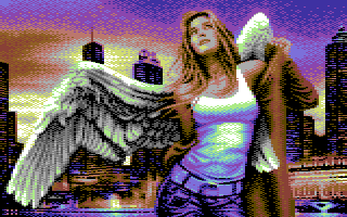
My position here is ... i often use templates and change most of them .. manipulate them in photoshop, while adding other things or details that i had before in my mind, or i think, it would fit well to the overall sceneario! So normally those pictures from me are more unique! But this angel picture (except the background) is perfect in the way it is... there was nothing to add extra in or leave something away.
And while we talk about convertings .. why we do it only here? .. i can show you tons of other examples here at CSDb, where nobody said anything .. and the pictures are from well known gfx artist here!!! I think there is a big difference between a simple convert and/or if you manipulate (re-pixeling) the whole one! Another factor here is, that i always try to pixel my pictures in the way, that it looks like FLI ... but it is still Koala (Multicolor)!
I also mentioned this on FaceBook:
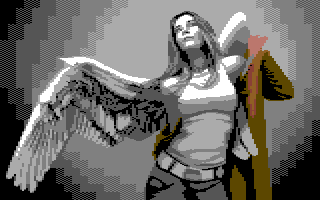
I didn't say it isn't a copy! Just to inform, maybe over 90 percent of the gfx artist uses templates! And yes, it is a convert in YUV mode with project one! I used only the shape here for the right proportions, every other pixel and all details are set manuel in Pixcen! The ZIP file contains most of the workstations in bitmap, png as well as koala format. Everyone is able to check out the progress of adding the details in (face (expression), hair, clothes, feathers of the wings ... etc.)
It's also nice to see other converts from this picture here! But notice THIS one was my base ...
 |
User Comment
Submitted by Oswald on 17 November 2014
User Comment
Submitted by chatGPZ on 17 November 2014
| would you please stop posting ugly conversions and copyright trolls? FUCK OFF |
User Comment
Submitted by lemming on 17 November 2014
Oh bloody fucking hell COPYRIGHT LAW :D
die plz |
User Comment
Submitted by v3to on 17 November 2014
raw convert using timanthes without colour restrictions:
 |
User Comment
Submitted by Jok on 17 November 2014
Magnar: You are wrong again - blind shoot. I don't need history of art lessons (as I had at least 10 years of those) - thanks for advice but I will cut discussion here as it started to be off topic and a bit personal (but please send pm if you want share opinion) don't want flame below this nice picture
To clear some more - I'm not against conversions and copies on c64 scene - just dont think its good idea to show someone else work (even if its just a part) in open competition as YOURS. We are not 14 years old anymore - a lot of things happened since Vallejo.
BTW It's very simple - read some ACTUAL writings about art, plagiarism, copyright law etc - it will clear any doubts. |
User Comment
Submitted by lemming on 17 November 2014
| As demotivating as that proving of a point was, it's not multicolor. This picture is. |
User Comment
Submitted by Oswald on 17 November 2014
User Comment
Submitted by Magnar on 17 November 2014
| Jok, you need to take a history lesson on art. All the masters have done plagiarism, and are great ones too. Most of them even worked in churches and paid their living-costs through restorations. If you sum up every artist how many really original work they have done from scratch and compare that with all their plagiarism, you would be stunned by the results. |
User Comment
Submitted by Jok on 17 November 2014
| I don't know if its converted or wired (as you see below, photo fits perfectly) But with such excellent technique you could easily do something 100% of your own. |
User Comment
Submitted by Jok on 17 November 2014
Magnar: you are absolutely wrong here. And your example proves something opposite.
Of course artist use reference, and chooses motif - its all ok. AS LONG as it is his own choose of motif, not the one already used by someone else - in this case it's plagiarism. (conversion is different thing but let's leave this now).
There is something like creative interpretation - but need a bit more then adding different background.
Picture itself is beautifully executed - full respect! (8)
Imo background could be a bit less contrasted to better expose the model. Perfect pixelwork anyway.
 |
User Comment
Submitted by Jammer on 17 November 2014
| Fuck me, I give 10. All in all great detail and a bit of Pal's vibes. |
User Comment
Submitted by Oswald on 17 November 2014
| converted as it is, but its so perfectly executed, I cant not love it. |
User Comment
Submitted by Yogibear on 16 November 2014
User Comment
Submitted by v3to on 16 November 2014
voted 8. the main subject is based on a scan but it is a pretty well repixelled + nice composition with the city background. the result is a good looking picture with a typical mood 80ies airbrush poster.
btw it shows the flaws of this kind of technique in places. the image is not ideal for the 4x8mc-matrix and here and i miss bit more colors here and there. somehow i think light red, purple or light grey would have been a better choice as bg color. |
User Comment
Submitted by PAL on 16 November 2014
| Thanx for making such a beautiful version of this image on the bread bin... WOW it shines and I love the absolutely gorgeous wing and on that other colours behind... the buildings are cleverly done and it is a super cool image! |
User Comment
Submitted by Raffox|HF on 16 November 2014
| I've seen really great conversions, nicely repixelled and color fixed, looking better than this one (in terms of colors and themes) be completely demolished and downvoted just because they were conversions. Sorry but for me this release is way upvoted :) |
User Comment
Submitted by Magnar on 16 November 2014
| In the last thousand years, stone carvers, painters and other various sculpture or graphic artists have used models or reference art in their own progression of creating. Today, the internet search is making it even easier to get hold of material, and convert programs are speeding the process of cross-developing. But, in the end, a 1:1 convert isn't strickly possible and as both Oliver and Marc told above, it is a lot of work to make something look good on C64. If you look closely on the C64 image, you will see a lot of details and work on the dithering and choice of coloring and repixeling to make the final product. It still have the original motive, pretty much like Mona Lisa represent the same girl that Leonardo da Vincis used as a model... |
User Comment
Submitted by Magnar on 16 November 2014
| I really don't care if the Angel and City is first Photoshop layered together and then afterwards converted. It is clear that the pixel work afterwards is quite enormous, and the end result with the nice choice of colors and all is just so Beautiful! Love it! |
User Comment
Submitted by Jammer on 16 November 2014
| Lady seems transfered 1:1 with proper retouch. As for now, I'm not that sure of my mark - maybe 8, maybe 10 ;] |
User Comment
Submitted by GeoAnas on 16 November 2014
User Comment
Submitted by Shine on 16 November 2014
@ Raffox:
Somehow i am now really really sad about your find. :( |
User Comment
Submitted by LordNikon on 16 November 2014
| After seeing tons of pictures with ugly and deformed faces and bodies released here lately, i really love this one. It spreads some hope in new releases. It is technically perfect with a great touch of artistic sense. 11/10! |
User Comment
Submitted by Raffox|HF on 16 November 2014
User Comment
Submitted by Scarzix on 16 November 2014
| I really love the wings, her clothes, the buildings - well 99% of it is totally awesome. If I have to mention anything "critic" its the cloud/sky gradient method of doing little "bubbles/circles". That's not my taste, but still this image is a true 10 from me. Thumbs up! |
User Comment
Submitted by Shine on 16 November 2014
| What a masterpiece! Your technique is as brilliant as the theme of this well chosen amount of genius pixels! I <3 it so much! 10/10 without "ILikeYou" bonus!!! ;) |
User Comment
Submitted by Bob on 16 November 2014
| awesome.. this is really nice. |
User Comment
Submitted by Dr.Science on 16 November 2014
| WTF! just awesome! Congratulations! |
User Comment
Submitted by jailbird on 16 November 2014
| Feels like FLI, top notch technique there. |
User Comment
Submitted by leonofsgr on 16 November 2014
| hmm... nice face and body :_) but... ehm... |
User Comment
Submitted by Peacemaker on 16 November 2014
User Comment
Submitted by TheRyk on 16 November 2014
| don't like the theme but gotta vote 10 for execution which is what makes this one excellent imho, esp the wrinkling of her shirt but also the whole color transitions in general |
User Comment
Submitted by psych on 16 November 2014
User Comment
Submitted by grip on 16 November 2014
User Comment
Submitted by Joodas on 16 November 2014
User Comment
Submitted by spider-j on 16 November 2014
| wow, what an impressive pic in classic multicolor style. |
User Comment
Submitted by Dr.j on 16 November 2014
Fuckin' awesome piccy!. Nexus you are
my pixel hero! such incredible and cool piccy haven't seen for a long time |
|
|
|
 | Search CSDb |
|
 | Navigate |  |
|
 | Detailed Info |  |
|
 | Fun Stuff |  |
· Goofs
· Hidden Parts
· Trivia
|
|
 | Forum |  |
|
 | Support CSDb |  |
|
 |  |
|


