|
| |
AKA :
Monthly Demo - September 2015
Credits :
SIDs used in this release :
Download :
Look for downloads on external sites:
Pokefinder.org
User Comment
Submitted by Merman on 15 September 2015
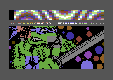
| A fun little demo with a really nice split effect, and great music by 4-Mat. Looking forward to more monthly releases! |
User Comment
Submitted by enthusi on 13 September 2015
Nice one!
I dont mind simple fx at all if they are pleasing :)
About the cookie-cutter masking in 'Caren and the Tangled Tentacles', here is a quick demo of it:
http://enthusi.de/mask.zip |
User Comment
Submitted by Monte Carlos on 12 September 2015
| yeah, very impressive back then. The moving sprites in background reminded me of this. |
User Comment
Submitted by hollowman on 12 September 2015
| Monte Carlos, World Demise/Slash Design |
User Comment
Submitted by Monte Carlos on 12 September 2015
| How was the demo with the cheese and the flag called transparently overlapping each other? |
User Comment
Submitted by Sledge on 12 September 2015
User Comment
Submitted by HCL on 11 September 2015
| Hmm.. i keep looking at that FLI-effect. This can *not* be the optimal way to achieve what is visible here.. Never mind, looks kinda nice :) |
User Comment
Submitted by ϵʟʞ on 11 September 2015
| A lot was told, and I also agree, yeah it is great! :) But - I also like the intro before this demo! :) Really good work! |
User Comment
Submitted by aNdy on 11 September 2015
| Great 'old' feel with 'modern' twist. |
User Comment
Submitted by chatGPZ on 11 September 2015
| i really like the color effect in the logo in first part <3 |
User Comment
Submitted by 4mat on 11 September 2015
| Good surprise TMR, love the fade fx. We used a similar masking effect in BSP (it's crazy weird when multiple sprites are overlapping) |
User Comment
Submitted by Jammer on 11 September 2015
| hmmm. If turtle was multicolor with $d021 set as green for example, I'd understand it without problems ;] But it's hires thus no background here. You guys are sure about it? ;) |
User Comment
Submitted by Bitbreaker on 11 September 2015
$ff -> $d01b
Then place all colourful pixels as paper, use black for ink. Now let some expanded sprites fly around. Done. No rocket science. But ink pixels have prio 1 and sprite appears in front of paper. |
User Comment
Submitted by Richard on 11 September 2015
| I like the intro, music and effects. The raster effects are nice, colourfull and very clever. Good luck with your monthly demo quest :) |
User Comment
Submitted by Shine on 11 September 2015
| Really cool! :) Intro is also nice! ;) Good job!!! ;) |
User Comment
Submitted by Joe on 11 September 2015
Gosh what a bore, thought people stopped being so obvious..
But still the effects, like in the intro (the tilted logos) and sprite-coloring is nice. |
User Comment
Submitted by pROF on 11 September 2015
User Comment
Submitted by Oswald on 11 September 2015
| very nice little demo! Jammer, its just normal VICII magic :) sprites turned behind foreground pixels. but right, dont remember ever seeing sprites and hires used like this, might be a firstie :) |
User Comment
Submitted by Joe on 11 September 2015
User Comment
Submitted by Yogibear on 11 September 2015
User Comment
Submitted by Jammer on 10 September 2015
| Ninja turtle is another example of 'how did he do this?' release :D I bet on cookie cutter sprites like in Caren. |
User Comment
Submitted by Motion on 10 September 2015
| Fantastic! Loving these tunes! :D Great to see more Cosine releases. Yippee! |
User Comment
Submitted by Smasher on 10 September 2015
well, the demo is cool, while the idea to release something each month it's simply crazy! :)
I wish you are successful and that you won't stop until MD209901, which will be your 1000th release in this serie, if my quick maths calculation is correct :) |
User Comment
Submitted by TheRyk on 10 September 2015
| Wonderful! Keep'em coming :) |
|
|
|
 | Search CSDb |
|
 | Navigate |  |
|
 | Detailed Info |  |
|
 | Fun Stuff |  |
· Goofs
· Hidden Parts
· Trivia
|
|
 | Forum |  |
|
 | Support CSDb |  |
|
 |  |
|


