|
| |
Released At :
Gubbdata 2016
Achievements :
C64 Graphics Competition at Gubbdata 2016 : #3
Credits :
Download :
Look for downloads on external sites:
Pokefinder.org
User Comment
Submitted by Hammerfist on 13 December 2018
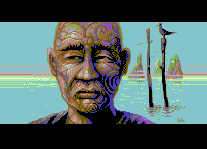
| Funny this is a rushed picture. I love the little details, depth of the picture with the elegant background details, the seagull, the asian man with tribals and the play with dark and light colors. I actually used it for two of my recent pictures (still to be released as of now) like what dithering and colors you used for your background graphics. Really helpful just examining it! :) |
User Comment
Submitted by PAL on 8 July 2016
| very calm and nice... I never was that huge fan of the facial tattoos that you also did in the past but here it is a element with that space around so it fits so great and make it something of very much interest... execution is flawless and so impressive - Lovin it! |
User Comment
Submitted by Bob on 6 July 2016
Wow amazing! really nice pic of a cool gubbe !!
I suppose this is the future of us or our childrens generation when they get old, uber tatooed the fuck out of them selves ;)
10/10 |
User Comment
Submitted by psych on 4 July 2016
User Comment
Submitted by hollowman on 4 July 2016
| So smooth! Amazing pixel perfection. |
User Comment
Submitted by NecroPolo on 4 July 2016
| Stellar picture. Hats off! |
User Comment
Submitted by redcrab on 3 July 2016
| No one make multicolor as smooth as you Vanja! Skintones to die for! <3 |
User Comment
Submitted by LMan on 3 July 2016
| Most impressive work Vanja! 10/10 |
User Comment
Submitted by Carrion on 3 July 2016
| a winner IMO. Nice to see this kind of gfx by Marmaid again! |
User Comment
Submitted by Mermaid on 3 July 2016
| Joe: There are no $d021 splits behind the graphics, only $d020 splits in the border :) |
User Comment
Submitted by Joe on 3 July 2016
| Rasterbars, $d021 behind pixels and bitmaps, splits even? What can go wrong? Nothing. Very nice image! |
User Comment
Submitted by Roysterini on 3 July 2016
| Very nice, Vanja. I love the use of the rasters. |
User Comment
Submitted by Jammer on 3 July 2016
| What iAN said, definitely! :) |
User Comment
Submitted by GeoAnas on 3 July 2016
User Comment
Submitted by celticdesign on 3 July 2016
| Rushed? That's just awsum!!!! |
User Comment
Submitted by Motion on 3 July 2016
| This is lovely! You really get the sensation of light and space. The sideborder horizon is really nice addition. |
User Comment
Submitted by Skate on 3 July 2016
| I missed your works like this one Vanja. Reminds me of one of your MC pics at the end of Deus Ex Machina. |
User Comment
Submitted by Shine on 2 July 2016
User Comment
Submitted by iAN CooG on 2 July 2016
| beautiful, and the usage of sideborders adds cinematographic depth. |
User Comment
Submitted by Mermaid on 2 July 2016
| Multicolour bitmap compofiller, thrown together in a rush shortly before the compo deadline. No references used, and not much sleep. Rasters are buggy on NTSC since I ran out of time. |
|
|
|
 | Search CSDb |
 |
|
 | Navigate |  |
|
 | Detailed Info |  |
|
 | Fun Stuff |  |
· Goofs
· Hidden Parts
· Trivia
|
|
 | Forum |  |
|
 | Support CSDb |  |
|
 |  |
|


