|
| |
Credits :
Download :
Look for downloads on external sites:
Pokefinder.org
User Comment
Submitted by Zierliches Püppchen on 6 September 2020
| Could be Amiga too ... great color choice. |
User Comment
Submitted by Golara on 6 March 2020
User Comment
Submitted by Morpheus on 27 August 2019
| The outlines on Retaliate = <3! |
User Comment
Submitted by Dr.j on 27 May 2019
| the saturated which is the appropriate way of watching , as it shine and glow so smoothly ! * masterpiece * |
User Comment
Submitted by Danzig on 26 May 2019
When you click the link on the csdb frontpage, see the image and your first thought is "that's some party banner photo, what upcoming event is that?" and need a second to recognize it's bloody MC... this deserves a straight 10!!! sad that I can't raise up to 12 here ;-) *Masterpiece*
Edit: An CJ's saturated version makes it Amiga :-D |
User Comment
Submitted by Joe on 26 May 2019
User Comment
Submitted by R. International on 19 May 2019
User Comment
Submitted by Yogibear on 19 May 2019
User Comment
Submitted by PAL on 18 May 2019
Just want to say... the image is insane cool... as always I would almost say to JonEgg... I only ment the comment about them colours because you are on another level and I suspected maybe you did not hold real hardware to test on... I also use that low color combos, but sometimes I have gotten surprises from that... howerev it works in yours... it is just subtile in a small part anyway... love the image!
Great usage of texture patterns as usual also... you are very very great at this. I have been said to be quick at gfx, but you are lightning fast... your way must be super insane effective... cudos to you. |
User Comment
Submitted by ChristopherJam on 18 May 2019
As for the dark blue, it always does come up a bit brighter when people run at a high saturation, but I wouldn't sweat it. Personally I quite like the glow it gives this one.
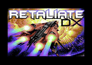
Here's what the pic looks like if I run it through my vic2 composite output simulator, with a fairly maxed out saturation on the composite to rgb leg:
 |
User Comment
Submitted by ChristopherJam on 18 May 2019
| Amazing work as always Jon. |
User Comment
Submitted by Dr. TerrorZ on 18 May 2019
Another nice one from JonEgg... I looked at it on a C64+1084S monitor and couldn't see a big problem with the colour combos (brown/blue) but this might be because the colour is at the edge of the explosion where it doesn't matter that much.
It could be the image looks a bit better with a low/mid saturation instead of high/max saturation. |
User Comment
Submitted by FABS on 18 May 2019
| This Pic is simply amazing! The perfection in multicolor!!! |
User Comment
Submitted by Krill on 18 May 2019
| Great! I like the 80s-style plain MC coarseness while the dithering looks quite modern. Simultaneously feels like a loading pic from back then and not. :) |
User Comment
Submitted by JCH on 18 May 2019
User Comment
Submitted by Adam on 18 May 2019
| gorgeous. really nice work. |
User Comment
Submitted by TheRyk on 18 May 2019
wow
plain MC?
bloody hardcode! |
User Comment
Submitted by JonEgg on 18 May 2019
Thanks for all the kind comments!
@PAL - Cheers for the advice. I'd be grateful if someone could tell me how the red-brown-blue gradient looks on a real 64 (as I don't have one). It's not too late to adjust the colours for the release of the game.
Maybe I could replace the blue with dark grey? |
User Comment
Submitted by Mikael on 18 May 2019
| Simply stunning, Jon! The perspective, use of colours, dithering. Just wow! |
User Comment
Submitted by The Diad on 18 May 2019
| This is amazing stuff. The explosion is particularly impressive to me. |
User Comment
Submitted by Ksubi on 18 May 2019
| Wowzers! Fantastic work JonEgg! |
User Comment
Submitted by PAL on 17 May 2019
Really amazing... Just wow...
JonEgg: I did do some images with dark blue, dark brown, dark red and then up... what I found was that this looks often very strange on the real hardware, it outlevel itselfs and actually the dark blue often eat in on them others like contrasty way... I am just saying so because I really love how it is done but maybe it will look a bit like a colorbanding on the real hardware... You are at a level and so super so hope it is ok for me to write this to you without it beeing scene wars and hell on earth ;-)
Fantastic image, absolutely super! |
User Comment
Submitted by Oswald on 17 May 2019
User Comment
Submitted by Holy Moses on 17 May 2019
| THIS. IS. A. MASTERPIECE. |
User Comment
Submitted by Mibri on 17 May 2019
User Comment
Submitted by HCL on 17 May 2019
| Yeah, that's how you do it! |
User Comment
Submitted by Zyron on 17 May 2019
User Comment
Submitted by Smasher on 17 May 2019
User Comment
Submitted by hedning on 17 May 2019
| JonEgg: You rule so much it hurts! |
User Comment
Submitted by JonEgg on 17 May 2019
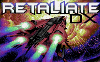
| Titlescreen for the forthcoming RGCD game Retaliate DX. |
|
|
|
 | Search CSDb |
 |
|
 | Navigate |  |
|
 | Detailed Info |  |
|
 | Fun Stuff |  |
· Goofs
· Hidden Parts
· Trivia
|
|
 | Forum |  |
|
 | Support CSDb |  |
|
 |  |
|


