|
| |
Credits :
Download :
Look for downloads on external sites:
Pokefinder.org
User Comment
Submitted by Walt on 7 July 2020
Great work :)
For the ones interested, the restrictions on the picture in the demo was that black had to be used as background color and only 3 colors had to be used on each of the 25 char lines (the picture had to be able to be shifted to the side and that would not be possible with a normal multicolor picture...) |
User Comment
Submitted by Yogibear on 7 July 2020
User Comment
Submitted by Joe on 6 July 2020
| Great work! Love how you fry it off to the brightest colors, looked really cool in the demo. |
User Comment
Submitted by Snabel on 5 July 2020
| This is gorgeous. Please keep up the spirit <3 |
User Comment
Submitted by Facet on 5 July 2020
| Hi Carrion, Really great work, I love it and feel honoured you picked up my theme of The Mighty Hunter. Next weekend I will release a new one... and hope you going to like it ;D Keep up your awesome work!! |
User Comment
Submitted by Carrion on 5 July 2020
btw:
There are Commodore plus/4 versions of both pics form "Expand" REU demo
Bot are recolored for C+4 palette.
https://retronavigator.com/post/622816347902099456/two-new-pixe..
As you can see the C+4 version of mine compo pic has blue instead of gray background.
The thing is the first version (and I sent it to Hedning) had a blue bg color too. But my BZ mates convinced me that grey-ish colors work better for background. But since C+4 has more blue color shades I used blue background that I think work quite well here. |
User Comment
Submitted by MMS_Z on 5 July 2020
Nice pic! Congrats!
Soooo: you faced a god in China with melted lava blocks in the background... I was not as lucky as You! :-D |
User Comment
Submitted by Carrion on 5 July 2020
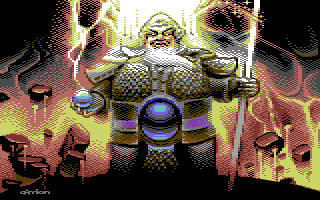
This is the final "Final Hunter" pic from me. ;)
I kind of liked the idea/theme that Facet started hence the pics in Bonzai's latest REU demo.
This one is a recolored version of the pic used in the demo. I played a bit with the coloring and liked the result, so decided to release it separately. The original in the demo was a bit restricted. Walt asked me to do it with some restrictions in mind because of the demo part he wanted to use it in.
It's kind of simple one, with simple gradients. But there's something old school in it that I like.
The pic is referenced from a photo I shot In China myself. :) |
|
|
|
 | Search CSDb |
 |
|
 | Navigate |  |
|
 | Detailed Info |  |
|
 | Fun Stuff |  |
· Goofs
· Hidden Parts
· Trivia
|
|
 | Forum |  |
|
 | Support CSDb |  |
|
 |  |
|


