|
| |
AKA :
little fast one...
Released At :
CSDB C64 Fun Compo 2021
Achievements :
C64 Fast Intro Competition at CSDB C64 Fun Compo 2021 : #4
Credits :
SIDs used in this release :
Cracks which use this intro :
Download :
Look for downloads on external sites:
Pokefinder.org
User Comment
Submitted by Doc Snyder on 24 August 2022
User Comment
Submitted by Count Zero on 15 April 2022
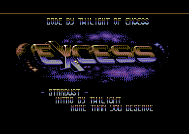
| Those stars to the left look extremely cloned. |
User Comment
Submitted by zscs on 15 April 2022
| Couldn't remember so far, from where the idea came from but yes, that logo inspired me (among others:-). I always mention in the production notes when I used something as reference but this time I had only an 'X' char as a reference in a temporary file/screenshot. So, nice find, thanks for linking it! ;-) I put a LOT of efforts on this logo anyway. |
User Comment
Submitted by iAN CooG on 15 April 2022
User Comment
Submitted by Slaxx on 12 May 2021
| Love the logo. Looking great! |
User Comment
Submitted by Yogibear on 9 May 2021
User Comment
Submitted by anonym on 7 May 2021
User Comment
Submitted by Twilight on 6 May 2021
thanks everyone for the flowers !
@DIDI: thanks for the cactus ;)
@Chico: short-time work since march :( a lot of time to code ;) |
User Comment
Submitted by Cupid on 6 May 2021
| Love the old style, kick-ass logo and font. Been ages since I seen those "shimmer" star sprites. |
User Comment
Submitted by TheRyk on 6 May 2021
User Comment
Submitted by zscs on 6 May 2021
Thanks for the nice words. <3 <3
@Conrad: the logo is a standard multicolour bitmap, no tricks used.
@Raistlin: the goal was to catch an oldschool feeling and yes I agree, colour transitions and dithering could be better but I focused more on the 3D look (well, spent a lot of time only for polishing the last 3 letters. Days, actually...:D). I finished it in September 2020 but remained unused until now. ;-) Thanks to Twilight to make this happen and also thanks to Jammer for the excellent music! |
User Comment
Submitted by KAL_123 on 6 May 2021
| Nice looking logo, music also great! |
User Comment
Submitted by Chico on 5 May 2021
| WOW! Looks like u have lots of time to code, Twilight. |
User Comment
Submitted by Doc Snyder on 5 May 2021
| Wow! Two really great intros within a week. Excellent work. Thumbs up! |
User Comment
Submitted by ccr on 5 May 2021
User Comment
Submitted by ChristopherJam on 5 May 2021
| Yes, that logo is gorgeous. Cracking tune, lovely rasters and sparkles. |
User Comment
Submitted by Didi on 5 May 2021
This looks and sounds really great!
Just one little nitpick: Why not NTSC-fix it before release when it's supposed to be a crack intro? You guys have the ability to do it and there is no need to rush. |
User Comment
Submitted by Raistlin on 5 May 2021
Really nice!
I think my only comment would be that the colour change on the logo is quite harsh.
Great stuff, though. Gratz. |
User Comment
Submitted by Conrad on 5 May 2021
| That's a great oldschool-style logo, with a nice 3D touch to it. I take it's a standard multicol bitmap without a raster-split colour change? |
User Comment
Submitted by Wayne Kerr on 5 May 2021
| Simple but very polished, nice graphics! |
User Comment
Submitted by Shine on 5 May 2021
Really cool work here! This logo works VERY WELL! Nice intro!!! :D
More than we deserve! :) |
User Comment
Submitted by fieserWolF on 5 May 2021
User Comment
Submitted by Flotsam on 5 May 2021
| Stylish and at the same time very classic C64 screen. Like it a lot. |
User Comment
Submitted by MCM on 5 May 2021
| Great classic intro, i like the logo and the colorsetup a lot, sids fits perfect ! |
User Comment
Submitted by Joe on 5 May 2021
| Cool logo! Feels like something from X-Ample! |
User Comment
Submitted by Jammer on 5 May 2021
|
|
|
 | Search CSDb |
|
 | Navigate |  |
|
 | Detailed Info |  |
|
 | Fun Stuff |  |
· Goofs
· Hidden Parts
· Trivia
|
|
 | Forum |  |
|
 | Info on other sites |  |
|
 | Support CSDb |  |
|
 |  |
|


