|
| |
AKA :
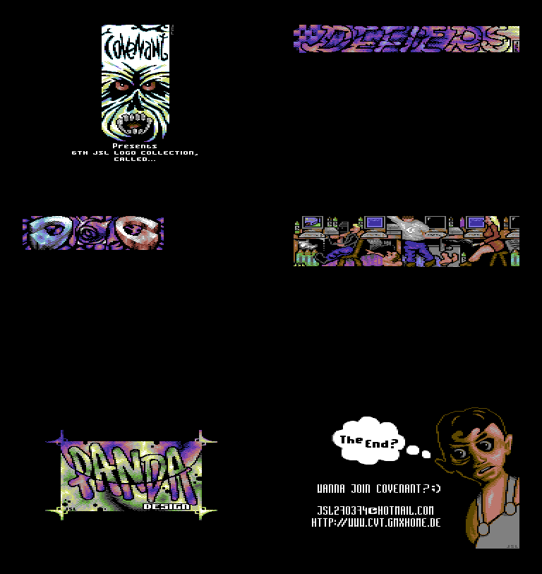
JSL 6th logos colly
Credits :
SIDs used in this release :
Download :
Look for downloads on external sites:
Pokefinder.org
User Comment
Submitted by JSL on 8 April 2009
BLACK VISIONS will be my next gfx collection by Tropyx, V-12 will do code and Snerg.. But watch the menu picture, it looks like FLI :)))
|
User Comment
Submitted by TWR on 14 February 2006
User Comment
Submitted by HCL on 8 February 2006
| Some cool ideas in here, but i agree that almost all logos could have been better if more time was spent on them. I would prefer 40 top-logos instead of 400 average-logos, but that's just me. |
User Comment
Submitted by Slartibartfast on 8 February 2006
Logos are for using.
Logo shows are for snoozing. |
User Comment
Submitted by TDJ on 7 February 2006
| @Deev: because people forgot what good logos look like. |
User Comment
Submitted by Deev on 7 February 2006
I agree you can't always anti-aliase quite as well as you'd like in multicolour mode, but you always have something you can put between white and black! Sometimes you have to adapt your composition to allow for anti-aliasing. Multicolour bitmaps aren't *that* limiting anyway.
I'm not getting why people rate this so highly, there's some decent ideas, but they're crowded out by lots of sub-standard stuff, IMO |
User Comment
Submitted by Tch on 7 February 2006
@Tempest:
Not since last time I checked myself in the mirror. ;)
Granted,not everything is of good quality.
But there are some really good HIRES logos in there.
Antialiasing is something that gets a bit hard in this format.
Still,JSL shows in some pics that he can do it,maybe it is a conscious choice,not to? |
User Comment
Submitted by tempest on 7 February 2006
| You guys blind or something? Btw. there's this new thing called antialiasing... |
User Comment
Submitted by Shake on 6 February 2006
| nice nice, i'm not always a fan of your fonts and technique. but who cares with originality and colour usage like you did in some of these logos. cool.. |
User Comment
Submitted by Tch on 6 February 2006
Amazing how JSL makes good graphics in plain Hires.
Thumbs up! |
User Comment
Submitted by Nemezis on 6 February 2006
| Pretty cool collection, lots of interesting ideas. Nice to watch something that doesn't interlace :)) |
User Comment
Submitted by CenTraX on 6 February 2006
| Murdock - you're lucky oldschool scener ! |
User Comment
Submitted by V-12 on 6 February 2006
| 2006 year and it's nice to get some stuff via snail mail before official release :-) anyway, nice collection, alot of wonderful logos. One thing I missed is a nice design. Also small logos should be in my opinion placed in the centre of the screen or even 2,3 logos should be merged because too much black screen sometimes appears :-) |
|
|
|
 | Search CSDb |
 |
|
 | Navigate |  |
|
 | Detailed Info |  |
|
 | Fun Stuff |  |
· Goofs
· Hidden Parts
· Trivia
|
|
 | Forum |  |
|
 | Support CSDb |  |
|
 |  |
|


