|
| |
Released At :
Big Floppy People 2006
Achievements :
C64 Graphics Competition at Big Floppy People 2006 : #3
Credits :
Download :
Look for downloads on external sites:
Pokefinder.org
User Comment
Submitted by MRT on 1 September 2006
Hey Sander...
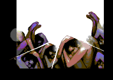
This image is very insatiable... ;-)
Insatiable
|
User Comment
Submitted by Steppe on 31 July 2006
But... you forgot to colour the upper half of the picture!!! :-)
Just kidding, this looks really awesome! Doesn't happen too often that a C64 picture hits my nerve and causes me to start thinking. |
User Comment
Submitted by Hein on 31 July 2006
| Oswald, I think it's up to the artist if he's made progress, not the critic. |
User Comment
Submitted by Oswald on 31 July 2006
| Sander, well, maybe it's just I'm stuck with old scene standards, and the rest is moving forwards, whatever that means. If this is the case thats bad news for me. |
User Comment
Submitted by DRAX on 31 July 2006
| Sander my man. This is imo a typical Sander style piece which is good. I really love you style. Nice to have some not naturalistic stuff. |
User Comment
Submitted by Scout on 31 July 2006
| With all respect to Redstar but this picture should came 1st or 2nd in the gfx compo. |
User Comment
Submitted by Clarence on 30 July 2006
| Ben, yep thx, my mistake. :) |
User Comment
Submitted by Sander on 30 July 2006
| @Oswald: 'Maybe the aim was artsyness and not quality' - that illustrates why you don't like it. Indeed, it was rather a conceptual thing than a crafty pixel job. I really lost interest in pixeling for the craft ages ago. But uninspired is something i completely disagree with. Perhaps the 'inspiration' should be found in the 'artyness' instead. But i wonder what seperates 'artyness' (imho, being done well == 'inspired') from 'quality'. Although it's ok if you don't like it. |
User Comment
Submitted by Clarence on 30 July 2006
Oswald: Mirage != Sander
:) |
User Comment
Submitted by Bizzmo on 30 July 2006
| Like the picture, but am I the only one who finds it a little distubing! Oh, and the music's nice! :-) |
User Comment
Submitted by Hein on 30 July 2006
| Despite the useless beams, my favourite in this compo. Ofcourse. Doh! |
User Comment
Submitted by Nightlord on 30 July 2006
| I really liked this picture. Overall it did touch my taste and my perception of life... great piece of art |
User Comment
Submitted by Oswald on 30 July 2006
check this:
Regine
then look again at obstacles.
I'm sorry to say, but this is what I think: this picture is a step backwards.
Maybe the aim was artsyness and not quality, still this picture feels only 50% finished an uninspired. :( |
User Comment
Submitted by CreaMD on 30 July 2006
User Comment
Submitted by Mirage on 29 July 2006
| Always nice to see an artist use himself and his own experiences to make a piece of art... Leon does this aswel ;_) naked, vulnerable sanders turned up side down and inside out because of the obstacles life throws at him is a nice concept :) (i don't know what the actual concept was... i'm just guessing here) 9/10 because the nose still looks weird on the middle character (did you spot that, jailbird ;)) |
User Comment
Submitted by jailbird on 29 July 2006
| WTF! Amazing motive, really nice pixelling! Straight ten and even more! |
User Comment
Submitted by Radiant on 29 July 2006
It came second.
EDIT: Oops, it didn't? Well, I wasn't 100% sober at the price ceremony, to be honest... |
User Comment
Submitted by Ixon on 29 July 2006
[edit]
Not #1.. though i really like this one. |
User Comment
Submitted by Mirage on 29 July 2006
$dd06 timer has been replaced by a proper irq and the new version has been uploaded... Thanks graham :)
Because of all the trouble i went through i also added credits for the code ;P |
User Comment
Submitted by hollowman on 29 July 2006
| almost as beautiful as sander himself |
User Comment
Submitted by Graham on 29 July 2006
| @Mirage: You use timers for stable irqs? Old C64's and new C64's are 1 cycle different with timer interrupts. It seems that the stable IRQ is sometimes 1 cycle wrong on my C64C and the FLI routine is doing some linecrunching because of this on some frames. |
User Comment
Submitted by Mirage on 29 July 2006
Graham: I slapped that viewer code together in 5 minutes before the party, i'm not surprised it bugs on some machines ;)
Sander: Sorry, apparently my code bugs :) |
User Comment
Submitted by Graham on 29 July 2006
User Comment
Submitted by CreaMD on 29 July 2006
| Hey Deek, fabulous music! ;-) Hey Sanderesque, I don't get it, but I'm simple. Anyway, neat use of space. |
User Comment
Submitted by ne7 on 29 July 2006
| really nice picture! who did the music as i quite like that too!? :) |
User Comment
Submitted by Klegg on 29 July 2006
| I really liked this picture a lot! Nice and clean, and very professional. |
|
|
|
 | Search CSDb |
 |
|
 | Navigate |  |
|
 | Detailed Info |  |
|
 | Fun Stuff |  |
· Goofs
· Hidden Parts
· Trivia
|
|
 | Forum |  |
|
 | Support CSDb |  |
|
 |  |
|


