|
| |
Website :
http://www.pixeljoint.com/pixelart/24156.htm
Released At :
Riverwash 2007
Achievements :
C64 Graphics Competition at Riverwash 2007 : #2
Credits :
Download :
Look for downloads on external sites:
Pokefinder.org
User Comment
Submitted by Ray Manta on 16 May 2016
User Comment
Submitted by The Shadow on 17 October 2009
User Comment
Submitted by Frantic on 12 June 2009
| I don't agree with sander here.. I think that the logo is... well, I agree that it is a liiiittle out of place, but I also think the picture would loose some of its dynamics without it. |
User Comment
Submitted by plagueis on 24 February 2009
User Comment
Submitted by chatGPZ on 10 February 2009
| awesome work indeed. true masters need no xyzfli :) |
User Comment
Submitted by Motion on 10 February 2009
The detail really pulls me into the scene, from the periphery of the forest. Thumbs up, bro!
|
User Comment
Submitted by Jak T Rip on 8 February 2009
User Comment
Submitted by null on 4 March 2008
| Awesome. And I too hope to see this style break through in demos :_) |
User Comment
Submitted by Mermaid on 4 March 2008
| Very very pretty picture, I have to agree with Sander though, it would have looked better to me without the logo. |
User Comment
Submitted by saehn on 4 March 2008
| I missed this one... glad you commented on it, Jammer! Very cool, hope Skurvy does more gfx. |
User Comment
Submitted by Jammer on 4 March 2008
it means:
how much weed is needed to paint such a thing :D |
User Comment
Submitted by The Overkiller on 4 September 2007
ile ziola trzeba nawdychac zeby cos takiego narysowac? ;-)
I totally second that. If I'd only know what this comment means .... |
User Comment
Submitted by Raf on 3 September 2007
| ile ziola trzeba nawdychac zeby cos takiego narysowac? ;-) hehehe |
User Comment
Submitted by psych on 28 August 2007
| Great stuff mate,keep it up !! |
User Comment
Submitted by Deev on 28 August 2007
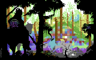
| really nice! The lighting is great, especially for hires, very atmospheric! |
User Comment
Submitted by Archmage on 28 August 2007
| Yay! This is way cool! Very well done! |
User Comment
Submitted by Rough on 28 August 2007
| I absolutely agree with the former commenters. One point: The samurai looks as if he sits a bit beside the horse, looks weird. |
User Comment
Submitted by Twoflower on 28 August 2007
| Very nice image, good use of hires restrictions and contrast. Fits very nicely into the new flow of graphics we've seen during the last year. I just wish for this style to break through in demos aswell. |
User Comment
Submitted by Heavy Stylus on 28 August 2007
| Wow! This image is absolutely stunning. Fantastic work! |
User Comment
Submitted by Malmix on 28 August 2007
| awesome! Great use of hires! |
User Comment
Submitted by scout on 28 August 2007
Very, very nice!
I love the depth/3d feel in this pic. |
User Comment
Submitted by Sander on 28 August 2007
Very cool picture, feels a bit Helm inspired (triangles), yet way more graphical. But this visual is very appealing, with the dark silhuouettes breaking the canvas and the great atmosphere in the background.
Something what bothers me is the logo on the samurai-chicken, kinda interferes with the general atmospheric depth. Otherwise, great work! |
|
|
|
 | Search CSDb |
 |
|
 | Navigate |  |
|
 | Detailed Info |  |
|
 | Fun Stuff |  |
· Goofs
· Hidden Parts
· Trivia
|
|
 | Forum |  |
|
 | Support CSDb |  |
|
 |  |
|


