|
| |
AKA :
Velocipede
Released At :
St LCP 2008
Achievements :
C64 Demo Competition at St LCP 2008 : #4
Credits :
SIDs used in this release :
Download :
Look for downloads on external sites:
Pokefinder.org
User Comment
Submitted by Sith on 24 March 2017
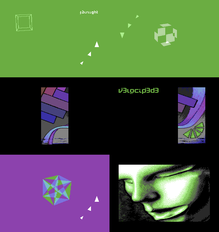
Techy demo with some style thrown in and a great pic (which we only get to see in bits 'n pieces. lol
The SID is indeed very suitable for this prod.
I especially like the thing with opposing 'magnet' forces. Something not seen before. |
User Comment
Submitted by bepp on 5 October 2010
| The soundtrack is just spot on! It perfectly accompanies the design of this demo. Interesting idea to use green as background. The filled triangles work well, however I'm not that fond of rotating vector objects. Übercool demo name, creative logo and charset. Overall a nice production! |
User Comment
Submitted by The Shadow on 19 November 2009
User Comment
Submitted by psych on 19 March 2009
| stunning music! nice design. |
User Comment
Submitted by plagueis on 29 January 2009
| Great demo. Puterman works sorcery with creating the mood for a demo. The tunes he creates or chooses are always original and creative. He makes minimalism stylish. |
User Comment
Submitted by d0c on 24 August 2008
| is it only going to be 1 flt demo in 2008? |
User Comment
Submitted by JackAsser on 24 August 2008
User Comment
Submitted by Motion on 12 August 2008
| The small font, title font and the end pic I love dearly...reminds me of something Saehn or Devistator would do. Cool haunting music, too. |
User Comment
Submitted by Avalon on 12 August 2008
I thank you all for your kind words.
I've uploaded the tune with correct SID-settings and name. |
User Comment
Submitted by G-Fellow on 11 August 2008
| I added the sid file to the demo, cool tune indeed, very minimalist tune and a good puterman&Oxidy demo. |
User Comment
Submitted by Jucke on 9 August 2008
| I really dig this demo, and it impressed me a whole lot on the ST LCP compo. I gotta agree with radiant-x that it feels more like a wrath demo than a flt one. But then, the way i remember it Oxidy has been in both FLT and Wrath several times, so its all the same. Anyway, really nice demo! And the music by Avalon kicks ass. |
User Comment
Submitted by Skate on 3 August 2008
| I felt like this demo is released before a bigger demo to fill up the space. |
User Comment
Submitted by Mace on 3 August 2008
In general I like demos with a bit more pace and coherence.
Thanks to the abstract bits of this production and the smoothness of it, I still think it's a nice piece.
I added an animated screenshot. |
User Comment
Submitted by Archmage on 3 August 2008
| I like this, and seeing it as a progressive demo I think it has more interesting design to it than Tristate. Cool font and a very nice tune. |
User Comment
Submitted by taper on 2 August 2008
| Another good demo. Nice tune, Avalon! |
User Comment
Submitted by Radiant on 2 August 2008
| Felt like a Wrath Designs demo in a way, and two of three involved have been in that group... But that's not negative. I voted this second. |
User Comment
Submitted by Hein on 2 August 2008
| Won't stick for long, but any FLT activity is appreciated. |
User Comment
Submitted by blackdroid on 2 August 2008
User Comment
Submitted by FATFrost on 2 August 2008
| my pot noodle has no soy sauce! wahhh! |
|
|
|
 | Search CSDb |
|
 | Navigate |  |
|
 | Detailed Info |  |
|
 | Fun Stuff |  |
· Goofs
· Hidden Parts
· Trivia
|
|
 | Forum |  |
|
 | Support CSDb |  |
|
 |  |
|


