|
| |
|
Knight'n'Grail Preview V1 [2009] |
AKA :
Knight n Grail Preview
Credits :
Download :
Look for downloads on external sites:
Pokefinder.org
User Comment
Submitted by SIDWAVE on 1 August 2009
| This game is a wee bit hard, but fun. |
User Comment
Submitted by AlexC on 1 August 2009
| I've got digital download version today and it is awesome game - one of best recently released. While some things are matter of taste I like all the details in the game and it shows a lot of hard work. |
User Comment
Submitted by Mix256 on 5 July 2009
Done.
It took about 8 month of hard, painstaking work.
Thanks go to: Mom and her pet cat.
|
User Comment
Submitted by Cresh on 12 May 2009
User Comment
Submitted by Steppe on 12 May 2009
| Checking daily if they're taking preorders already. :-) |
User Comment
Submitted by JackAsser on 12 May 2009
| @Archmage: Good shit pal! Keep that good gfx flowing. :) |
User Comment
Submitted by Jammer on 12 May 2009
User Comment
Submitted by Archmage on 12 May 2009

The game will be made available in a real C64 plastic case. :) |
User Comment
Submitted by Mix256 on 26 April 2009
| Dane: A collegue of mine. Who is also a scener (TDM), didn't know that when I asked him though. |
User Comment
Submitted by Dane on 26 April 2009
| Nice. Who's doing the music for it? ;) |
User Comment
Submitted by d0c on 25 April 2009
here is what psytronik software had to say the 23.04.09 about knight'n grail...
"It's looking good for a June release - most of the game is now done and a suitably moody soundtrack is being plumbed in as we speak. (The preview of the title tune I heard reminded me of Ghosts 'n' Goblins!"
"I tell you what guys, you are gonna LOVE this game! After some extensive playtesting I can safely say it's one of the most beautifully constructed games I've seen on the C64 in a loooooong time." |
User Comment
Submitted by Jammer on 25 April 2009
| kudos for archmage for that gem! \o/ |
User Comment
Submitted by Ksubi on 25 April 2009
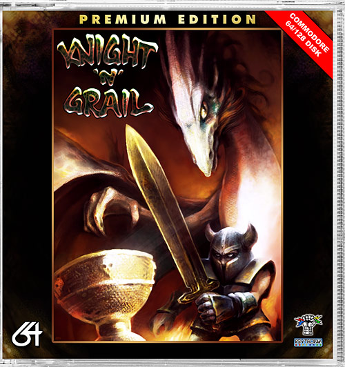
| Wicked artwork Archmage! Captures the game perfectly...looking forward to the release of this gem :) |
User Comment
Submitted by Archmage on 23 April 2009
Sneak preview of a detail of the box art.
 |
User Comment
Submitted by FATFrost on 18 April 2009
| i think you should have a bonus level where he has a shield and blasts through big fat swamp slugs that pop with nice dirty sounds! give me the level editor and i will help to make it! Great work, reminds me a lot of SpellCast. |
User Comment
Submitted by grennouille on 18 April 2009
| 0-)) Hope to see the full release soon then! |
User Comment
Submitted by Mix256 on 18 April 2009
grennouille: If I knew what part of the game to do a preview of, I would.
The game is nearing completion now, so there might not be any point in releasing one, though. :) |
User Comment
Submitted by grennouille on 14 April 2009
| A new preview soon? I love this game! |
User Comment
Submitted by Jak T Rip on 26 January 2009
This looks more than just average. This is really good. The sword is totally funtastic (If I had coded it the game would not evolve further, because instead of being productive I'd just look at the swing of the sword all the time)!
It is a good concept that you collect keys and have yourself struggling to remember the dungeon.
And great gfx throughout. Thumbs up!! |
User Comment
Submitted by Stainless Steel on 25 January 2009
| I suggest some medieval melodious DraxMon tunage for this. |
User Comment
Submitted by Tfardy on 24 January 2009
| Great looking preview. Can't wait for a full version, or even a preview with sound. Cool !!! |
User Comment
Submitted by Jammer on 22 January 2009
| i found the difficulty well adjusted. enemies pose certain threat i.e. in places where both bats and worms attack the player and we have no opportunity of ducking. not too mention shooting faces ;) it's not frustrating though :) |
User Comment
Submitted by pippo79 on 22 January 2009
| Yeah, this is the stuff I like! It's gonna be a great game, I personally will suggest to make it a little more difficult adding some enemies, or maybe implementing a strict countdown to solve the quest... Anyway, GREAT! |
User Comment
Submitted by Steppe on 21 January 2009
| Oh baby, this is really juicy stuff! I'd like to preorder two copies as soon as it's up on Amazon! |
User Comment
Submitted by AüMTRöN on 21 January 2009
Insta-boner! Great! 5 cocks up!
Hope you find the time to put the effort into the rest of this cool game... Good luck! |
User Comment
Submitted by Alias Medron on 21 January 2009
WOW!! Great preview! nice concecpt.. animations (especialy the weapon implementation is great).
Needs some work but for a first preview it's more than good..
keep it on! |
User Comment
Submitted by Radiant on 21 January 2009
| Yeah, looks really promising! |
User Comment
Submitted by daison on 21 January 2009
User Comment
Submitted by v3to on 21 January 2009
| Hey, this is fun. Good looking and playability. Go ahead :-) |
User Comment
Submitted by Mix256 on 21 January 2009
>> "I think he is a bit slow actually..."
And there it is...the comment I've been hoping not to get. ;)
I will see what I can do. |
User Comment
Submitted by Majikeyric on 21 January 2009
Very nice preview! keep up the good work ! ;-D
A little suggestion though :
it is possible to move the main character by two pixels instead of one ? I think he is a bit slow actually... |
User Comment
Submitted by Jammer on 21 January 2009
Quoting ZyronI think I jumped up-right diagonally from the screen below.
Zyron just found an easter egg screen in the game :D:D:D |
User Comment
Submitted by Jazzcat on 21 January 2009
Beautiful!!!
The art of game making on C64 is alive and well, more!!!!! |
User Comment
Submitted by Zyron on 21 January 2009
Quoting Mix256Zyron: How did you end up there?
I think I jumped up-right diagonally from the screen below.
Quoting Mix256Really need to finish this
Yes, definitely! |
User Comment
Submitted by Mix256 on 21 January 2009
Zyron: How did you end up there? Really need to redo the bkg-check routine...
Really need to finish this, especially after all of your lovely comments. :)
Thanks all!
|
User Comment
Submitted by Kater on 21 January 2009
| Verry cool prewiew! I´m looking forward to the finished game! ;-) and as d0c said: more game making and less demo making! :-) |
User Comment
Submitted by Archmage on 21 January 2009
Very nice indeedio! The graphics are really cool and the gameplay seems very fluent. Can't wait to see this finished. If you manage to get it published, I'll buy it without thinking twice. Yay!
And with reference to Jammer's comment about hero-sword-proportions: don't you make that sword smaller! This is totally über nextgen c64 game gfx! |
User Comment
Submitted by Jammer on 20 January 2009
| seems really nice. i guess all things like scrolling glitches and so on will dissapear in course of development. i wonder about hero-sword proportions and consequently about the height of his jumps :D have you thought about 2-sprite high main character? ;) apart from that i have only positives in mind - game is challenging enough to await the full version :) btw. asterion's tunes would fit gladly ;) |
User Comment
Submitted by Twoflower on 20 January 2009
| Brilliant preview with nice animations, loads of features (ever tried to press space?) and overall a very nice looking engine. This is right up my alley, really adorable. Nice to see that people are starting to produce quality games for this machine again. |
User Comment
Submitted by Zyron on 20 January 2009
I like this, very promising. But I got stuck in the wall.
 |
User Comment
Submitted by kerm1t on 20 January 2009
| Nice and well balanced, like a n**tendo classic. I like smoothness of animations. Keep up! |
User Comment
Submitted by iAN CooG on 20 January 2009
very, *very* nice.
I felt the urge to onefile it and add a inf. energy trainer just for my pleasure - else I sux at it :P
find it on my page http://iancoog.altervista.org/HF |
User Comment
Submitted by DRAX on 20 January 2009
User Comment
Submitted by d0c on 20 January 2009
| more game making and less demo making! |
User Comment
Submitted by Richard on 20 January 2009
| Looks commercial quality! |
User Comment
Submitted by The Shadow on 20 January 2009
| The level of creativity from the old scene is back!!! We are now having a renaissance. New wares will flow once again... |
User Comment
Submitted by The Hobbit on 20 January 2009
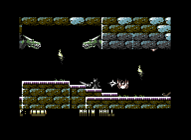
| This is a pretty cool preview, especially with the exomized version (from 239 to 63. WOW!) The game looks promising. I'm looking forward to the final version. |
User Comment
Submitted by Mix256 on 20 January 2009
Thanks a bunch all!
JackAsser: Hope it works for ordinary MC mode as well, because that is exactly what I'm doing. :)
Except I can have one different color per row in the blocks. The problem has to do with a timing issue that I haven't bothered taking care of yet (actually I have, but I didn't fix it properly).
Oswald: Completely agree with you on the transparancy thing. Had a black sprite behind the main char for a while until I decided it was needed for the enemies...
Will fix that when I get the proper multiplexor in place (got a sprite-splitter thing in there now).
|
User Comment
Submitted by JackAsser on 20 January 2009
Looks great!!! Please keep up the good work! I see that you have quite severe $d800-update bugs, maybe you already have a solution in hand since this is just a preview. But a suggestion could be f.e. to only allow the same $d800 color for a whole block, this would reduce the number of $d800 writes to only update between the edges of two blocks (this assumes it's bitmap mode ofcourse, dunno if it is though...)
Anyways, good shit! :D |
User Comment
Submitted by Oswald on 20 January 2009
YAY! :) some nitpicking: I dont like when sprites use their transparent color as black and then the background is not black. Its very disturbing, makes the sprites feel really unreal. secondly, maybe you have plans with that but for now I dont like how the sword jumps from one side to another when changing directions overall it doesnt really belong to the character. I think 1 sprite would be enough.
I loove the rising flames, the boomerang weapon, the map, weapon system and the game machanics all feel right and correct.
|
User Comment
Submitted by Raffox|HF on 20 January 2009
User Comment
Submitted by assiduous on 20 January 2009
| added image which works with out the cart(exomized down to 63 blocks) |
User Comment
Submitted by enthusi on 20 January 2009
smooth!
Scrolling, animations so far.
Nice.
You can start it in vice when using i.e. the AR6-crt and its fastload (which handles long files) when truedrive is being switched on of course...
I wish you the motivation you need to continue and finish this!
|
User Comment
Submitted by Skate on 20 January 2009
User Comment
Submitted by Heavy Stylus on 20 January 2009
Not tried it yet, but I'm well impressed with the screenshot!
2009 looks like a promising year for C64 gamers :) |
|
|
|
 | Search CSDb |
 |
|
 | Navigate |  |
|
 | Detailed Info |  |
|
 | Fun Stuff |  |
· Goofs
· Hidden Parts
· Trivia
|
|
 | Forum |  |
|
 | Support CSDb |  |
|
 |  |
|


