Released At :
Euskal Encounter 18
Achievements :
Mixed Graphics Competition at Euskal Encounter 18 : #3
Credits :
Download :
Look for downloads on external sites:
Pokefinder.org
User Comment
Submitted by daison on 5 October 2010
Is this really your first picture ever?
I'm already curious what you will come up with next, keep it up! |
User Comment
Submitted by plagueis on 29 August 2010
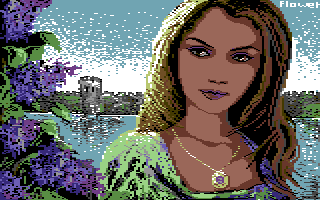
| Nice piece...very masterful facial rendering, plus the purple flowers create a great effect. |
User Comment
Submitted by Joe on 13 August 2010
| Anna, I hope you do more on this setup. PS. Nice work on the ZX as well! |
User Comment
Submitted by Flower (Andreevskaya) on 13 August 2010
Hello everybody!
Thanks a lot for your kind comments. I hope you'll see more from me :) Best wishes, Anna |
User Comment
Submitted by nada on 2 August 2010
User Comment
Submitted by Deev on 30 July 2010
| really nice for a first release and I like that the pixel style is so different from the techniques that so many people (myself included) tend to favour. I hope we'll see some more from you! |
User Comment
Submitted by Jammer on 27 July 2010
| resembles cinemaware style alot - sinbad and throne of falcon ftw \o/ |
User Comment
Submitted by Joe on 27 July 2010
Actually, I dont think of it as retro at all. I fancy this image very much. I might have ideas about how I personally would have approached it:
Some subtle antialiasing and fixing color clashes.
However, it is raw and that is the beauty of it. |
User Comment
Submitted by Hermit on 27 July 2010
It's amazing, how this technique can make the flowers on the left alive. Absolutely, Defender OTC came in to my mind on first sight.
Maybe not so easy nowadays to return back to retro-style after seeing a lot (dominant amount) of dithered pictures for decades. |
User Comment
Submitted by v3to on 27 July 2010
| agree with joe. the pic looks raw. actually i like the motive and the combination of two different styles is also interesting. the woman reminds me the loom ega version and the background as paintbrush-style with atmosphere similar to defender of the crown or guild of thieves. unfortunately some details look a bit rushed (not depending the style), i.e. woman's clothing or the whole upper right area. hope to see more of you :) |
User Comment
Submitted by SIDWAVE on 27 July 2010
| Good one! And its interesting to see a different pixeling style used. Oh and then i have to say, it looks like it could have been a pic inside Defender of the Crown. :) |
User Comment
Submitted by molebrain on 27 July 2010
User Comment
Submitted by FATFrost on 26 July 2010
User Comment
Submitted by Twoflower on 26 July 2010
| Very nice. The tower and flowers are awesome, although the angles of the girl feels a bit undecided. Quite raw, yes. |
User Comment
Submitted by Joe on 26 July 2010
User Comment
Submitted by Yodelking on 26 July 2010
| Reminds me much of "Defender of the Crown"! :) A lovely pic! |
User Comment
Submitted by Fredrik on 26 July 2010
I like this very much, and lovely colours!
|
|
|
 | Search CSDb |
 |
|
 | Navigate |  |
|
 | Detailed Info |  |
|
 | Fun Stuff |  |
· Goofs
· Hidden Parts
· Trivia
|
|
 | Forum |  |
|
 | Support CSDb |  |
|
 |  |
|


