|
| |
|
There can be only One [2010] |
AKA :
Highlander 2.0, Highlander Redux
Credits :
Download :
Look for downloads on external sites:
Pokefinder.org
User Comment
Submitted by v3to on 20 February 2011
User Comment
Submitted by Motion on 23 September 2010
It was great to see this develop, and you've done an exceptional job of it. Awesome!
|
User Comment
Submitted by JCB on 10 September 2010
Ste's redone the logo in hires and given it to me. Just needs a slight change to my colour bitsetting app to make sure those bottom couple of lines use colours 0 and 3 so the hires colours for that square don't screw them (works on whole "char" sizes atm, not lines). It might end up being part of a demo rather than (or later, as well as) a standalone graphic..
*edit* Just thought of an easier way to do it.. |
User Comment
Submitted by FATFrost on 10 September 2010
| Let's use antialias to end the war in Afghanistan. It's that good! |
User Comment
Submitted by Frantic on 10 September 2010
Personally I find it just fine as it is, but if it should necessarily be "improved", why not simply make the text-logo in hires (i.e. switch mode for that particular part of the screen)? In my hümble opinion, that would look a lot better than some boring antialiasing. :)
EDIT: Oh.. hehe.. just noticed that DK was actually mentioning hires. |
User Comment
Submitted by DeeKay on 10 September 2010
| Very nice STE, very classic, i like this! ;-) Nice improvements on Kilt, background etc. Though I have to agree that hires or Antialiasing would work wonders for the Logo. Don't try orange, since it's too close in Luma to red, I'd much rather go for pink and light grey instead! |
User Comment
Submitted by Linus on 9 September 2010
| Nice improvement, like it a lot. |
User Comment
Submitted by Moloch on 9 September 2010
Fantastic! As Ed said, the full figure is more spot on now than the older version.
I'd really like to see more "updates" in the future if that is part of your plan. |
User Comment
Submitted by Twoflower on 9 September 2010
| Quite an improvement from the original one - really nice to see this! |
User Comment
Submitted by GT on 9 September 2010
User Comment
Submitted by tbolt on 9 September 2010
Wow, very nice update to an already great image from years past! Great work!
|
User Comment
Submitted by JCB on 9 September 2010
A few things, despite Ste not wanting this to turn into another babbling waffle about palettes..
Better doesn't make it right or wrong.
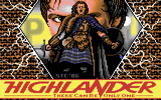
The "colour" parts of the logo were done on Ste's original C64 (as seen in the Bouncy Thingz demo), only the stippling/enhancements were done on a PC recently so the fades etc haven't changed. Pretty much all of this picture was redrawn on photoshop with a "recreation" of how Ste (and I) remember the palette.
Both images (gifs) use the same palette.
Please, if you don't understand part of that take it to PM for all our sakes ;)
*edit*
To make it slightly clearer (I just woke up after all) unless you have the palette Ste and I use for VICE you'll have the wrong colours to begin with and then switching old/new lumas doesn't work when using an external palette so if we both DID have old VICs this palette is likely our old VIC one (or as close as we can get to how our kit was set up) |
User Comment
Submitted by MagerValp on 9 September 2010
This one looks better on a 9 luminance vic, as opposed to the logo you released a few weeks back that looks better with 5.
What's inside your C64?
|
User Comment
Submitted by STE'86 on 8 September 2010
feel free to have a go at anti aliasing that logo Wile.
i wasted quite a bit of time trying to do exactly that and all i got it to do was look more chunky and illegible as the orange eat into the yellow spacing. if you can get it to look anything like, i will happily change it again.
tho Pete has just suggested a rastered Hires mix to do that area. which may work better |
User Comment
Submitted by Ed on 8 September 2010
Yes! This is more like it.
Looks and feels like classic in every sense. Chessboard pixels, quite limited color-scale, etc. i Like the details and the juxtaposition of picture elements (zoomed in face in the background, full-length portrait in the front), and of course the typeface in the lower part of the picture. The flashes are so 1980s but works today as well. Not sure what the advertisers would have put there today if the flick had been introduced today... Probably some bokeh, some half figure in the front and some credits... Or some HDR-background...
I like the remake, and the "There can be only one" tag suits well! :)
Thumbs up!
(edit: in comparison to the older version. Here the full figure looks better taken care of and more similar to Christopher Lambert. Also the background face has turned from a less "Max headroom" look, into getting a smoother surface. I also noticed there was some unfocused part in the background, which suits the bokeh-trend quite well. Also the flashes add something to the general feeling. )
(double edit: The flick would probably have placed in another setting if made today, most likely ancient greek and some shabby chic/modern downtown appartment in <enter big town name here>... ) |
User Comment
Submitted by Joe on 8 September 2010
User Comment
Submitted by Wile Coyote on 8 September 2010
| That's some improvement over the other Highlander pic. Logo antialias would have helped too. |
|
|
|
 | Search CSDb |
|
| Navigate | |
|
| Detailed Info | |
|
| Fun Stuff | |
· Goofs
· Hidden Parts
· Trivia
|
|
| Forum | |
|
| Support CSDb | |
|
 |  |
|