|
| |
AKA :
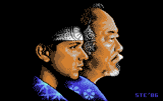
Karate Kid II redux
Credits :
Download :
Look for downloads on external sites:
Pokefinder.org
User Comment
Submitted by v3to on 20 February 2011
User Comment
Submitted by Jucke on 1 October 2010
| Damn! thats seriously good executed. I am impressed. |
User Comment
Submitted by Morpheus on 28 September 2010
| It's great to see these touched-up versions by one of my old heroes, and this is a true classic. Ripped by many for their scrolly/pic/muzak demo. Look forward to the MT demo and more graphics from Ste'86. |
User Comment
Submitted by icon on 24 September 2010
| Wow! Have I died and went to heaven! One of my ABSOLUTELY favorite 64 pixelgod made a "new" work 2010?! Awesome! |
User Comment
Submitted by Motion on 23 September 2010
| Absolutely stunning work, Steve. Really impressive - so much so, it hurts to look at the old version now! |
User Comment
Submitted by STE'86 on 22 September 2010
| have added a zip archive containing this release, the original release and 3 gifs at major stages during completion. for anyone interested that is :) |
User Comment
Submitted by Bizzmo on 22 September 2010
| Nice, but could do with some rainbows / swirly stuff etc. |
User Comment
Submitted by STE'86 on 22 September 2010
not really wanting to get into this palette thing again but does it really fcking matter what colours i display a gif in to you Oswald? AND you are viewing it on a super bright lcd display no doubt whereas i am drawing it on a crt display.
and as for the facial feature dimensions, feel free to check them anytime
 |
User Comment
Submitted by Oswald on 22 September 2010
| palette is out of this earth. dark brown is too light, so where it meets with black it looks ugly, also 0e looks like 03.. blergh... you must have had a terrible crt. |
User Comment
Submitted by Wile Coyote on 22 September 2010
| Massive improvement, although the Karate Kid's nose looks a little on the large side. |
User Comment
Submitted by DeeKay on 22 September 2010
Very nice, steve, shadowing and highlighting is much improved in the new one, also love the new texture on Daniel-san's Kimono...
Is this the titlescreen for the 2010 remake game of Karate Kid? ;-D |
User Comment
Submitted by daison on 22 September 2010
| I like the old signature better, other than that it's a great improvement ;) |
User Comment
Submitted by Sander on 22 September 2010
Quote:like rainbow swirls, 60's psychedelia and surreal colour schemes? nah, i think i'll pass on that thanks :)
If that is your definition of creativity - i have no further questions ;) But i can still appreciate reproductions of 80ties film posters in 2010, don't get me wrong. |
User Comment
Submitted by STE'86 on 22 September 2010
like rainbow swirls, 60's psychedelia and surreal colour schemes? nah, i think i'll pass on that thanks :)
oh and i did want to work a bit of red into the lips but alas colour constraints meant i would have had to lose either brown or light grey from the area to do so, and that wasnt a realistic option. |
User Comment
Submitted by Sander on 22 September 2010
| Huge improvement! I kinda miss the lipstick on the kid though. Now you´ve shown your skills, stun us with some creativity please :) |
User Comment
Submitted by enthusi on 22 September 2010
for those whose memory plays tricks on them: this is the old famous one:
Karate Kid II
Quite nice ;-)
Did he have indeed such a nose I wonder? |
User Comment
Submitted by Conrad on 22 September 2010
User Comment
Submitted by Zyron on 22 September 2010
| Awesome. I always thought the original was great but now I see it isn't. ;) |
User Comment
Submitted by Jazzcat on 22 September 2010
| Ah! This is great! MC rules! |
User Comment
Submitted by Ksubi on 22 September 2010
| Excellent. But I think we'd all like to see some new art from you STE'86 :) |
User Comment
Submitted by STE'86 on 22 September 2010
it's supposed to. :)
the smoother flatter shading on Daniel is there because his skin is young and smooth whereas Miyagi's skin is far more leathery in texture. |
User Comment
Submitted by Frantic on 22 September 2010
Nice!
Just to remark on something.. I think the shadowing/dithering looks a bit different on Mr Miyagi (or whatever he is called) and the "kid", in a slightly inconsistent way. |
User Comment
Submitted by Jammer on 22 September 2010
| karate kid refined - great! |
User Comment
Submitted by pvcf on 22 September 2010
User Comment
Submitted by FATFrost on 21 September 2010
|
|
|
 | Search CSDb |
|
|
| Navigate | |
|
| Detailed Info | |
|
| Fun Stuff | |
· Goofs
· Hidden Parts
· Trivia
|
|
| Forum | |
|
| Support CSDb | |
|
 |  |
|