|
| |
|
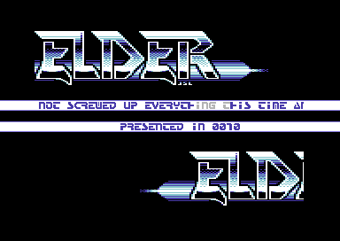
Double Logo Scrolling Machine [2011] |
Credits :
SIDs used in this release :
Download :
Look for downloads on external sites:
Pokefinder.org
User Comment
Submitted by pmc on 6 May 2011
| Nice. Old skool cool, just the way I like it. :) |
User Comment
Submitted by daison on 6 May 2011
nice one, white/blue scheme looks still fresh!
keep it up! |
User Comment
Submitted by Fresh on 5 May 2011
As I've already told you, a really nice release! Clean coding, fine choice of Gfx and SID, I'd say... tasty recipe!
Thumbs up. |
User Comment
Submitted by Elder0010 on 5 May 2011
| well, i had some ideas at first, and they required more space, but i decided to remove stuff in order to make something simpler but still nice to look at! |
User Comment
Submitted by Testa on 5 May 2011
cool logo by JSL and very good music,
i checked the code and it not bad
at all, but why use 2 banks: one
for the logo and one for the scroller??
you have enough space in one bank for
the logos and the scroller..
nice little production, anyway..
|
User Comment
Submitted by Rough on 4 May 2011
| Yeah, logo is really good and cool font choice. |
User Comment
Submitted by TheRyk on 4 May 2011
| Very good stuff! I also like the logo and that everything harmonizes very well. |
User Comment
Submitted by bepp on 4 May 2011
| Nice! Keep up the good work. Looking forward to seeing more from you! |
User Comment
Submitted by Stainless Steel on 4 May 2011
User Comment
Submitted by Danzig on 4 May 2011
| The logo makes me shout: I want the 80ies back. Thumbs up JSL! |
User Comment
Submitted by Yogibear on 4 May 2011
|
|
|
 | Search CSDb |
|
 | Navigate |  |
|
 | Detailed Info |  |
|
 | Fun Stuff |  |
· Goofs
· Hidden Parts
· Trivia
|
|
 | Forum |  |
|
 | Support CSDb |  |
|
 |  |
|


