|
| |
|
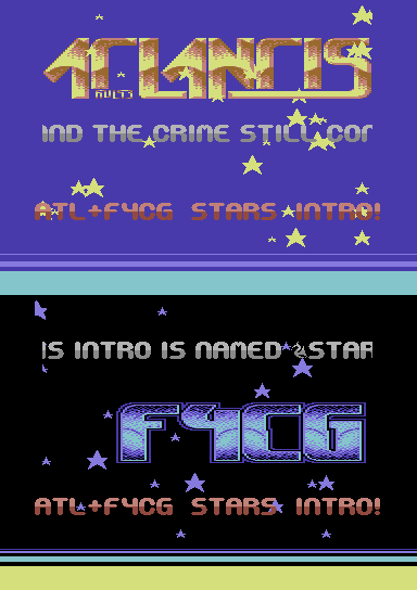
Stars Intro (atl+f4cg) [2013] |
Released At :
Intro Creation Competition 2013
Achievements :
C64 Demo Competition at Intro Creation Competition 2013 : #16
Credits :
SIDs used in this release :
Cracks which use this intro :
Download :
Look for downloads on external sites:
Pokefinder.org
User Comment
Submitted by Dr.Science on 16 December 2013
| I added a "After Compo Edition" --> minor bugs (logo switch) were eliminated. The After Compo Edition is not fitting into memory restricions of the compo, so that is why two versions are available for download. |
User Comment
Submitted by daison on 5 December 2013
Cool; I love the border raster effect the most here.
The logo switch bug annoys me a bit though. |
User Comment
Submitted by Dr.Science on 4 December 2013
@bepp: 1. thanx! 2.screenshot changed.
@hammerfist:1. thanx. i saw on all your comments, you didn't only write "i like/i don't like" but gave a lot of infromation WHAT you like or not. this is great. 2. the different "styles" must be different but not too much - since it still is ONE intro. Otherwise I just create 2 intros and mix them together. I wanted to have a line through the intro, that are the stars and the rastercolors. But this is my idea and may not be shared by all :-) |
User Comment
Submitted by bepp on 3 December 2013
Yeah! Great feel! One of the better ones in this compo! I like that there's a lot of things to look at :)
But Dr.Science, you seriously need to check the colors in your emu. These looks nowhere near the real stuff... O_o |
User Comment
Submitted by Hammerfist on 2 December 2013
| Clever how the two different logos (great ones, btw!) with their colors and the changing background color create almost different styles for both 'parts' of the demo. I think it's a missed opportunity that this wasn't worked out further by also changing the scroller, sprite and raster colors. A -1 for re-using the font from the Blue Intro or vice versa, but a +1 for changing logo and scroller position for each logo. 7/10 |
User Comment
Submitted by G-Fellow on 30 November 2013
| Nice intro, I had in the last days such a background color changes idea, too. :) |
User Comment
Submitted by Richard on 30 November 2013
| Nice effects. Great music and production overall ;) |
User Comment
Submitted by Dr.Science on 30 November 2013
@TheRyk: Thanks dude, you're abosuletly right. This issues could be improved, and maybe will in a future version (without deadline,hehehe). BTW: The Stars are choosen randomly at the start of the intro, you can switch them with "left arrow key" when the intro has started:-)
@The Dr.J:ok mate, we say "alle guten dinge sind drei" - next time it will be ok ;-)
@grennouille:like most other releases in the compo, this is NOT NTSC fixed....(yet?) |
User Comment
Submitted by grennouille on 30 November 2013
User Comment
Submitted by TheRyk on 29 November 2013
Quite good!
Glitches a little when switching between the modes or logos, would have been smart to clear (scroll)text before switching and clear the logo before or use some empty screen for the area of the old logo value while clearing.
Enough beef, you know I tell you these minor flaws to improve, not to really complain, I like the stars, especially in "dark mode" :) Unnecessary to mention that the tune is ubergreat, but nothing to write home about in an intro competition unless the tune is new. However, visual stuff is adjusted (spider would say "synched") quite well to the music. |
User Comment
Submitted by Dr.j on 29 November 2013
| @Dr.Strnage: nothing have happened!!. everything is Cool ! , we are all human being :-) keep cool mate |
User Comment
Submitted by Doc Strange on 29 November 2013
| @The Dr.j: Blame me for that, sorry... ;) |
User Comment
Submitted by Dr.j on 29 November 2013
Very cool intro , but a little *issue*
Our group name is Delysid and not what you wrote there :-) thanks anyway... |
User Comment
Submitted by Xenox on 29 November 2013
User Comment
Submitted by iAN CooG on 29 November 2013
|
|
|
 | Search CSDb |
|
 | Navigate |  |
|
 | Detailed Info |  |
|
 | Fun Stuff |  |
|
 | Forum |  |
|
 | Support CSDb |  |
|
 |  |
|


