|
| |
|
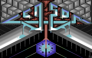
Censor Design Logo "Fluid Mechanics" [2014] |
AKA :
Let it flood!
Credits :
Download :
Look for downloads on external sites:
Pokefinder.org
User Comment
Submitted by Jammer on 12 April 2014
User Comment
Submitted by TheRyk on 9 April 2014
yeah strictly speaking some shading does not make 100% sense in our normal 3D perception. but in the end, why not just call those elements escher-esk?
To me, one of the best logos you did recently. |
User Comment
Submitted by Dr.j on 9 April 2014
| Andy!! i am so impressed by this one. i know your abilities and i think IMHO this its one of your greatest full screen logos ever . the design its excellent and execution (colors and patterns) are beautiful . really GREAT job my dear friend . keep your excellent images ruling... |
User Comment
Submitted by Joe on 9 April 2014
Some thoughts:
Interesting overall composition. Although the symmetrical upper half of the image isnt really counterbalanced with the geometrical object in the lower. It is as if the perspective on one hand is fooling our perception of what is above and below. In fact the isometric suggests a horizontal displacement. I could imagine the Designs-object could have been a brilliant diamond or something more advanced than to just lend itself to the rigid orthogonal isometric view.
There is more to do with the color restrictions you have set up for yourself. Although playing in the safe zone of good-looking color combination. There are ways of making things look dirty and appealing. Try not to be too stubborn on ordinary cross-dithering or at least try to make more use of it (the gradients of the grey floors for example).
One advice. A multicolored pixel is of course wider in x than I y. Hence the logo could with ease use a somewhat bolder framing when you make the thin top parts.
Keep up the experimentation. Isometric views is good for exploring how things of advanced shapes would project in space, try something more advanced as you go along. |
User Comment
Submitted by CONS on 8 April 2014
User Comment
Submitted by Ksubi on 7 April 2014
| Excellent! Now that's how to do it! |
User Comment
Submitted by leonofsgr on 7 April 2014
User Comment
Submitted by Doc Strange on 7 April 2014
| Another good one, well done. |
User Comment
Submitted by STF on 7 April 2014
| Impressive ! Good work mate :) |
User Comment
Submitted by wysiwtf on 7 April 2014
something about the "design" hexagon looks wrong/out of place but i cannot pinpoint it...
apart from that another great CENSOR logo :) |
User Comment
Submitted by CRT on 7 April 2014
| Stylish and cleaner than the previous. Great job! I see the flip selection in Pixcen is coming to good use. |
User Comment
Submitted by Conjuror on 7 April 2014
| Another great full screen logo. Nice work. |
|
|
|
 | Search CSDb |
|
 | Navigate |  |
|
 | Detailed Info |  |
|
 | Fun Stuff |  |
· Goofs
· Hidden Parts
· Trivia
|
|
 | Forum |  |
|
 | Support CSDb |  |
|
 |  |
|


