|
| |
Released At :
Transmission64 2021 Fall Edition
Achievements :
C64 Graphics Competition at Transmission64 2021 Fall Edition : #7
Credits :
Download :
Look for downloads on external sites:
Pokefinder.org
User Comment
Submitted by Electric on 18 December 2023
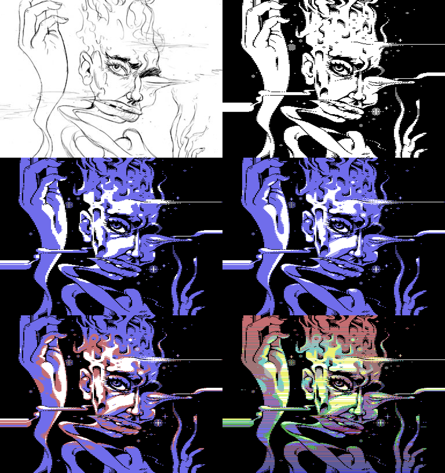
Based on a pencil sketch and pixeled in PhotoShop with a touchpad.
Workstages:
 |
User Comment
Submitted by grip on 7 December 2021
User Comment
Submitted by katon on 6 December 2021
| I have in my collection all your works from the last century and modern ones, I will write briefly what Electric you do in graphics that makes a man speechless. I sit and look and watch your unique style captivates me completely. Amazing job! |
User Comment
Submitted by Electric on 6 December 2021
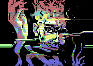
Thanks! This pic has as well kind of 'roughness' due it does not use the dark tones (9,6,b,2) almost at all. I suppose most of the people don’t really understand that this picture is indeed characters, not ‘koala’ – so the difficulty of the image is not visible as the pic looks merely FLI.
As I wrote in comments of 'Babes' -pic, most sceners seem to still prefer technical smoothness while a lot of C64 artists seem atm go already further. This is indeed a traditional example of development, that the demo art is developing.
Anyway, briefly explained how the pic works: as it has in fact only four colours one being the background (black) I decided to use one tone for light colours (f,3,d,7,1) and left the two remaining for midtones (5,c,a,e) that are split into midtones in light and midtones in dark and mixed heavily. So 'the shadows' are in here created with cold midtones (e,5) instead of dark tones.
I've also kep the antialiasing to minimum and due I do not have any dark tones in use midtones are left completely without antialiasing. This is where it looks 'rough' to most but I trust my pixeling. The fact it’s coloured with rasters as well causes bit random colours appearing here and there. I’ve started to like this ‘non-controlled’ colouring in a way as it somehow feels more creative. In general, I think the colour mixing here works OK already, compared to my earlier four tests.
Workstages: http://www.boingbeing.com/temp/twister_animated.gif
I’ve still got one more idea for the colour mixing with this mode. Though the audience does not seem to prefer this, I will still work it out (as can’t get no sleep if I don’t). |
User Comment
Submitted by Copyfault on 5 December 2021
While the picture makes me happy and give deep respect to Electric for the artist he is, the compo placement of it makes me awfully sad.
This deserved to be in the top3, if not on the 1st place.
@Ptoing: try this mode, it has a lot of potential! |
User Comment
Submitted by ptoing on 5 December 2021
| My favorite from the compo. I really wanna give this kinda mode a go sometime. |
User Comment
Submitted by 4gentE on 5 December 2021
User Comment
Submitted by Wile Coyote on 5 December 2021
| Funky. Grotesque. Interesting. |
User Comment
Submitted by Joe on 5 December 2021
Crazy image! Now if she could move ;D
Lovely work with the different tones for the image. |
User Comment
Submitted by scapegoat on 5 December 2021
User Comment
Submitted by Electric on 4 December 2021
| The image is in charmode (4 colours) with rasters in three of the tones. Includes sprites on top and bottom borders. Yet another test in mixing of colours. Watch it on a CRT for full experience. |
|
|
|
 | Search CSDb |
|
 | Navigate |  |
|
 | Detailed Info |  |
|
 | Fun Stuff |  |
· Goofs
· Hidden Parts
· Trivia
|
|
 | Forum |  |
|
 | Support CSDb |  |
|
 |  |
|


