|
| |
Credits :
Download :
Look for downloads on external sites:
Pokefinder.org
User Comment
Submitted by DeeKay on 15 December 2007
ptoing: What, you set every pixel by hand and then you're not supposed to care about huge 8x8 blocks and artefacts? 8) That's a bit of a contradiction, wouldn't you say?
I know there are c64-gfxians who TRULY don't care about artefacts. But they don't care about misplaced pixels either, though! 8) Their style is completely different to yours, and quite often I don't like it! ;-D |
User Comment
Submitted by ptoing on 2 October 2006
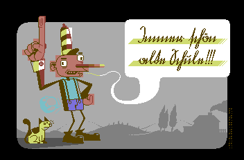
| DeeKay: I dunno, I like it how it is. I think it helps the retarded looking character in looking even more retarded. I like the odd artefact here and there and don't really see the need to hide restrictions like your life depends on it :) |
User Comment
Submitted by Krill on 2 October 2006
| Deekay: i read that some German gothic script was tought longest in Bavaria... :) Still before your time though ;) |
User Comment
Submitted by DeeKay on 1 October 2006
A great picture ruined by blocky coloring. One may call it another Ptoing style experiment, yes, but sorry, for my eyes that's as much of a "style experiment" as writing random numbers into SID-registers is a style experiment to a musician! ;-)
It just hurts, i can't help it! <:-)
Calling (M)UFLI to the rescue! 8) Or just make it plain 2color hires, would still look better...
Now i just need to decipher the writing... |
User Comment
Submitted by Krill on 19 September 2006
| ... or in some nickelodeon-styled cartoon demo w/ lotsa animations <3 |
User Comment
Submitted by Jak T Rip on 18 September 2006
I love the cat! I love the cat!
I simply love the cat!!!!
And I agree quite much to what Jammer said. |
User Comment
Submitted by Jazzcat on 17 September 2006
| It does look like a storybook come to life on C64. I enjoyed the use of background against foreground. The Main character really stands out because of this. The cat is nice and just as demented as the main character. :) |
User Comment
Submitted by Deev on 17 September 2006
| nicely done as always! I don't think the artefacts are a problem, they fit in nicely with the slightly deformed/demented look of the doll. |
User Comment
Submitted by chatGPZ on 17 September 2006
| braille is surprisingly easy actually :) |
User Comment
Submitted by Mirage on 16 September 2006
| My Braille knowledge is 0, so thanks for explaining |
User Comment
Submitted by ptoing on 16 September 2006
ta everyone :)
@Mirage:
The 4th Braille symbol means "number follows", so it's ptg 06 :P |
User Comment
Submitted by setz on 16 September 2006
| lovely work ptoing :) I love the style, everything I see from you is awesome in it's own way |
User Comment
Submitted by Krill on 16 September 2006
Immer schön alte Schule! \o/
True greatness. |
User Comment
Submitted by Skate on 16 September 2006
| I totally loved the unhidden hires bugs :) Very cute work Ptoing... |
User Comment
Submitted by Jammer on 16 September 2006
| ptoing is a strong breath of fresh air among all the graphicians, his style is a bit somewhere nearby mermaid but ptoing's works are more original speaking of technique. keep going man, i really support your work :) |
User Comment
Submitted by Hoild on 16 September 2006
It feels so good to see such an abuse of color blocks -- keep it up my dear deviant artist!
|
User Comment
Submitted by Mirage on 15 September 2006
User Comment
Submitted by Jetboy on 15 September 2006
User Comment
Submitted by MRT on 15 September 2006
@Matt:
Working on that, working on that... :-) |
User Comment
Submitted by leonofsgr on 15 September 2006
User Comment
Submitted by Matt on 15 September 2006
man what another great picture again!
I am awaiting a demo with graphics from ptoing only. any chance for that?
|
User Comment
Submitted by ptoing on 15 September 2006
| @wec: MRT told me the exact same thing via PM and I am totally aware of this, but I have to say that i quite like characterclashes every now and then. Without the blocky nature of hires I would have never arrived at the style I used for Yus Chunk for example. Embracing restrictions without hiding them every once in a while is very nice. |
User Comment
Submitted by jailbird on 15 September 2006
| Haha, great one Ptoing! :D The way you have used the 2col/char limit gives it a special flavour. |
User Comment
Submitted by Trazan on 15 September 2006
| I like. Good style and unique |
User Comment
Submitted by chatGPZ on 15 September 2006
User Comment
Submitted by MRT on 15 September 2006
| I realy love the background and the style of this image! It reminds me of those old '50 years books, which tell a story accompanied by loads of images (some of the first comic books?), but with that wicked Ptoing twist! |
|
|
|
 | Search CSDb |
|
 | Navigate |  |
|
 | Detailed Info |  |
|
 | Fun Stuff |  |
· Goofs
· Hidden Parts
· Trivia
|
|
 | Forum |  |
|
 | Support CSDb |  |
|
 |  |
|


