|
| |
Credits :
Download :
Look for downloads on external sites:
Pokefinder.org
User Comment
Submitted by Peeshaya on 18 September 2020
| Mysterious, simple structure and darkness combined. Me like! |
User Comment
Submitted by Jucke on 12 May 2007
| Very nice. And yes, sometimes (often) less is more. |
User Comment
Submitted by Mermaid on 12 May 2007
User Comment
Submitted by ptoing on 19 January 2007
Thanks for comments.
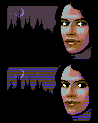
I put the normal screenshot because I think it is nice to see the pixelling technique, but I can see the concerns about the PAL emulation.
So I made an animated gif that changes every 5 seconds from PAL to clean pixels, whee. It should still best be watched on the real thing, Vice PAL emu is not 100% accurate. |
User Comment
Submitted by newid on 19 January 2007
| @ MagerValp: Agreed about the PAL emu. It rarely occurs, but this time I have to admit that PAL emu would produce a better screenshot. |
User Comment
Submitted by Skate on 19 January 2007
| AFLI is a very good choice for a hires master :) Nice colors. |
User Comment
Submitted by MagerValp on 19 January 2007
Very nice. The screenshot confuses me though, as the picture clearly takes advantage of PAL blending. Why isn't the screenshot taken with PAL emulation on?
|
User Comment
Submitted by hollowman on 19 January 2007
| just a face, but very well done |
User Comment
Submitted by Tao on 19 January 2007
| I don't find it too surprising that Ptoing is doing great in AFLI; after all, he's a masterful hires graphician, and AFLI is just hires but with new colours every line... |
User Comment
Submitted by Radiant on 19 January 2007
User Comment
Submitted by Hein on 19 January 2007
| Cool. AFli may be tempting to use a lot of colours, but you didn't, which rules in my opinion. Impressive portfolio btw, I hadn't seen it before. Keep it up. |
User Comment
Submitted by Oswald on 19 January 2007
| it's ammazing to see that ptoing can do his own style even in modes like afli. \o/ (see the url for his work in the news:) |
User Comment
Submitted by Higgie on 19 January 2007
| the motive is just a "standard" face but well performed. the gfx mode works fine here. but i allways find it difficult to judge gfx in a mode i haven't used myself. (i'm koala only! ;) ) ... the overall impression is: i like it, although you did pictures that impressed me more. :) |
|
|
|
 | Search CSDb |
|
 | Navigate |  |
|
 | Detailed Info |  |
|
 | Fun Stuff |  |
· Goofs
· Hidden Parts
· Trivia
|
|
 | Forum |  |
|
 | Support CSDb |  |
|
 |  |
|


