|
| |
|
Collection - Cut 1 [2007] |
Credits :
Download :
Look for downloads on external sites:
Pokefinder.org
User Comment
Submitted by Jak T Rip on 19 February 2007
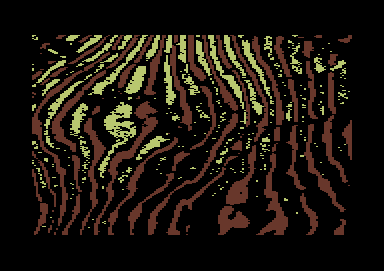
I love the optical effect it creates. I respect the simplicity. But simplicity for me does not necessarily involve less colours. Few prominent colours and few elements/lines whatsoever, this underlines the effect you create, but why not anti-alias, why not use all the colours you have to make those few lines and elements perfect?
I find the collection a fresh breeze in the sense of a graphical study that shows the effects we tend to forget about when doing a simple, uncreative but nice looking boris v picture... here are the rules of art and you can see how they work, how a line works, what effect it creates on us...
But without the perfectioning part using the full range of what can be done, it is merely a study as a base for something greater to come, I think...
--> like the autumn picture and oil art you made... I still love them to pieces every time I see them!! They are just perfect in and out and can never be improved :) |
User Comment
Submitted by tempest on 7 February 2007
| this is my favourite of these "experimental" computer images. 3 colors... out of 16. far out man. |
User Comment
Submitted by ptoing on 4 February 2007
| @Steppe: Very standard optical illusion. Red colours are seen as closer and blue colours are seen as farther away. Other colours are inbetween obviously. Everyone who delved a bit into colourtheory knows this ;) |
User Comment
Submitted by ZZAP69 on 4 February 2007
| I really like the depth between the colours and the 3D-effect that it makes. This looks like a picture of a planet surface taken by Nasa or similar. |
User Comment
Submitted by Deev on 2 February 2007
| this is definately my favourite of the collection series. I guess the temptation for most graphicians would be to anti-aliase all those edges, but using ONLY red/yellow/black gives it an interesting look that feels quite different to most other c64 graphics. |
User Comment
Submitted by Steppe on 2 February 2007
| Wow, that yellow is so far behind the red, I can't believe it! |
User Comment
Submitted by Ed on 2 February 2007
| The "collection"-series takes C64 art to a completely new level I think... Whether you like it or not... I love it! I'd better start composing "a tune for some wiggly lines"... |
|
|
|
 | Search CSDb |
|
| Navigate | |
|
| Detailed Info | |
|
| Fun Stuff | |
· Goofs
· Hidden Parts
· Trivia
|
|
| Forum | |
|
| Support CSDb | |
|
 |  |
|