|
| |
AKA :
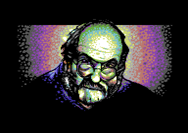
Kubrick vs. Multicolor
Released At :
Forever 2008
Achievements :
C64 Graphics Competition at Forever 2008 : #2
Credits :
Download :
Look for downloads on external sites:
Pokefinder.org
User Comment
Submitted by Carrion on 30 August 2018
ok, ok... I might seam lame/ignorant/not aware till today but...
is it really Stanley K. ;) hell it is...
it hit me today while watching some documentary on YT and ... there you hav e it. sometimes you see csdb releases and you realize 10 years later it's a wired (cough... inspired) pic from some document from Discovery Channel
(which YT is kind of for me at the moment).
good job anyway by a Hungarian bro! |
User Comment
Submitted by Joe on 20 November 2009
I believe it's the xx:th time I came across this image on the HD and at the CSDb
thinking of the very simple, elegant situation in which Jailbird formulated the order.
Smooth, easy, laidback and all that jazz. |
User Comment
Submitted by jailbird on 18 March 2009
@Joe: what were you smoking? =)
@Jetboy: thanks :) |
User Comment
Submitted by Jetboy on 18 March 2009
| It's hard to decide, but i think its one of your pictures i like the most. |
User Comment
Submitted by Joe on 15 March 2009
Puzzled and Ligeti, I prefer Ferrari at the moment.
Where is all that jazz? it's in the corners. |
User Comment
Submitted by Higgie on 20 March 2008
| great picture! great style! |
User Comment
Submitted by oys on 20 March 2008
User Comment
Submitted by Motion on 18 March 2008
| @Jailbird: Thanx for the extra info! :) |
User Comment
Submitted by DeeKay on 18 March 2008
| Really lovely, JB! 8) Nice coloring (though i wonder why you faded to dark grey in the background and not to brown or "dirty grey" (blue/brown lines alternating)) and really nice pixeltechnique! I always love to see the Made/Cyclone circlefadingstyle on c64 pics! ;-) |
User Comment
Submitted by jailbird on 18 March 2008
@Motion: well, my initial idea was to pixel a picture with as less chessboard-dither as possible, so any kind of overusage would ruin the main concept a bit ;)
Actually I already used a similar technique for the greetings part in Smart Girls Hate Booze, only that now I wanted it more colorful and just a little less clean. |
User Comment
Submitted by Motion on 18 March 2008
A really nice piece - and a great choice of shading and colour, but I think dithering can pay off, too. Look at Vanja's style in this link.
TRAX 2001 Compopic
|
User Comment
Submitted by Mäestro AmN on 16 March 2008
User Comment
Submitted by Alias Medron on 16 March 2008
Just great!
Who needs dithering anyway?? right Jailbaby?? :D |
User Comment
Submitted by psych on 16 March 2008
| Lovely colours! Like it a lot. |
User Comment
Submitted by Deev on 15 March 2008
| pretty good! nice style and use of colours. |
User Comment
Submitted by saehn on 15 March 2008
| Great work, nice color technique. :) |
User Comment
Submitted by jailbird on 15 March 2008
Thanks for the comments :)
Oh and many beers go to Clarence for the displayer and HCL for the help. I love you :D |
User Comment
Submitted by Joe on 15 March 2008
| Nice technique, although it seems from the final work stage that the next step would be to try dithering in creating a more vivid effect/layer of the colors. |
User Comment
Submitted by Oswald on 15 March 2008
| this is truly shocking, looks like hires at first. |
User Comment
Submitted by Archmage on 15 March 2008
| I like the style a lot, and the motive has personality to it. Good job, JB! |
User Comment
Submitted by Edhellon on 15 March 2008
| I was really impressed when JB showed this a couple days ago. Excellent pixeling as always, surrealistic use of colors and dithering and still just *so* good in the end! Hats off. |
User Comment
Submitted by Skate on 15 March 2008
| Great use of multicolor mode. His face looks very very realistic still with the usage of unrealistic colors. |
User Comment
Submitted by Stainless Steel on 15 March 2008
Awesome color combinations!
|
User Comment
Submitted by Mermaid on 15 March 2008
| Pretty mcol pic, nice dithering. |
User Comment
Submitted by Ed on 15 March 2008
Pixels GOOD put! Love the image + the format!
OMG, it is Dr.Phils brother, the other green head |
User Comment
Submitted by Linus on 15 March 2008
User Comment
Submitted by leonofsgr on 15 March 2008
| purple and green?! ;_) ugly! ;_) |
User Comment
Submitted by Mindcooler on 15 March 2008
|
|
|
 | Search CSDb |
|
 | Navigate |  |
|
 | Detailed Info |  |
|
 | Fun Stuff |  |
· Goofs
· Hidden Parts
· Trivia
|
|
 | Forum |  |
|
 | Support CSDb |  |
|
 |  |
|


