|
| |
|
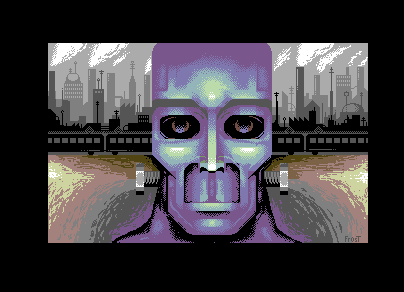
Cyberstein's Monster [2009] |
Released At :
LCP 2009
Achievements :
C64 Graphics Competition at LCP 2009 : #6
Credits :
Download :
Look for downloads on external sites:
Pokefinder.org
User Comment
Submitted by grip on 4 November 2013
User Comment
Submitted by Tao on 17 February 2010
User Comment
Submitted by Jak T Rip on 26 July 2009
| there are many, many things you could have done worse. Great work, actually! |
User Comment
Submitted by Frost on 23 July 2009
Thanks for the comments, folks!
This is my first take on hires, and actually my second fullscreen pic on c64.
It is many, many things in this pic that I feel that i could improve.
Expect some better stuff from me in the future. :) |
User Comment
Submitted by Motion on 20 July 2009
This is right up my street ...and then some! Brilliant colour balance. Frost you RocK!! :)
|
User Comment
Submitted by Deev on 19 July 2009
| Good stuff, my only critisism would be that the ground doesn't quite fit with the clean lines elsewhere. |
User Comment
Submitted by saehn on 19 July 2009
| Surprise, more hi-res work! Very nice. If I could give some feedback: I think this picture is very near completion, but my opinion is that it could use a little more time with finishing touches. Also, the direct perspective and symmetry makes it seem a little too balanced... although maybe that's what you wanted! Good work in any case. :-) |
User Comment
Submitted by lucadip on 19 July 2009
User Comment
Submitted by FATFrost on 19 July 2009
i like this picture, but i felt that the bolts weren't needed.
|
User Comment
Submitted by Hoild on 19 July 2009
The industrial landscape in the background is ptoingish goodness, but the monster is unfortunately sub-par.
-Should be more grotesque and/or minimalistic to fit that landscape, same about the spark showers or whatetever those things are. |
|
|
|
 | Search CSDb |
|
 | Navigate |  |
|
 | Detailed Info |  |
|
 | Fun Stuff |  |
· Goofs
· Hidden Parts
· Trivia
|
|
 | Forum |  |
|
 | Support CSDb |  |
|
 |  |
|


