|
| |
Released At :
Datastorm 2010
Achievements :
C64 Demo Competition at Datastorm 2010 : #2
Credits :
SIDs used in this release :
Download :
Look for downloads on external sites:
Pokefinder.org
User Comment
Submitted by Sith on 20 February 2017
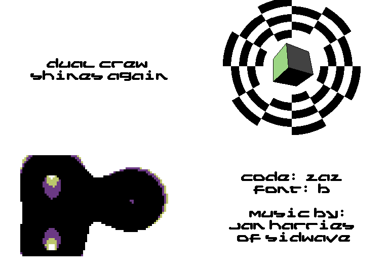
Great style and music. These color-filled hires vectors are visually the tastiest I've ever seen. I love the font animation too.
Only thing I find slightly annoying is that the logo, although excellent, recurs way too much throughout the demo. That would only be acceptable for loading animation. |
User Comment
Submitted by Paul Bearer on 3 March 2010
User Comment
Submitted by Axis/Oxyron on 20 February 2010
These colorful hires vectors are just wow.
|
User Comment
Submitted by Clarence on 19 February 2010
| Yep, that final object with 6 colours + black outlines (+background) was super nice. Overall a good quality, nicely designed, slick comeback demo. |
User Comment
Submitted by HCL on 10 February 2010
Yeah, vector with colors colors supernice!!
Also check out the char-screens! The chars are transparent and mix colors -> 7 colors + white!!
White is teh sexxy sexxy! |
User Comment
Submitted by fenek on 10 February 2010
| It has sweet vectors, they are hires, they are colored they are sexy :) |
User Comment
Submitted by Zaz on 8 February 2010
| Indeed the blue thing is a Thargoid. I had some more Elite objects lined up, but there was not enough time to make the routine handle the exhaust and front antenna of the Cobra MkIII so that idea fell through. |
User Comment
Submitted by NecroPolo on 8 February 2010
Great stuff, to and fro.
Music and style is frickin' awesome, c'grats guys!
The 3D + crosshair (?) thingy reminds me of space objects from Elite - supercool :D |
User Comment
Submitted by Archmage on 8 February 2010
| Nice one! Very good design and a good demotune by Jan the Man. |
User Comment
Submitted by KM on 8 February 2010
| Good design, really like the music on this one! |
User Comment
Submitted by Zaz on 7 February 2010
There should have been more stuff, but there simply wasn't enough time: I've been working on this since my previous release, and up to the competition day. The alternative would have been to not release at Datastorm...
Thanks for the generally positive comments. |
User Comment
Submitted by Oswald on 7 February 2010
| major hardon, nice design and effects, would have been a killer with a bit more content. |
User Comment
Submitted by PAL on 7 February 2010
| The dual crew logo with moving colors behind is fantastic, could be on any network tv channel... as an indent or devider, just looks amazingly cool! |
User Comment
Submitted by Sixx on 7 February 2010
| Solid stuff! A couple of nice effects and an awesome soundtrack by Rambones. |
User Comment
Submitted by daison on 7 February 2010
| Fresh indeed. I love the DUAL CREW logo (loading?) screen. |
User Comment
Submitted by Joe on 7 February 2010
| Great colors and line up. |
User Comment
Submitted by Yazoo on 7 February 2010
| this feels fresh. nice release - and good tune by jan. |
User Comment
Submitted by Richard on 7 February 2010
User Comment
Submitted by 5k3105 on 7 February 2010
User Comment
Submitted by Nightlord on 7 February 2010
| I really enjoyed this one. My fave in DATASTORM 2010 |
User Comment
Submitted by Motion on 7 February 2010
| Boy! This demo's so white, it gotsta be right! Great design, awesome fx and a wicked tune! |
User Comment
Submitted by null on 7 February 2010
| Nice demo, and Jan: I like this side of you, that makes cool tunes... |
|
|
|
 | Search CSDb |
|
 | Navigate |  |
|
 | Detailed Info |  |
|
 | Fun Stuff |  |
· Goofs
· Hidden Parts
· Trivia
|
|
 | Forum |  |
|
 | Support CSDb |  |
|
 |  |
|


