|
| |
Released At :
Arok 2010
Achievements :
C64 Graphics Competition at Arok 2010 : #2
Credits :
Download :
Look for downloads on external sites:
Pokefinder.org
User Comment
Submitted by NecroPolo on 20 July 2010
Man you're quite an experienced scholar of women, are you ;)
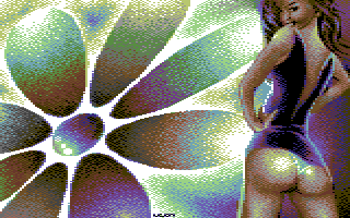
I like the flower but for me it was really difficult do concentrate on the left side.
If I was a pixel boy, this pixel girl would steal my heart. I would do anything to be in the same demo with her :) |
User Comment
Submitted by Joe on 19 July 2010
| Actually I'm preparing a robot- follow up on this one, without flowers. But I can't promising anything as it's a one buzz second idea I had... Yesterday ;D |
User Comment
Submitted by saehn on 19 July 2010
| I'm OK with the girl's proportions, I think it's deliberate. We've seen enough of Leon's work to know that he can achieve basic proportions, so this must be purposeful exaggeration, maybe even just for decorative reason (do ripe yet pert buttocks need rationale!?). I really like that you're working more with multicolor these days, Leon! :-D The coloring and dithering of the flower is interesting, caught my eye. |
User Comment
Submitted by MAC on 19 July 2010
Girls proportions are weird somehow.
Ass is to big, legs to skinny. Arms and shoulders also looks strange.
And that flower is just something to fill up the rest of the screen. Second girl or something would have been nice. |
User Comment
Submitted by FATFrost on 19 July 2010
| Girls is good, flower is meh. X |
User Comment
Submitted by The Shadow on 19 July 2010
| I agree with Malmix, this is done in a style similar to many FLI picures. |
User Comment
Submitted by Mäestro AmN on 18 July 2010
| A really good summer+party feeling picture, congratulations Leon Mäestro! :) |
User Comment
Submitted by leonofsgr on 18 July 2010
| phases.gif upload done... |
User Comment
Submitted by Xiny6581 on 18 July 2010
| I have one word for this, "summer"!!!. Damn what a fine picture. |
User Comment
Submitted by Oswald on 18 July 2010
| wow, this picture radiates as hell: summer, girls, happinness. makes me smile. excellent. |
User Comment
Submitted by Malmix on 18 July 2010
| really nice, gives me the impression of having more than three colours per char |
User Comment
Submitted by Joe on 18 July 2010
Hot!
Edit: Using black as background color might not have been the best. I'd struggle to get rid of the colorclashes on the panties/body and the hard dithering against the white in the flower.
I've made the same mistake several times myself. But I think a substitute color or the most commonly used in an image is the right one to reserve for the background. |
User Comment
Submitted by Wile Coyote on 18 July 2010
Good picture, like the colours.
Almost gives the impression that the area to the left should be a demo part. |
User Comment
Submitted by Jazzcat on 18 July 2010
| Also, very cheeky indeed. Love the face! |
User Comment
Submitted by Ksubi on 18 July 2010
| Thats a bit cheeky :P Love it! Really nice colour combinations. |
|
|
|
 | Search CSDb |
|
 | Navigate |  |
|
 | Detailed Info |  |
|
 | Fun Stuff |  |
· Goofs
· Hidden Parts
· Trivia
|
|
 | Forum |  |
|
 | Support CSDb |  |
|
 |  |
|


