|
| |
Credits :
Download :
Look for downloads on external sites:
Pokefinder.org
User Comment
Submitted by Chico on 14 October 2010
User Comment
Submitted by RaveGuru on 13 October 2010
Thumbs up!!
@Dane: Not bad actually =D |
User Comment
Submitted by Dane on 13 October 2010
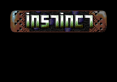
| "Killer instinct", coming soon from Booze Design? :D |
User Comment
Submitted by Perplex on 13 October 2010
Very nice and different.
@Archmage: Maybe the next demo can be named "Instict" so that you can include some unused logos? ;-) |
User Comment
Submitted by Higgie on 13 October 2010
thanx for all your comments and votes!
@jackasser: don't worry! ;) i still think this is a nice logo but far away from the standards archmage set. today i would have taken a slightly different approach with the letters, though. nobody will ever blame you for using archmages gfx (instead of mine). i would have prefered them myself if i would have been the one to choose.
@archmage: don't punish them too hard! ;) great that you like it!
@pal: i guess, i once tried with brown but didn't like it that much. today i think that you are right! :)
@skate: that's also what i like most about it.
@moloch: i think it's physically centered but looks a bit shifted to the upper left because of the way the letters are made. |
User Comment
Submitted by JackAsser on 13 October 2010
| Thanx for this one Higgie and I'm truly sorry that I forgot to use it. :( |
User Comment
Submitted by Archmage on 13 October 2010
| Very nice logo, and I will flog my groupmates for not using it when they had the chance. |
User Comment
Submitted by psych on 13 October 2010
| Great! Something truely fresh. |
User Comment
Submitted by Jammer on 13 October 2010
| teh colours, teh texture! brilliant \o/ |
User Comment
Submitted by Moloch on 13 October 2010
Very nice logo. The only thing that bothers me is the logo is off center within the box, but that is probably a visual illusion. Really like the coloring.
|
User Comment
Submitted by Yazoo on 12 October 2010
User Comment
Submitted by Skate on 12 October 2010
| I totally loved it! Specially the checker background with the bumps. |
User Comment
Submitted by plagueis on 12 October 2010
User Comment
Submitted by PAL on 12 October 2010
Love it... the only thing I would change in there is the grey coloring within the squars, they should be brownish in my mind... cool logo!
Again I must say that I will miss those instinct graphics... |
User Comment
Submitted by Stainless Steel on 12 October 2010
|
|
|
 | Search CSDb |
|
 | Navigate |  |
|
 | Detailed Info |  |
|
 | Fun Stuff |  |
· Goofs
· Hidden Parts
· Trivia
|
|
 | Forum |  |
|
 | Support CSDb |  |
|
 |  |
|


