|
| |
AKA :
after party final version
Credits :
Download :
Look for downloads on external sites:
Pokefinder.org
User Comment
Submitted by Flotsam on 23 August 2022
| As excellent as all the other works of art on the release list. |
User Comment
Submitted by KAL_123 on 6 February 2020
| Fantastic style. A superb picture, i love it. |
User Comment
Submitted by Jammer on 21 December 2015
| How come I missed that?! :O Probably best tiny/clean/regular detail up to date ;) |
User Comment
Submitted by Heavy Stylus on 25 April 2014
User Comment
Submitted by Motion on 26 March 2014
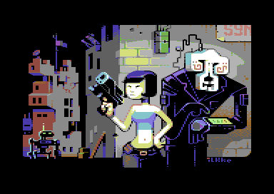
| Really impressive. I love the colours and the details, especially the lighting. Just look at that droid approaching on the left, the glow from the wrist display on the right-hand droid. The dude on the roof with a rifle. Of course, not forgetting the splendid main character. Absolutely perfect! |
User Comment
Submitted by Sounx on 24 February 2014
| Man I love this pic. The whole atmosphere of the picture appeals to me, but it's mostly the beautiful, simple composition that makes this one work for me. |
User Comment
Submitted by Akira on 20 December 2013
User Comment
Submitted by Jak T Rip on 8 December 2013
User Comment
Submitted by Rough on 27 November 2013
| Brilliant cyberpunk style. |
User Comment
Submitted by slimeysmine on 27 November 2013
User Comment
Submitted by celticdesign on 19 November 2013
| <3 Very nice! Would be perfect for comics :-) |
User Comment
Submitted by leonofsgr on 19 November 2013
interesting style, o_O
10/10 |
User Comment
Submitted by FATFrost on 18 November 2013
You little ripper!!
Beaut werk... Illke u keep making my day... |
User Comment
Submitted by finchy on 18 November 2013
| Wow, love it! More please :) |
User Comment
Submitted by Hammerfist on 18 November 2013
| Wowee, this is awesome stuff! I love the color-usage and the cartoonish style. Everything's very nice 'n neat and the anti-aliasing is very low-key (but also not absent, Redcrab, check the girl's hips and the cyborg's shoulders). Very nice picture indeed! |
User Comment
Submitted by Nuckhead on 18 November 2013
| I'm mesmerized ... like it alot:) |
User Comment
Submitted by redcrab on 18 November 2013
| WOW. Instant classic! There's so much to like here. The characters and overall motif of course but also the technical approach with crisp shapes and no dithering. (yes I love pixels but not dots) Ilkke for president. I love this! |
User Comment
Submitted by Moloch on 18 November 2013
| Nice and fresh, thumbs up! |
User Comment
Submitted by hedning on 18 November 2013
| 36 votes and 18 downloads? o.O |
User Comment
Submitted by The Phantom on 18 November 2013
| Roberto with Leela's wrist thing! Awesome! |
User Comment
Submitted by iAN CooG on 18 November 2013
what hedning said, party version linked to the party, afterparty 100% finished version released on its own.
Psyboarfunk [party version]
add the party version there |
User Comment
Submitted by hedning on 18 November 2013
| Top notch, but my anal personality don't want this version to be connected to the Syntax compo. Your 90% version should be uploaded too. |
User Comment
Submitted by grip on 18 November 2013
User Comment
Submitted by Oswald on 18 November 2013
| cool, fresh usage of the colors, adore your style, but you seem to be undecided here, the bodies seems not in your style while everyting else is. |
User Comment
Submitted by BokanoiD on 18 November 2013
User Comment
Submitted by Archmage on 18 November 2013
User Comment
Submitted by Heavy Stylus on 18 November 2013
User Comment
Submitted by psych on 18 November 2013
Absolutely AWESOME!
Please remember - if one day you would like to release your graphic collection, I'm the musician who will compose exclusive tune for it ;)
Love your work! |
User Comment
Submitted by Conjuror on 18 November 2013
When I first saw it on the big screen, I thought it was petascii - maybe because of all the great petascii we've seen lately or pixels are blown up so large.
Really like the style. The front robot reminds me of benders bank robber "friend". Nice sense of depth. Can really imagine an animated cartoon. |
User Comment
Submitted by STF on 18 November 2013
User Comment
Submitted by Mermaid on 18 November 2013
This is great! Surprised it didn't win.
Edit: oh, right, this isn't the compoversion. I still like the unfinished version better than the picture that won the compo. |
User Comment
Submitted by apprentix on 18 November 2013
User Comment
Submitted by X-jammer on 18 November 2013
User Comment
Submitted by bepp on 18 November 2013
| What Shine said! Really nice! |
User Comment
Submitted by Shine on 18 November 2013
Yeah ... your style is very unique ... i love it!!! 10/10
EDIT: My personal 1st place for the compo! :) |
|
|
|
 | Search CSDb |
 |
|
 | Navigate |  |
|
 | Detailed Info |  |
|
 | Fun Stuff |  |
· Goofs
· Hidden Parts
· Trivia
|
|
 | Forum |  |
|
 | Support CSDb |  |
|
 |  |
|


