|
| |
Released At :
Gubbdata 2015
Achievements :
C64 Graphics Competition at Gubbdata 2015 : #1
Credits :
Download :
Look for downloads on external sites:
Pokefinder.org
User Comment
Submitted by Wile Coyote on 15 November 2022
User Comment
Submitted by 4gentE on 17 December 2021
User Comment
Submitted by El Jefe on 17 December 2021
Awesome pic!
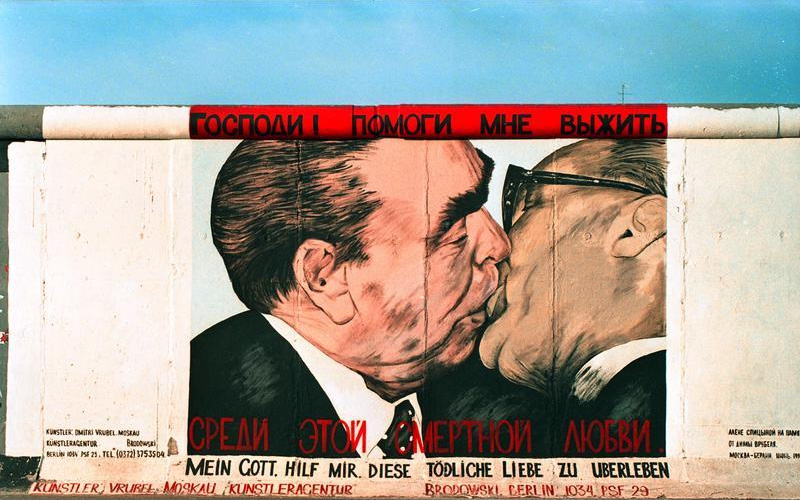
Reminds me a bit of:
 |
User Comment
Submitted by katon on 16 December 2021
| K I N G AND M A S T E R OF PIXELS I T S ONE AND ONLY JOE !!!!!!!!!!!!!!!@@@@ |
User Comment
Submitted by FABS on 19 June 2018
User Comment
Submitted by Hate Bush on 14 July 2015
| how come i haven't commented upon this yet? this is breathtaking, probably the best c64 pic i've ever seen. |
User Comment
Submitted by NecroPolo on 5 July 2015
| It has such a level and depth of visual competence that I fail to produce but succeed to comprehend. As for the effect on the viewer, it is a metal song written in pixels instead of notes. And it's great for one, it must be among my most favourite pixel art pieces I've ever seen. Respecto! |
User Comment
Submitted by Jak T Rip on 14 June 2015
Simply wonderful. Perfect combination of technical brilliance and motive.
Who were the "downvoters" only giving a 9 or 8? ;-)) |
User Comment
Submitted by Joe on 6 June 2015
| Thanks Jok, that means something to me. Besides I adore your artwork! |
User Comment
Submitted by Jok on 5 June 2015
| Idea and restrictions work together here - very good |
User Comment
Submitted by Martinland on 5 April 2015
User Comment
Submitted by Fresh on 2 April 2015
| Unbelievable piece of art! |
User Comment
Submitted by Frantic on 2 April 2015
| Another picture by Joe. Another crystal clear 10/10. :) |
User Comment
Submitted by Joe on 2 April 2015
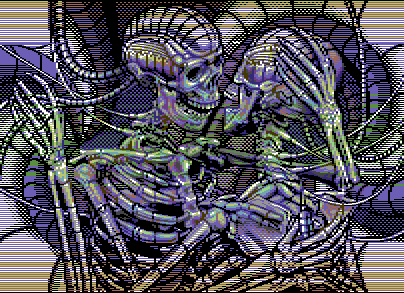
On the 3rd of March, I asked Firehawk about a show-routine for a whole-border image,
along with a small mock-up (similar in content, different in character). Ideas on
how sprites could be used more efficient for the quality of the result was refused
for a completely free area (for future use of the actual code) I asked about rasters
in the side-border and was leaned it would affect the $d021 in the bitmap.
Which I found useful.
Two weeks into the process, the picture had to change from 8 sprites to 7 sprites in
the upper and lower borders, with a complete rework of the image. Bad lines would repeat
colors in the rastered background so everything was somewhat changed.
The work is completely made up on a sketch on paper (5 days), later translated to 8-bit
graphics, all the work for the image was held in a layered Photoshop document, where I
could change graphics independently of the position. Also to test colors.
The main pixel work was done in PixCen (20 days). Everything else is code, which was
started early in the process, on and off each greater update (The work of the image
was done regardless.) until a set deadline for the 27:th of March. |
User Comment
Submitted by Scarzix on 2 April 2015
| wondering, which tools did you use? did you draw some, code the viewer, then draw some more or did you start out, planning exactly how much of the border you would open and then filled in the pixels or? and which programs if I may ask? |
User Comment
Submitted by daison on 1 April 2015
| Wow... amazing, speechless |
User Comment
Submitted by algorithm on 31 March 2015
| This is the definition of elite concept and pixelling. Straight 10/10 |
User Comment
Submitted by Joe on 30 March 2015
Thank you for all the votes and comments!
Prowler: I agree that it tends to be rather flat and even in level.
I choose to work with black for the border sprites and heavy outlines
with little dither. Could have made it different all together,
but the content and experiment surpassed the image and so did 25 days.
Hedning: Thanks for participating your great party.
For those who wonder what I got, it was a t-shirt with Mermaids
dinosaur from the recent image Walking on the Moon. |
User Comment
Submitted by hedning on 30 March 2015
| Crazy cool, Joe. It was an honour to be able to shake your hand and hand over the first price. Brilliant work here. |
User Comment
Submitted by Stone on 30 March 2015
User Comment
Submitted by Pad on 30 March 2015
User Comment
Submitted by prowler on 30 March 2015
| Superb work Joe - congratulations on the win! One thing I reflected upon when I first saw it was that the image lacked some "depth". This might be intentional and gives that extra arty/illustrational feel to it. A full 10 of course! |
User Comment
Submitted by Malmix on 30 March 2015
| Incredible in so many ways. |
User Comment
Submitted by Ksubi on 30 March 2015
| As usual, Joe goes above and beyond. Wonderful artwork that I can just stare at and look at all the detail. Thumbs up to Firehawk also! |
User Comment
Submitted by Scarzix on 30 March 2015
| jaw dropping - watching the live stream when this was shown. DAMN!... thats awesome! |
User Comment
Submitted by Sith on 30 March 2015
| Wut da fuck?!? So trippy, yet looks so lively, detailed and real. Reminds me of some Chemical Bros vid. A worthy winner. |
User Comment
Submitted by PAL on 29 March 2015
| fantastic... it is just a gem to come back to in the years to come. My hat is down and I bow to you, master of the trade. |
User Comment
Submitted by Matt on 29 March 2015
| Holy crap my eyeballs just popped out of my head. |
User Comment
Submitted by GH on 29 March 2015
User Comment
Submitted by fenz on 29 March 2015
User Comment
Submitted by Shine on 29 March 2015
| Perfection in it's own class!!! <3 Congratulation! 10/10 |
User Comment
Submitted by rez on 29 March 2015
User Comment
Submitted by jailbird on 29 March 2015
| Oh my fucking god. This is... WOW. |
User Comment
Submitted by Cresh on 29 March 2015
User Comment
Submitted by Metal Maniac on 29 March 2015
User Comment
Submitted by redcrab on 29 March 2015
Lots of smart stuff going on here!
Wothy winner indeed |
User Comment
Submitted by Oswald on 29 March 2015
| holy mother of sweet god, my eyes almost popped out until I understood how you managed to get more colors in the sideborders. genious! |
User Comment
Submitted by Mixer on 29 March 2015
| This is brilliant in so many ways. |
User Comment
Submitted by grip on 29 March 2015
User Comment
Submitted by awsm on 29 March 2015
| Witchcraft. Amazing in both technical execution and artistic direction. |
User Comment
Submitted by Hein on 29 March 2015
| Obviously made with so much patience and love for the machine. Incredible. Also good that you stress for more explorations beyond the borders, allthough this picture will last forever. |
User Comment
Submitted by ilesj on 29 March 2015
Wha!! I don't even...
It's Joe-fantastic, plus it's full borders! Out of words. |
User Comment
Submitted by LMan on 29 March 2015
| Hugely impressive pixelwork. |
User Comment
Submitted by psych on 29 March 2015
| @Mermaid, this is exactly what I wrote him today :) |
User Comment
Submitted by Mermaid on 29 March 2015
| You're unbeatable, Joe! :) |
User Comment
Submitted by Brush on 29 March 2015
| Original and perfectly executed! |
User Comment
Submitted by Digger on 29 March 2015
User Comment
Submitted by Dr.j on 29 March 2015
| totally super duper awesome ++ 12/10. Joe you are not human mate ;-) |
User Comment
Submitted by SIDWAVE on 29 March 2015
Holy crap... :)
James does what everybody does: 1 key at the time, it makes a pixel, note, or writes letters... but when he does it, it comes out this way, the "we gonna have skeleton sex!" way :) |
User Comment
Submitted by TheRyk on 29 March 2015
User Comment
Submitted by encore on 29 March 2015
| Didn't look all that great on the projector but looks fantastic on my C64. Awesome fullscreener. |
User Comment
Submitted by Jammer on 29 March 2015
|
|
|
 | Search CSDb |
|
 | Navigate |  |
|
 | Detailed Info |  |
|
 | Fun Stuff |  |
· Goofs
· Hidden Parts
· Trivia
|
|
 | Forum |  |
|
 | Support CSDb |  |
|
 |  |
|


