|
| |
AKA :
DamnYouLarsForBeingTooSlowReleasing
Credits :
SIDs used in this release :
Download :
Look for downloads on external sites:
Pokefinder.org
User Comment
Submitted by Krill on 9 August 2011
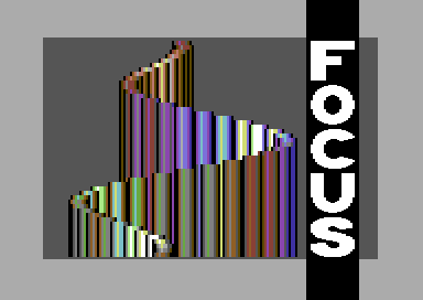
| Actually, both versions have their respective pros and cons. Cruzer's has better code (3 lines distance instead of 4, or maybe it's just because of sprite usage here) while this version has better design, BUT i really like the colour fades in Cruzer's version. |
User Comment
Submitted by Wile Coyote on 9 August 2011
| Cool bars. Too bad a better logo wasn't used. |
User Comment
Submitted by Ed on 9 August 2011
| Looks good. Thank you Lars |
User Comment
Submitted by HCL on 8 August 2011
| Very nice!! Should have kept it for a bigger prod imo, but that's your choice. |
User Comment
Submitted by Clarence on 8 August 2011
| Cruzer's version is more tidy (3 pixels distance) but this looks indeed better. |
User Comment
Submitted by Cruzer on 8 August 2011
| Hahaha, oh wow! Well, thanks for letting me be first, also to Cheesion, as well as Slammer who has worked on a similar routine before I started mine about 3 years ago (hence the credits for inspiration.) |
User Comment
Submitted by Cybortech on 8 August 2011
| Cheesion/Graffity did 18 years ago in unfinished Justinblue. : ) |
User Comment
Submitted by Dane on 8 August 2011
| But your design looks better at least! :) |
User Comment
Submitted by Mirage on 8 August 2011
More bugs than Cruzer's version but no point in waiting to put it into a proper demo any more, i would say.
Oh, and damn you Cruzer ;P |
|
|
|
 | Search CSDb |
|
 | Navigate |  |
|
 | Detailed Info |  |
|
 | Fun Stuff |  |
· Goofs
· Hidden Parts
· Trivia (1)
|
|
 | Forum |  |
|
 | Support CSDb |  |
|
 |  |
|


