|
| |
|
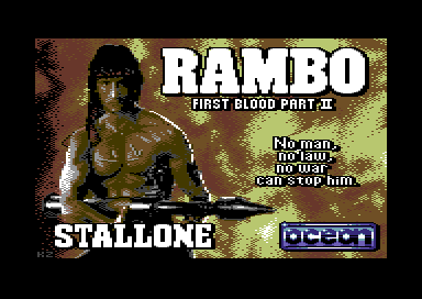
Kenzbo - First Blood Pt 2011 [2011] |
AKA :
Rambo Reloaded
Released At :
Rambo Revisited - GFX Compo
Achievements :
C64 Graphics Competition at Rambo Revisited - GFX Compo : #4
Credits :
Download :
Look for downloads on external sites:
Pokefinder.org
User Comment
Submitted by v3to on 21 August 2012
old vic colors are recommended.
congratz kenz |
User Comment
Submitted by DeeKay on 21 August 2012
| Not too sure on this one, I'd have to see it in a proper palette to really judge. But even with teh color horror, I can see that it's less defined in the details than e.g. Cybortech's pic... Features in the face are barely recognizable, it's rather murky... And Cybor not only absolutely excells on the face, he also managed to capture the bazooka and especially that weird apparition on top of the bazooka *really* well, better than any other Mcol pic in the compo! ;-) |
User Comment
Submitted by TheRyk on 28 August 2011
| This is my absolute fav in this competition, even better than the real thing. |
User Comment
Submitted by chatGPZ on 28 August 2011
"It might have been better if the compo rules included the words:'must use same Rambo pose as featured in the original Loading pic'"
it also should have banned any sort of creativity alltogether. wtf.
this picture totally wins because of the background pattern. like it almost better than in danes rendition (plain koala is always a winner) |
User Comment
Submitted by Wile Coyote on 28 August 2011
@STE86:
Me and Deadlines dont get along. If something works out, then great.
If it dont, then I return to it another day.
I tend to get sidetracked all too easily.
|
User Comment
Submitted by Yogibear on 28 August 2011
User Comment
Submitted by CreaMD on 27 August 2011
| If I would made the deadline 3 months from now, most of the participants would be working on their entry last week before the deadline anyway and compo would be totally boring and ignored. That's the human nature. |
User Comment
Submitted by STE'86 on 27 August 2011
| TIGHT deadline????? 2 weeks is tight? bloody hell :) |
User Comment
Submitted by Wile Coyote on 27 August 2011
@Raffox:
The rules are kinda lax.
It might have been better if the compo rules included the words:
'must use same Rambo pose as featured in the original Loading pic'
The compo opened with a tsunami of poop, and poor lash ups.
While searching for ref material to create a master piece, fell into the frame-of-mind:
'lets make a joke pic, as I really don't have the time right now to enter the compo'.. |
User Comment
Submitted by Raffox|HF on 27 August 2011
@ Wile Coyote:
I'm sorry, what was your comment here? Frymbo
I didn't get to read it on time... |
User Comment
Submitted by Wile Coyote on 27 August 2011
@Raffox:
I made RAM-BO for fun. It's not a serious entry.
The only pixel skills used were on the Ocean logo.
That said. As a converted image, I have some love for it. |
User Comment
Submitted by Raffox|HF on 27 August 2011
@ Wile Coyote:
Isn't this your entry? RAM-BO |
User Comment
Submitted by Wile Coyote on 27 August 2011
Good to see a white Rambo logo. Thats what I would have done, should I have created a serious entry.
It is also good to see white skin highlights.
If it had not been for the tight deadline, I would have entered the compo.
I think FLI might have been the best way to go, with the addition of FLI-PROFI to make use of the first 3 characters. |
User Comment
Submitted by pievspie on 27 August 2011
EXCELLENT USE OF REALISTIC COLOUR I LIKE IT A LOT |
|
|
|
 | Search CSDb |
|
 | Navigate |  |
|
 | Detailed Info |  |
|
 | Fun Stuff |  |
· Goofs
· Hidden Parts
· Trivia (1)
|
|
 | Forum |  |
|
 | Support CSDb |  |
|
 |  |
|


