|
| |
|
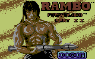
Rambo First Blood Part 2.1 [2011] |
AKA :
Gin & Tonic tastes like piss
Released At :
Rambo Revisited - GFX Compo
Achievements :
C64 Graphics Competition at Rambo Revisited - GFX Compo : #20
Credits :
Download :
Look for downloads on external sites:
Pokefinder.org
User Comment
Submitted by DeeKay on 28 August 2011
| gpz: Yes, I've also noticed that in the _original_ poster it's an explosion (see my NUFLI one). However, we don't know if that was what Steve Wahid was actually trying to paint, and I've always seen it as sunset sky with wisps of clouds - which I even think works much better than the in-your-face explosion, btw.... It certainly looks more like that than like an explosion! ;-) |
User Comment
Submitted by CreaMD on 28 August 2011
| But I liked how Glenn turned explosion to sand in his image. Great. ;-) |
User Comment
Submitted by chatGPZ on 28 August 2011
| somehow the background pattern now doesnt look how its supposed to be anymore at all, imho. (is not stripes, its an explosion! =D) |
User Comment
Submitted by DeeKay on 28 August 2011
| Wile: Working on that right now! :-) Quite drunk already, so i dunno if i can finish it tonight or tomorrow before buenzli ends.... |
User Comment
Submitted by Yogibear on 28 August 2011
| Is certainly an improvement of the original! |
User Comment
Submitted by Joe on 27 August 2011
Gah, to follow the general logic, I'd set the background color to orange instead of yellow, and that would have made wonders. The antialias is withdrawn to a witty non-dithering style, showing each none-shaved limdb under the skirt, one might wonder if the old 80:ies ideal was a oily bare shaven man or a hairy woman?
|
User Comment
Submitted by Wile Coyote on 27 August 2011
Rambo was the first game I ever picked up for the Commodore C64. Back in the day, the loading screen and music blew me away. Now in 2011 the original Loading pic hasnt aged nearly as well as the music. It gives the impression Steve Wahid was given about one day to do his best, and come up with something. This new polished version works well. I have to admit, it exaggerates the shinny almost inflated balloon look of the original.
I have two entries coming, one of them handpixel work (improved original) but the other one of them is converted (though manually postprocessed and hand-layouted to match the original pic). - Deekay
Thats the one I want to see most, the other one. |
User Comment
Submitted by Ragnarok on 27 August 2011
| at first glance kinda subtle changes but then it hits you. very, very good execution, deekay. thumbs up! also, have fun @ buenzli |
User Comment
Submitted by CreaMD on 27 August 2011
| Tribute to the original while trying hard to get it better looking. Respect. I like this one. |
|
|
|
 | Search CSDb |
|
 | Navigate |  |
|
 | Detailed Info |  |
|
 | Fun Stuff |  |
· Goofs
· Hidden Parts
· Trivia
|
|
 | Forum |  |
|
 | Support CSDb |  |
|
 |  |
|


