|
| |
Released At :
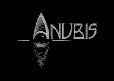
3-Color-Logo Competition 2013
Achievements :
C64 Graphics Competition at 3-Color-Logo Competition 2013 : #104
Credits :
Download :
Look for downloads on external sites:
Pokefinder.org
User Comment
Submitted by Jak T Rip on 5 May 2013
| Nice to see some exile action :) Not a bad logo I think! |
User Comment
Submitted by Hammerfist on 17 March 2013
Voted 1/10 because it is only a conversion. No original thought seems to have gone into this. I prefer something ugly someone made him- or herself above an obvious copy any day. (With the sole exception of copying for the sake of design - but that is not relevant here.)
As for your reaction, Exile: yes, it is perfectly fine that you enter this. I experiment too. My 3D-shaded logo was an experiment, for instance. I hope we'll also see some original work from you in the future! |
User Comment
Submitted by TheRyk on 20 February 2013
| Narf, I didn't suspect conversion, obviously I'm just too trustful, indeed, mentioning the source in the production note would have been a good idea. that of course explains the rather rough dithering I mentioned. |
User Comment
Submitted by BHF on 20 February 2013
| As STE'86 said. It looks like a plain conversion to me. |
User Comment
Submitted by Exile on 20 February 2013
Sorry guys, but i don't see the problem here. Just playing around with pc tools which i never used before. Don't make such a fuss over these tryouts.
|
User Comment
Submitted by spider-j on 20 February 2013
| At least the creator(s) should mark it as convert himself. Always feels like cheating when some else discovers the original. |
User Comment
Submitted by Didi on 20 February 2013
| It's valid concerning the rules but in my personal opinion should be considered lame because it's a plain conversion instead of own creative work. |
User Comment
Submitted by iAN CooG on 20 February 2013
User Comment
Submitted by STE'86 on 20 February 2013
you really should declare sources in a compo...
 |
User Comment
Submitted by iAN CooG on 19 February 2013
| ok, probably the koala pic needs to be optimized before conversion (poke $d021,1 to see the garbage) =) |
User Comment
Submitted by Urban Space Cowboy on 19 February 2013
| Oh but it can be if the 'foreground' color is black! Uploaded my own quick conversion for proof: there are 245 unique characters. Of course we wouldn't have this problem if people did their own conversions. Hint hint. |
User Comment
Submitted by Exile on 19 February 2013
| Can be converted, Its 244 char big. |
User Comment
Submitted by iAN CooG on 19 February 2013
| another one that can't be converted |
User Comment
Submitted by Yogibear on 19 February 2013
User Comment
Submitted by TheRyk on 19 February 2013
| Like it a lot. Though there's room for improvement in terms of dithering (slightly thicker letters would have allowed a little more elaborate dithering even in the actual logo), the idea with the initial A/eye is just great. |
|
|
|
 | Search CSDb |
|
 | Navigate |  |
|
 | Detailed Info |  |
|
 | Fun Stuff |  |
· Goofs
· Hidden Parts
· Trivia
|
|
 | Forum |  |
|
 | Support CSDb |  |
|
 |  |
|


