|
| |
Released At :
Font Creation Competition 2013
Achievements :
C64 Graphics Competition at Font Creation Competition 2013 : #4
Credits :
| Code | .... | WTE |
| Charset | .... | WTE |
Download :
Look for downloads on external sites:
Pokefinder.org
User Comment
Submitted by Raistlin on 24 January 2024
Love this font! Really awesome.
Though .. the J looks too close to the F for me. But I'm old and half-sighted. |
User Comment
Submitted by WTE on 13 August 2013
User Comment
Submitted by spider-j on 28 July 2013
| ugly colors in screenshot. looks great on real machine!!! good work, WTE! |
User Comment
Submitted by WTE on 23 July 2013
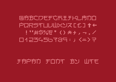
Yes, the X is a problem. I had a hard discussion with myself about it. The original 1x1 font didn't look nice with a vertikal line in the middle connecting the bows. Finally I did not change the 2x2 char. Maybe I lost the argument. :-(
But this allows for futher improvement. :-) |
User Comment
Submitted by Dr.j on 23 July 2013
| I very like this Font . cool to me |
User Comment
Submitted by Jak T Rip on 23 July 2013
Cool stuff! Especially the M... and the Z is also extremely Japanese. The only one I don't like for it does not look very Japanese is the X. Rest rocks.
Domo arigato gosaimasu. |
User Comment
Submitted by G-Fellow on 23 July 2013
User Comment
Submitted by user on 23 July 2013
User Comment
Submitted by BokanoiD on 23 July 2013
User Comment
Submitted by Oswald on 23 July 2013
| my fave so far, very clean and smooth. |
User Comment
Submitted by Yogibear on 23 July 2013
User Comment
Submitted by WTE on 22 July 2013
| Made by upscaling to 2x2 and 'streamlining' of an exiting 1x1 font (already created in 2010 [ http://blog.c128.net/archives/446 ]). All Work done on a Commodore 128 with MyChar Font Editor. |
|
|
|
 | Search CSDb |
|
 | Navigate |  |
|
 | Detailed Info |  |
|
 | Fun Stuff |  |
· Goofs
· Hidden Parts
· Trivia
|
|
 | Forum |  |
|
 | Support CSDb |  |
|
 |  |
|


