|
| |
Credits :
SIDs used in this release :
Download :
Look for downloads on external sites:
Pokefinder.org
User Comment
Submitted by Karmic on 7 January 2016
| Uploaded PAL/NTSC fixed version |
User Comment
Submitted by jailbird on 15 December 2015
| This is a poopastic poop! 10/10! |
User Comment
Submitted by Smasher on 14 December 2015
SEI
JSR $e544
...rest tomorrow :) |
User Comment
Submitted by iAN CooG on 14 December 2015
| zesmasher: time for you to start coding it =) |
User Comment
Submitted by Smasher on 14 December 2015
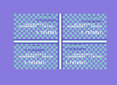
Hey this intro is quite good, but it could be much better with the following easy fx: upperleft area, the chessboard shifts down... bottomleft area CB shifts right, bottomright shifts up, upperright shifts left.
a more advanced FX could be to use chessboard zooming! |
User Comment
Submitted by The Phantom on 14 December 2015
| PS.. When I first saw this, I was reminded of a Wanderer demo called Wanderful |
User Comment
Submitted by The Phantom on 14 December 2015
@Flex - The blue works for everything BUT the logo, it's really hard to read a BLUE logo on a BLUE background.
I also wanted to give thanks for the greet - I LOVE GETTING GREETED :D
On a side note, I was going to change the settings myself, to see if I was right about the coloring, but man... The code is tight. Using the same value for several functions prevents me from changing those colors without messing up something else.
Still, good intro. "Almost" flawless on NTSC too ;) |
User Comment
Submitted by Flex on 14 December 2015
User Comment
Submitted by The Phantom on 14 December 2015
I honestly think it's too blue.
I LOVE the concept here, but honestly think the ONE thing that would greatly improve this is: Change the logo coloring to something other than blue.
Good work though. |
|
|
|
 | Search CSDb |
|
 | Navigate |  |
|
 | Detailed Info |  |
|
 | Fun Stuff |  |
· Goofs
· Hidden Parts
· Trivia
|
|
 | Forum |  |
|
 | Support CSDb |  |
|
 |  |
|


