|
| |
|
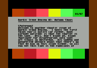
Nordic Scene Review #3 [2005] |
AKA :
Autumn Chaos
Credits :
SIDs used in this release :
Download :
Look for downloads on external sites:
Pokefinder.org
User Comment
Submitted by Ninja on 30 September 2005
| Good issue again! Hope 2F will come back. Waiting for your hiring-offers ;) |
User Comment
Submitted by Nightlord on 25 September 2005
| tdj: yes, I really think it does motivate people. at least your own reviews have motivated me before (but you ended up not reviewing this year's floppy releases :) ). When will you update your blog by the way ? |
User Comment
Submitted by TDJ on 25 September 2005
Nightlord: do you really think people will create more demos now they are sure that they will be reviewed? Ofcourse it's a plus, everybody likes that extra attention, but I personally wouldn't be influenced by it. But maybe that's because I'm too lazy ;)
The way you defend your comments here make sense, however I definitely got a different vibe from your editorial, hence my reaction. |
User Comment
Submitted by Nightlord on 25 September 2005
| tdj: i think demo reviews always boost the activity of demo authors. I never claimed we were the first or the only ones to do it. But I feel us doing it in regular intervals might have some kind of positive effect on overall productivity and also encourages other mags to shift more focus on demo reviews. but then again I might be wrong |
User Comment
Submitted by TDJ on 25 September 2005
Hmm .. although I do like the format of this (demoreviews are always the first chapter I check out in a mag), I don't think the quality of the text holds a candle next to that of Game overview. ALIH is a great writer: Puterman & Nightlord are not (okay, but not great), and that makes this a little less interesting to read.
Also, I was kind of baffled by Nightlord's comments in the intro chapter about the fact that demo reviews would become meaner, and people would talk about demos more, because of NSR .. a bit pretentious, isn't it? Hey, I've been writing 'mean' demoreviews since 1991, and quite a lot 'meaner' than these guys do, so I guess they managed to influence me through some kind of timewarp. And oh yes, people have been discussing demos for quite some time now as well, and I don't see a review-mag making any difference there ..
So while I see the value of NSR, I don't think it's as important as the editors claim it to be. Don't take yourself too serious guys - us 'reviewers' are still only scavengers feeding on the remains of the 'real' demoscene :) |
User Comment
Submitted by A Life in Hell on 25 September 2005
| I'm actually finding the font easier to read now that I'm used to it. Seriously, Thumbs up, guys, a great mag as usual - although I did notice that the tone in this issue was different to previous issues... it somehow seemed more somewhat depressed about the state of things, I guess. Kinda hard to explain what I mean. I still love it, though. |
User Comment
Submitted by Frantic on 25 September 2005
| done reading. great! waiting for the next issue.. |
User Comment
Submitted by ne7 on 25 September 2005
| nice issue!! re: the mean comment - yea i think its important to remember its a review - its one or two peoples opinion. its not the be-all and end-all of life, and it isnt mean to critisise in this way: if you cant take some critisism then how can you ever get better? :) - i for one enjoyed reading the review of sphaeristerium even tho i think puterman didnt like the music... you can't please everyone all of the time *grin* and anyway i value his opinion and took it on board :) |
User Comment
Submitted by H.O on 25 September 2005
Another nice, stylish issue. It's a pity the font wasnt updated though, since I feel it detracts from the readability.
As for the meanness level; I didnt experience the reviews as particularly mean which I actually think is a good thing. I dont see a point in being mean for the sake of it. Rather, I found the reviews to be honest and subjective which is the way a review should be (IMO) since complete objectiveness when reviewing is just a myth.
|
User Comment
Submitted by Oswald on 25 September 2005
| very elegant, remembers me to driven, no hype just good text, that is nice to read. |
User Comment
Submitted by Hein on 24 September 2005
| Enjoyable to read, because its compact. But, don't flatter yourself, mean isnt really a word to be used by you 2 softies.. Way too constructive for that. Btw, the font still sucks. |
User Comment
Submitted by DJ Gruby on 24 September 2005
| No, none of the design elements was influenced by Biba 2 by Arise. Believe me! |
User Comment
Submitted by Radiant on 23 September 2005
| The writing style is growing on me. I've not got much to say, other than that. Solid texts, well worth the read. Let's hope for some more involvement from Twoflower in issue #4 (that revised font, for instance). |
|
|
|
 | Search CSDb |
|
 | Navigate |  |
|
 | Detailed Info |  |
|
 | Fun Stuff |  |
· Goofs
· Hidden Parts
· Trivia
|
|
 | Forum |  |
|
 | Info on other sites |  |
|
 | Support CSDb |  |
|
 |  |
|


