|
| |
|
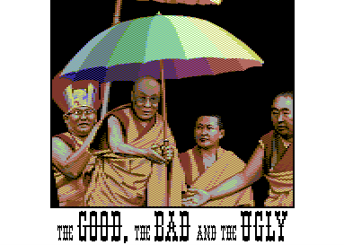
The Good, the Bad and the Ugly [2006] |
Credits :
SIDs used in this release :
Download :
Look for downloads on external sites:
Pokefinder.org
User Comment
Submitted by F7sus4 on 26 September 2020
User Comment
Submitted by morphfrog on 26 September 2020
| Have totally missed this one as well, really superb piece of art! |
User Comment
Submitted by hedning on 25 September 2020
User Comment
Submitted by JAC on 10 January 2017
| Incredible detail in the faces. Hard to believe it's a multicolor picture. |
User Comment
Submitted by DeeKay on 29 December 2009
Totally missed that, just found it through HGSC on Facebook (Facebook is just a waste of time? Pah! ;-). Great work, it always makes me happy whenever my age-old pixelgod Hein decides to put aside whatever program he uses to make these really nice tunes these days and lay down some pixels for a change! ;-) ...though I do wonder why the Dalai Lama is "the bad"...
Extra bonus points for the colorful border gfx! |
User Comment
Submitted by Jammer on 3 December 2008
| indeed! you found the oregano :D |
User Comment
Submitted by Hein on 3 December 2008
Jammer, does it somehow remind you of
 |
User Comment
Submitted by Jammer on 3 December 2008
| one thing disturbs me, namely the leftmost guy. the rest of monks have great realistic eyes, he doesn't. i wonder if darker colour there would help ;) was it intentional? :D |
User Comment
Submitted by Jak T Rip on 28 August 2006
| and the colours! :) wonderful |
User Comment
Submitted by Valsary on 28 August 2006
| Awesome picture! Awesome idea! ...Dalai Lama will pray for You ;) |
User Comment
Submitted by Hydrogen on 26 August 2006
| Stunning pixelwork. Amazing details in every cursor, especially faces. Congratulations. |
User Comment
Submitted by psych on 25 August 2006
User Comment
Submitted by Mace on 25 August 2006
Always amazing how it turns out to be possible to make something/someone so recognizable with only this few pixels!
Good work! |
User Comment
Submitted by Motion on 25 August 2006
| Wow! This has been a great month for gfx releases for sure. It just gets better! Yeah, that umbrella sure is sumthin'! Wonderful picture and great subject matter. |
User Comment
Submitted by A3 on 25 August 2006
| Details, it's all in the details. :) Really nice... .. . .. |
User Comment
Submitted by chatGPZ on 25 August 2006
User Comment
Submitted by Oswald on 25 August 2006
| holy shit, yes the small details.. :-) |
User Comment
Submitted by Jetboy on 25 August 2006
| Umbrella is killing me. Absolutely amazing! Though the rest is very good too. |
User Comment
Submitted by leonofsgr on 25 August 2006
| nice, nice, nice! \o/ i like the photo-realistic picture on c64! nice, nice, nice! \o/ |
User Comment
Submitted by Jazzcat on 25 August 2006
| Excellent! I love those monks. Especially the one that is looking away. Photoreal on C64 with no flicker! |
User Comment
Submitted by Matt on 25 August 2006
what's this?
is it the graphic boom? heaps of graphicians seem extremely busy lately.
this picture is awesome hein! |
User Comment
Submitted by blackdroid on 25 August 2006
| who is the fourth person ? person with a walk-on ? |
User Comment
Submitted by Steppe on 25 August 2006
| Hein, you rule! Straight 10. |
User Comment
Submitted by Tao on 25 August 2006
| I just *love* the juxtaposition with the multi-coloured umbrella and the monks. |
User Comment
Submitted by Tch on 25 August 2006
| Yes,indeed lovely details! 8D |
User Comment
Submitted by Sander on 25 August 2006
| Look at the details on those faces, that's extremely rare high quality. Hein makes us look like amateurs when it comes to technique. The real Dutch Master. (especially since Mirage lives in England ;) |
User Comment
Submitted by Style on 25 August 2006
| awesome shading and composition - whats with the recent spate of ultra-high-quality graphic releases? |
|
|
|
 | Search CSDb |
|
 | Navigate |  |
|
 | Detailed Info |  |
|
 | Fun Stuff |  |
· Goofs
· Hidden Parts
· Trivia (1)
|
|
 | Forum |  |
|
 | Support CSDb |  |
|
 |  |
|


