|
| |
Released At :
X'2008
Achievements :
C64 Graphics Competition at X'2008 : #22
Credits :
Download :
Look for downloads on external sites:
Pokefinder.org
User Comment
Submitted by nada on 29 January 2009
maybe i would if Wrath was dancing well !? ;)
thx Jak! :D
|
User Comment
Submitted by Jak T Rip on 20 January 2009
| interesting! sure you are not from wrath? |
User Comment
Submitted by nada on 8 November 2008
| PSycHo: thank you, yes, i would also like to see a dancing demo ! \o/ |
User Comment
Submitted by nada on 7 November 2008
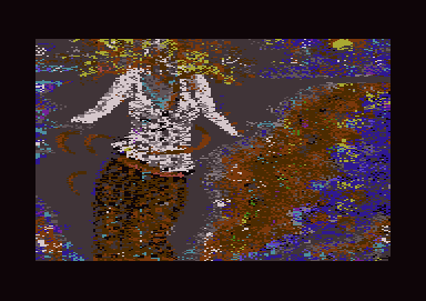
Dance all over is really my first Dance with Amica Paint and I must confess, I felt completely in love with Joystick&Spraycan.
I really enjoyed it, and did my first Steps with much Love, Patience and Curiosity.
Thank to everybody who felt and appreciated that, and supported me with the Feedback!
:-) |
User Comment
Submitted by Yazoo on 6 November 2008
| no offense - but i think this is a little overrated. @nada - keep on trying |
User Comment
Submitted by leonofsgr on 6 November 2008
| cool background! cool colors! cool body cool feeling!! 9/10 |
User Comment
Submitted by Mace on 6 November 2008
Sorry, I can't appreciate a picture like this.
I find it hard to think that the arrangement of the pixels has an underlying intention.
It seems more that the picture itself has one, but it's not beauty, skill or effort. |
User Comment
Submitted by Stainless Steel on 6 November 2008
User Comment
Submitted by daison on 6 November 2008
| but how come her head is exploding? |
User Comment
Submitted by psych on 6 November 2008
| I like this one very much. Will fit nicely somewhere in the demo with good music in the background :) She's really dancing :) |
User Comment
Submitted by Ed on 6 November 2008
@Tao: You where wrong this time, however we know we are cooler than noise.
Some pretty nice stuff going on in this image. I wish Nada good luck in the future to come, lot more pixels left back home. |
User Comment
Submitted by null on 4 November 2008
even though this kind of style *can* look nice, I don't think it works too well in this case.
Nada, I hope to see more of your art in the future! :_) |
User Comment
Submitted by Scout on 4 November 2008
I wonder why this is rated so low?
I really like this. |
User Comment
Submitted by SIDWAVE on 4 November 2008
| This is art boys! wake up! |
User Comment
Submitted by Tao on 2 November 2008
| My gut reaction when seeing this was "Oh, yet another Wrath Design" release... |
User Comment
Submitted by McMeatLoaf on 2 November 2008
| This is just me, but the brownish field to the right nearly looks like Gotland to me... |
User Comment
Submitted by yago on 28 October 2008
| The first Picture by nada, has a special dynamic feeling and groovy hips |
User Comment
Submitted by Youth on 27 October 2008
| Looks like pointilism with pixels is not such a good idea :) |
User Comment
Submitted by Radiant on 27 October 2008
| I don't know. I'd rather hang this on my wall than your average picture of dragon + warrior against a crimson sunset. |
User Comment
Submitted by Style on 27 October 2008
| A failed experiment perhaps? |
User Comment
Submitted by d0c on 27 October 2008
| looks like a fucked up file that have been read half way, because of a read error.... |
|
|
|
 | Search CSDb |
|
 | Navigate |  |
|
 | Detailed Info |  |
|
 | Fun Stuff |  |
· Goofs
· Hidden Parts
· Trivia
|
|
 | Forum |  |
|
 | Support CSDb |  |
|
 |  |
|


